The federal funds rate is one of those economic terms that sounds like it belongs in a room full of beige suits, stale coffee, and a PowerPoint no one asked for. But in real life, it matters a lot. It influences borrowing costs, savings yields, credit cards, business financing, home affordability, and the general mood of markets that tend to faint dramatically whenever the Federal Reserve clears its throat.
If you want to understand the U.S. economy in fast-forward, study the history of the fed funds rate. The line tells a wild story: inflation panic, recession medicine, near-zero emergency policy, and a modern hiking cycle that moved with the urgency of a smoke alarm. From the towering peaks of the early 1980s to the basement-level lows of the financial crisis and the pandemic, this rate has served as the Fed’s loudest economic signal flare.
In this guide, we will walk through what the fed funds rate is, why its history matters, where the record highs and lows happened, and what the most useful charts reveal. We will also look at how the post-2022 cycle fits into the long arc of monetary policy. Spoiler: central banking is not exactly stand-up comedy, but the chart does have plot twists.
What Is the Fed Funds Rate, Exactly?
The federal funds rate is the interest rate banks and certain other institutions charge one another to borrow reserve balances overnight. In plain English, it is the price of very short-term money in the U.S. banking system. The Federal Reserve does not usually set the exact market rate directly. Instead, the Federal Open Market Committee, or FOMC, sets a target for it. Today, that target is expressed as a range.
That distinction matters. When people say, “the Fed raised rates,” they usually mean the FOMC raised the target range for the federal funds rate. The effective federal funds rate is the real-world market rate that trades inside, or very close to, that range. Think of the target range as the lane markers on the road and the effective rate as the car staying between them. On most days, the car behaves. In some historical moments, it absolutely did not.
This rate sits near the center of the U.S. financial system. It affects prime lending rates, short-term Treasury yields, savings products, floating-rate debt, business credit, and market expectations about the economy. It does not set your 30-year mortgage in a neat one-to-one way, but it does influence the broader interest-rate environment that eventually lands in your wallet.
Fed Funds Rate History at a Glance
The monthly effective federal funds rate series begins in 1954, and the history since then looks less like a straight line and more like a cardiogram after three espressos. Here is the short version of the long saga.
| Era | What Happened | Why It Mattered |
|---|---|---|
| 1950s to mid-1960s | Rates were generally low to moderate. | Postwar growth and relatively calmer inflation kept policy less dramatic. |
| Late 1960s to early 1980s | Rates climbed sharply and became highly volatile. | Inflation surged, the Fed tightened aggressively, and the early 1980s delivered the all-time peak. |
| Mid-1980s to 1990s | Rates remained elevated by modern standards but gradually normalized. | The Fed kept pressure on inflation while managing growth and recessions. |
| 2000s | Rates fell after the dot-com bust, then rose before the housing and financial crisis. | The cycle showed how the Fed alternates between support and restraint. |
| 2008 to 2015 | Rates fell to effectively zero. | The Great Recession pushed the Fed to the lower bound and forced unconventional policy tools into the spotlight. |
| 2015 to 2019 | Gradual rate increases, then some cuts. | The Fed tried to normalize after years of emergency settings. |
| 2020 to 2021 | Back to near zero. | The pandemic triggered emergency easing again. |
| 2022 to 2023 | Fastest hiking cycle in decades. | Inflation roared back, and the Fed answered with aggressive tightening. |
| 2024 to 2026 | Rates moved lower from the 2023 peak but stayed well above pandemic lows. | The Fed shifted from emergency inflation fighting to a more calibrated stance. |
The Highs: When the Fed Hit the Brakes Hard
The most famous chapter in fed funds rate history is the early 1980s, and for good reason. Inflation had become the main villain of the U.S. economy. During the Great Inflation, price pressures built for years, confidence eroded, and the Fed eventually decided it had to act with unmistakable force. Under Chair Paul Volcker, the central bank tightened policy aggressively, and the fed funds rate shot into territory that today looks almost fictional.
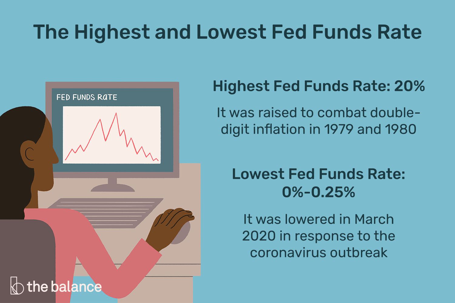
The daily effective federal funds rate hit 22.36% on July 22, 1981. On a monthly-average basis, the series peaked at 19.10% in June 1981. Those are not typos. That was the era. If modern borrowers gasp when they hear “higher for longer,” the early 1980s would like a word.
Why did rates go so high? Because inflation was painfully high too. The Fed was trying to break an entrenched inflation psychology that had spread through wages, prices, and expectations. Higher interest rates were meant to cool demand, tighten financial conditions, and prove that the central bank was serious. It worked eventually, but not gently. The 1981–82 recession was severe, unemployment rose sharply, and many interest-sensitive sectors got clobbered. Monetary policy, it turns out, is often like medicine with a label that reads: “May cause discomfort, nausea, and economists arguing for 40 years.”
Still, the lesson from that peak remains powerful. When inflation becomes deeply embedded, the Fed may need to tighten more aggressively than people expect. The fed funds rate history of 1980 to 1982 is less a bump on the chart and more a mountain range with attitude.
The Lows: When the Rate Moved to the Floor
If the early 1980s were the age of sky-high rates, the post-2008 world was the era of the floor. As the financial crisis intensified, the Fed cut the target from 5.25% in September 2007 to a target range of 0% to 0.25% in December 2008. That was the moment the modern zero-rate era truly began.
Once rates were pinned near zero, the Fed had little room left to stimulate the economy through traditional cuts. That is why the years after 2008 became a laboratory for tools like forward guidance and large-scale asset purchases. The fed funds rate itself could not go meaningfully below zero, so policy had to get creative without abandoning the basic mission of supporting employment and stabilizing inflation.
The effective rate stayed very low for years. Then, after a gradual normalization phase later in the 2010s, the pandemic sent policy right back into emergency mode. In monthly data, the effective fed funds rate fell to 0.05% in April 2020 and stayed there in May 2020. That is about as close to the basement as you can get without taking a shovel to the floorboards.
Low rates can help support borrowing, spending, and financial stability during crises. But they also come with trade-offs. Savers earn less, risk-taking can increase, and the Fed has less room to cut when the next crisis arrives. The lows in fed funds history are not just about cheap money. They are also a reminder that near-zero policy usually appears when the economy is under real stress.
The 2022–2026 Chapter: A Modern Tightening Cycle With Teeth
After the pandemic shock came a very different problem: inflation. By June 2022, the Consumer Price Index was up 9.1% from a year earlier, the biggest 12-month increase since 1981. That gave the Fed a familiar headache with a modern twist. Supply constraints, strong demand, a tight labor market, and post-pandemic distortions created price pressure that would not politely go away on its own.
So the Fed moved fast. Between March 2022 and July 2023, the FOMC raised the target range by 5.25 percentage points, bringing it to 5.25% to 5.50%. That range held through the middle of September 2024. The pace and scale of the tightening made this the sharpest rate-hiking cycle in decades and instantly turned “basis points” into dinner-table conversation for people who previously had better hobbies.
Then came the easing phase. Over the final three meetings of 2024, the Fed lowered the target range by a cumulative 100 basis points, bringing it down to 4.25% to 4.50%. By December 2025, the range was lowered further to 3.50% to 3.75%, and in March 2026 the FOMC maintained that range. Around mid-April 2026, the effective federal funds rate was 3.64%, sitting neatly inside the band.
This recent chapter matters because it shows how the modern Fed tries to thread the needle. It had to fight inflation without assuming the economy would absorb every rate increase painlessly. Compared with 1981, the levels were much lower. Compared with 2020, they were miles higher. That contrast is exactly why the fed funds rate history remains so useful: every cycle has its own personality, but the chart always keeps the receipts.
What the Charts Show
If you only look at headlines, rate history can feel like a random series of announcements. Charts fix that. A good fed funds chart turns policy into a visible story.
1. The Monthly Effective Rate Chart
This is the classic long-run chart. It is the best view for spotting the major eras. You can clearly see the dramatic run-up into the early 1980s, the long downward trend that followed, the collapse to near zero after 2008, the second near-zero period in 2020, and the staircase higher in 2022 and 2023. If you want one chart to frame the whole history, this is it.
2. The Daily Effective Rate Chart
The daily chart is where the chaos lives. It captures short-term spikes and policy transition moments that monthly averages smooth over. That is why the daily series is so useful for identifying the exact all-time high in July 1981. Monthly data tells you the peak era; daily data shows you the day the chart basically tried to punch through the ceiling.
3. The Target Rate and Target Range Chart
This view helps explain the mechanics of modern policy. Before December 16, 2008, the Fed’s target was commonly reported as a single rate. After that, it was reported as a range. Comparing the target with the effective rate helps show how policy implementation works: the market rate usually sits within the band, steered by the Fed’s operating framework and administered rates.
4. The “Rates Versus Inflation” Chart
If you really want context, compare the fed funds rate with inflation. This helps explain why the early 1980s looked so extreme and why the post-2022 cycle happened at all. A rate number by itself is just a number. A rate number next to inflation is a policy argument in picture form.
Why Fed Funds Rate History Still Matters
Studying fed funds rate history is not just an academic exercise for policy nerds and chart lovers. It helps explain why borrowing costs move, why markets obsess over FOMC meetings, and why two periods with the same nominal rate can feel completely different depending on inflation, employment, and financial stress.
For households, the fed funds rate shapes the broad interest-rate climate. Credit cards and home equity lines tend to feel it quickly. Savings accounts and money market funds often move with it too, though sometimes with the enthusiasm of a teenager asked to do laundry. Mortgage rates are influenced more indirectly, but the policy path still matters because it affects Treasury yields, expectations, and investor behavior.
For businesses, the rate influences financing costs, hiring decisions, inventory strategy, and expansion plans. For investors, it changes discount rates, bond yields, equity valuations, and sector leadership. For policymakers, it remains the main lever for balancing maximum employment and price stability. That is a lot of responsibility for one little overnight rate.
Big Lessons From the Long History
The first lesson is that inflation changes everything. When inflation is contained, the Fed has more room to be patient. When inflation surges, patience quickly becomes a luxury item.
The second lesson is that zero is not normal. It is crisis policy. The long stretches near zero after 2008 and in 2020 were not signs of a carefree economy. They were signs that the Fed was fighting serious weakness or shock.
The third lesson is that the level of the rate matters less than the context around it. A 5% fed funds rate can be restrictive in one era and merely neutral-ish in another, depending on inflation, productivity, labor markets, and financial conditions. Context is the difference between “policy is tight” and “policy is just wearing serious shoes.”
The fourth lesson is that charts reveal patterns that headlines miss. A single FOMC move can sound huge in the news. On a 70-year chart, it may look like one stair on a very long staircase.
Experience: What It Feels Like to Live Through Different Rate Eras
Looking at fed funds rate history on a chart is useful, but living through different rate eras feels very different from staring at a line on a screen. When rates are low, the economy often feels softer around the edges. Borrowing seems easier, monthly payments look friendlier, and people start acting as if cheap money might last forever. Homebuyers stretch a little further. Businesses refinance. Investors get comfortable. Savers, meanwhile, look at their bank statements and wonder whether their money is being paid in appreciation and compliments instead of actual interest.
When rates rise, the emotional climate changes fast. A business owner who was once comparing expansion plans starts comparing financing quotes and grimacing. A first-time homebuyer who felt clever in one spring market suddenly feels like math has become a personal enemy by fall. Families that carry credit card balances notice the difference quickly. Even people who never mention monetary policy in normal conversation begin saying things like, “Maybe we should wait a few months,” which is really just central banking translated into kitchen-table English.
The early 1980s were an extreme version of that feeling. In a high-rate world, financing big purchases becomes painful, recession fears become real, and the cost of borrowing can overshadow nearly every other business decision. People stop thinking in abstract percentages and start thinking in delayed plans, canceled projects, and whether survival is more important than growth. That was the atmosphere when the Fed went all in against inflation. The rate history from that era is dramatic, but the lived experience behind it was even more intense.
The post-2008 and 2020 near-zero periods felt different. They did not feel “easy” so much as emergency-lit. Rates were extremely low, but the reason was economic weakness and crisis. In those periods, the low fed funds rate was less a gift and more a rescue tool. Cheap borrowing could help stabilize the system, but it could not instantly fix broken demand, market panic, or a public-health shutdown. That is an important emotional truth hidden beneath the chart: low rates are sometimes comforting, but they often arrive with very uncomfortable company.
The 2022 to 2026 experience combined several worlds at once. Borrowers felt squeezed, savers finally earned something again, investors had to relearn the meaning of discount rates, and the public had to process the strange reality that strong job growth and painful inflation can happen at the same time. It reminded everyone that the fed funds rate is not just a policy number. It is part of the background rhythm of economic life. You may not watch every Fed meeting, but you absolutely feel the consequences in payments, prices, savings, and decisions about what to do next.
That is why fed funds rate history continues to fascinate people beyond economists. It is not only the story of what the Fed did. It is also the story of how different generations experienced borrowing, saving, risk, opportunity, and uncertainty. One era rewards caution. Another rewards leverage. One era makes cash feel boring. Another makes cash feel oddly glamorous. The chart may be made of percentages, but the real story is made of decisions.
Conclusion
The history of the fed funds rate is really the history of how the Federal Reserve has responded to changing economic threats. In inflationary eras, the rate climbed high enough to make modern eyes water. In crises, it fell close to zero to support demand and financial stability. In more ordinary times, it moved up and down in cycles that reflected the Fed’s constant balancing act between growth and inflation.
The headline moments are easy to remember: the early 1980s peak, the zero-rate years after 2008, the pandemic floor, and the fast post-2022 climb. But the deeper lesson is that the fed funds rate is never just a number. It is a signal, a strategy, and sometimes a stress test for the entire economy. If you want to understand where the U.S. economy has been and how policy makers think, start with this chart. It has more plot than most prestige TV.