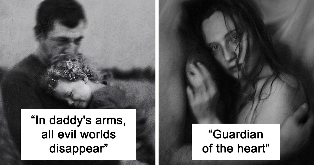
Portrait photography has a funny way of exposing the photographer right along with the subject. You think you’re documenting someone else’s face, and then suddenly your own obsessions show up in the frame: your love of soft window light, your weakness for dramatic shadows, your suspiciously emotional relationship with overcast skies, and your tendency to say, “Just one more shot,” at least 47 times. This collection of 30 portraits moved between two visual moods I love most: pleasant and open, then dark and cinematic. Some frames feel like a slow Sunday morning with coffee and clean linen curtains. Others look like they know where the bodies are buried. That range is exactly what made the project exciting.
What ties the portraits together is not one location, one lens, or one editing trick. It is intention. In bright, welcoming portraits, I leaned into soft light, gentle expressions, breathing room in the composition, and warmer color. In darker portraits, I used contrast, negative space, tighter crops, deeper shadows, and a more deliberate sense of tension. The result was a set of images that didn’t just show faces; they suggested stories. That is the real fun of portraiture. A portrait can be flattering, but it should also be revealing. It should make the viewer pause for half a second longer than expected and think, “There’s something going on here.”
Why This Portrait Series Works
The phrase pleasant to dark portraits sounds simple, but the visual shift is more nuanced than turning brightness up or down. Pleasant portraits are not boring, and dark portraits are not automatically gloomy. The strongest images in both categories rely on the same foundation: connection, control of light, and composition that supports emotion instead of fighting it.
Across these 30 portraits, I treated mood like a sliding scale rather than an on-off switch. A pleasant portrait might use soft side light, relaxed posture, and an open frame with breathable background blur. A darker portrait might still feature a calm expression, but the tighter crop, stronger shadow pattern, and cooler grade create an entirely different emotional read. Small changes matter. Turn the face five degrees away from the window, and suddenly the image becomes quieter. Lower the chin a touch, and confidence turns into contemplation. Ask the subject to stop smiling, and the room gets dramatically more honest.
The Pleasant Side: Light, Warmth, and a Bit of Charm
1. Soft light makes people look like themselves on a very good day
For the lighter portraits in the set, I used the kind of light that feels forgiving without becoming flat. Window light, open shade, and late-day sun gave me just enough shape across the face while keeping skin tones natural. This kind of setup works beautifully when you want the portrait to feel friendly, romantic, or quietly confident. It is less “behold this tortured soul” and more “this person probably gives excellent advice and owns at least one plant that is somehow still alive.”
I also gave these images more physical breathing room. Instead of trapping the subject in a tight headshot every time, I allowed hands, clothing texture, and hints of environment to remain in frame. That extra context made the portraits feel lived-in. A pleasant portrait is not only about brightness; it is about ease. It invites the viewer in instead of challenging them at the door.
2. Expression matters more than perfect posing
Some of my favorite lighter portraits happened right after the “official” pose broke. A laugh between directions. A glance away from the camera. A look that said, “Are we done yet?” in the most photogenic way possible. Genuine expression almost always beats stiff perfection. I still guided posture, shoulders, chin angle, and hands, but I tried not to iron the humanity out of the moment.
That balance is crucial in portrait photography. Over-direct, and people look arranged. Under-direct, and they look abandoned. The sweet spot is gentle coaching with enough room for personality to slip through.
3. Color can whisper just as effectively as it can shout
In the more pleasant portraits, I favored warmer tones, creamy highlights, and colors that felt cohesive rather than loud. Beige, rust, soft green, dusty blue, and muted gold gave the images a calm visual rhythm. Wardrobe and background did a surprising amount of emotional heavy lifting. When colors cooperate, the portrait feels polished even before editing begins.
The Darker Side: Contrast, Tension, and Beautiful Trouble
1. Shadows are not the enemy; they are the plot twist
The darker portraits in this series were where I let myself get a little dramatic. Not “cape on a windy cliff” dramatic, although I’m not ruling that out for future projects. I mean visually dramatic: stronger contrast, more shadow retention, tighter lighting control, and compositions that let darkness occupy meaningful space inside the frame.
Instead of filling every shadow, I let parts of the face fall away. A cheek disappeared. One eye became dominant. The jawline turned into structure instead of decoration. These choices made the portraits feel more psychological. When less is revealed, the viewer tends to lean in. Mystery is sticky like that.
2. Dark portraits need intention, not just underexposure
Here is the classic trap: some photographers hear “moody portrait” and simply make everything darker. That is not mood. That is a visibility issue. Dark portrait photography works when the shadows are purposeful and the subject still has a visual anchor. Maybe it is a catchlight in one eye. Maybe it is a bright collar against a black background. Maybe it is a sliver of light along the nose and lips. The image needs structure, or it turns from cinematic to accidental in a hurry.
In several portraits from this collection, I used a single directional source and carefully positioned the subject so the light shaped the face rather than washing over it. The result was a mood that felt tense but controlled. More noir, less “someone forgot to pay the electric bill.”
3. Darker portraits often reveal stronger character
What surprised me most was how many subjects became more themselves when the setup grew moodier. In bright portraits, people sometimes default to “camera face,” which is usually a socially acceptable smile and the posture of someone pretending they have never felt awkward in their lives. But in darker setups, they often settled into something more honest. The lower-key environment gave them permission to be serious, still, and emotionally specific.
That is part of the magic of moody portrait photography. The visual language changes the performance. A portrait does not merely capture a mood; it can create one.
How I Built Variety Across 30 Portraits
Light direction changed everything
The fastest way to transform a portrait was not swapping gear. It was changing the angle of light. Front light softened features and minimized drama. Side light created form. Backlight added atmosphere and separation. Light from slightly above introduced a sculpted, classic quality. Light from the side with minimal fill made the portrait feel more private, more cinematic, sometimes even a little dangerous.
That variety helped the set feel unified without becoming repetitive. Even when the same subject appeared in multiple images, the emotional read changed depending on how the light wrapped, where the shadows landed, and how much negative space I left around them.
Cropping helped control emotional distance
A wider portrait often feels more observational. It gives the subject room to exist in context. A tighter crop can feel more intense, intimate, or invasive. I used that difference strategically. The pleasant portraits tended to breathe more. The darker images often pressed closer, emphasizing eyes, skin texture, and tiny asymmetries that make faces feel real.
There is also something deliciously unsettling about cropping just tight enough that the viewer cannot fully escape the subject’s gaze. It is subtle, but effective.
Backgrounds were chosen for emotion, not decoration
I tried to keep backgrounds useful. A bright wall bouncing soft light supported the airy portraits. A textured dark corner, doorway, or shadowed room helped the moodier ones. I did not want clutter stealing attention from the face, but I also did not want every portrait floating in a vague blur like it had been vacuum-sealed for social media. Environment matters. Even a simple background contributes tone, depth, and narrative suggestion.
What These Portraits Taught Me About People
Portrait photography is often sold as a technical pursuit: lens choice, aperture, focal length, light modifiers, editing workflow. All of that matters. But these 30 portraits reminded me that people are the real variable. Two subjects can stand in the same pool of light and produce completely different images. One fills the frame with energy. Another does it with stillness. One gives you expression in constant motion. Another offers a single perfect look after ten minutes of silence.
That is why I stopped chasing a formula and started paying closer attention. Some people need conversation to relax. Some need quiet. Some need exact direction. Others become brilliant the second you stop fussing with them. The best portraits in this project happened when I adjusted my approach to the person, not when I forced the person into my favorite visual template.
It also made me rethink the idea that a flattering portrait is the ultimate goal. Flattering is nice. We all enjoy looking vaguely expensive and emotionally well-regulated. But memorable is better. Several of my favorite images in the dark half of the series are not traditionally “pretty.” They are stronger than pretty. They feel lived in. They have edges. They suggest history.
Editing the Series Without Killing the Mood
Editing was where the series could have easily gone off the rails. Pleasant portraits can become syrupy if you over-warm the tones and scrub every trace of texture from the skin. Dark portraits can become muddy if you crush the blacks so aggressively that the whole image looks like it was developed in a cave. My approach was to edit with restraint and keep each frame anchored in believable light.
For the brighter portraits, I lifted exposure carefully, protected skin tone, softened transitions, and kept whites clean without blowing out detail. For the darker ones, I deepened shadows while preserving enough separation in the face and clothing. I paid special attention to color temperature. Warmer grades felt welcoming. Cooler grades hinted at distance, melancholy, or tension. Small color shifts had an outsized effect on emotional tone.
I also kept a close eye on consistency. Because the portraits ranged from pleasant to dark, the sequence needed progression rather than chaos. I wanted the collection to feel like one body of work moving through emotional weather, not a folder full of random moods fighting in a parking lot.
Why Viewers Respond to This Kind of Portrait Collection
People connect with contrast. A portrait series that only offers one emotional note can still be beautiful, but a series with range feels more human. That is what these 30 portraits are really about. They move from warmth to mystery, from openness to tension, from charm to gravity. That range mirrors real life. Nobody is one expression, one lighting pattern, or one emotional temperature all the time.
Viewers may not know the technical reason a portrait feels inviting or unsettling, but they feel it. They notice when the light is gentle, when the shadows are persuasive, when the frame breathes, when the pose feels natural, and when the subject seems genuinely present. That is what makes portrait photography memorable. It is not just about seeing a face. It is about sensing a state of mind.
500 More Words From Behind the Lens
Working on this series changed the way I think about the space between photographer and subject. Before I started, I assumed the biggest challenge would be visual variety. After all, 30 portraits can start to blend together if you are not careful. But the real challenge was emotional variety. I did not want every image to look like the same person wearing a different shirt and standing near a different wall. I wanted each portrait to carry its own pulse.
That meant paying attention to tiny things that would normally be easy to dismiss. The pause before someone speaks. The way a person’s shoulders drop when they stop performing. The split second after a forced smile disappears and something truer replaces it. I found that some of the most powerful portraits happened in transition moments, when the subject was moving between expressions rather than holding one. Those in-between frames felt less posed and more discovered.
I also learned how strongly environment influences behavior. In bright spaces, people often became more conversational, playful, and expressive. In darker spaces, they slowed down. Their movements became smaller. Their faces settled. Even people who arrived joking around would become noticeably more introspective once the light narrowed and the set grew quieter. It was as if the room itself gave them permission to reveal a different side of their personality.
There were practical lessons too. I became much more patient about waiting for the right expression instead of machine-gunning the shutter and hoping luck would bail me out. I got better at simplifying the frame, especially when the portrait needed more emotional weight. I stopped trying to “fix” every shadow and started asking whether that shadow was actually doing the storytelling for me. More than once, the answer was yes.
Another unexpected part of the experience was how often the subjects themselves preferred the darker images. I assumed most people would choose the brightest, most traditionally flattering frame. Many did not. They were drawn to the portraits that felt moodier, stranger, and more revealing. They said those images looked more like them on the inside, even when they were less polished on the outside. That was a great reminder that people do not always want perfection from a portrait. Sometimes they want recognition.
If I were to continue this project, I would push the contrast even further, not only visually but emotionally. I would pair gentler portraits with images that feel almost theatrical, then build a sequence that moves like a narrative arc. Because that is what this series gave me in the end: not 30 separate portraits, but 30 pieces of a conversation about how people can appear soft, guarded, luminous, haunted, playful, tired, elegant, and complicated, sometimes within the same ten-minute session. Which, frankly, is rude of human faces, but excellent for art.
Conclusion
30 Portraits I Took That Vary From Pleasant To Dark became more than a visual exercise. It turned into a study in how light, expression, color, composition, and trust can radically change the emotional meaning of a face. The brighter portraits proved that softness can still carry depth. The darker portraits proved that mystery can be more revealing than full disclosure. Somewhere between the two, the collection found its voice. And that is probably the biggest lesson of all: a strong portrait does not just show what someone looks like. It suggests what it feels like to be in the room with them.