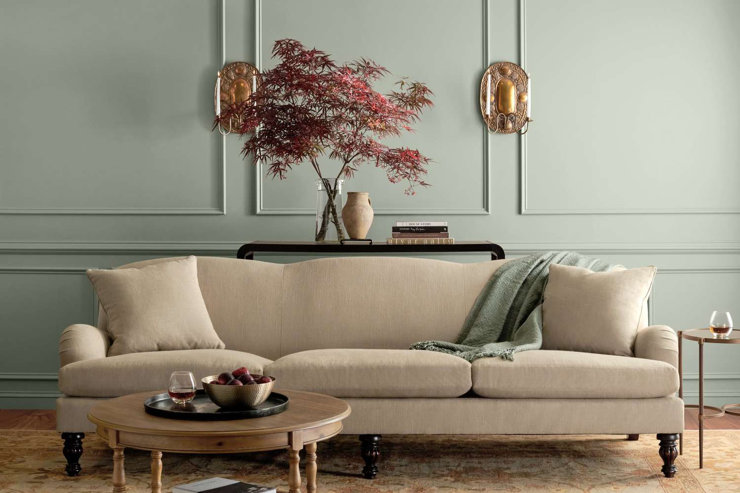
Martha Stewart has never been the type to simply “pick a beige and call it a day.” When she enters a category, whether it is cooking, gardening, entertaining, organizing, or making a linen closet look emotionally stable, she brings a whole philosophy with her. Her latest home design move is a new wall paint collection created with Fine Paints of Europe, and the result is exactly what longtime Martha fans would expect: polished, nature-inspired, practical, elegant, and calm enough to make your living room feel like it has finally started meditating.
The collection, known as the Martha by Martha Stewart Interior Designer Collection, includes 40 curated colors formulated by Fine Paints of Europe. These shades are not loud trend-chasers. They are soothing, timeless paint colors designed to make a home feel layered, personal, and quietly luxurious. Think creamy whites, soft greens, misty blues, grounded grays, warm taupes, muted pinks, and a few deeper tones that add drama without acting like they own the deed to your house.
In a design world currently obsessed with warmth, nature, and comfort, this launch feels perfectly timed. Homeowners are moving away from icy gray walls and high-contrast interiors that look stunning online but feel a little chilly at breakfast. Instead, people want rooms that feel lived-in, restful, and connected to the natural world. Martha’s new paint line answers that craving with colors that are easy to use, easy to layer, and elegant enough to outlast the average social media trend.
What Is Martha Stewart’s New Paint Line?
The new Martha Stewart paint line is a collaboration with Fine Paints of Europe, a premium paint company known for rich color, smooth finishes, and durable coatings. The collection features 40 nature-inspired colors selected with Martha’s signature eye for refined living. It is positioned as a luxury interior designer collection, but its appeal is broader than professional decorators. These shades are made for anyone who has ever stood in front of 300 paint chips and whispered, “Why are there this many whites?”
The palette is intentionally edited. Instead of overwhelming homeowners with thousands of choices, Martha’s collection narrows the decision to a thoughtful group of warm, cool, and neutral hues. That curation is the real magic. It gives people enough range to personalize a space without making paint selection feel like a graduate-level exam in undertones.
Color names in the collection reflect Martha’s world of homes, gardens, cooking, and classic American living. Shades such as Bedford Gray, Fennel Seed, Araucana Blue, Picket Fence, Glass of Milk, Heavy Cream, Conch Shell, Malted, Quaking Aspen, Basketweave Green, and Porch Ceiling Blue sound less like corporate swatches and more like pages from a beautifully photographed lifestyle book. Naturally, the names are doing half the decorating work before the can is even opened.
Why the Collection Feels So Timeless
The most interesting thing about Martha Stewart’s new wall paint collection is that it does not scream “new.” That is a compliment. The best paint colors often feel like they have always belonged somewhere: on a sunlit kitchen wall, behind a favorite reading chair, around a quiet bedroom, or inside a hallway that needs a little dignity after years of backpack traffic and mystery scuffs.
Timeless paint colors usually share a few qualities. They are balanced rather than extreme. They work with natural materials like wood, stone, linen, rattan, brass, ceramic, and marble. They shift gracefully throughout the day as light changes. And they do not need constant explanation. Martha’s palette leans into all of that.
Soft Neutrals That Do More Than “Not Offend Anyone”
Neutral paint has been unfairly blamed for boring rooms, but the real problem is usually the wrong neutral. A flat, grayish beige can make a room feel like a waiting area. A warm, nuanced neutral can make the same room feel tailored, inviting, and expensive in that quiet “someone here owns cloth napkins” way.
Colors such as Picket Fence, Glass of Milk, Heavy Cream, Lamb, Parchment, Rice Paper, Travertine, and Goose Down offer versions of white, cream, and pale neutral that are softer than stark gallery white. These colors are useful in open-plan spaces, small rooms, bedrooms, kitchens, and hallways because they create a backdrop without disappearing completely. They also pair beautifully with wood floors, woven textures, vintage rugs, and black or brass accents.
Greens and Blues That Bring the Outdoors In
Nature-inspired paint colors are having a major moment, but Martha Stewart has been working with garden-influenced palettes for decades. Greens such as Basketweave Green, Tadpole Green, Book Binding Green, Fennel Seed, and Succulent feel especially relevant right now because they offer calm without looking sleepy. They can make a dining room feel collected, a home office feel focused, or a bedroom feel like it has a better sleep schedule than you do.
Blues such as Araucana Blue and Porch Ceiling Blue bring in a fresher, airier mood. These are not harsh coastal blues or overly sweet nursery shades. They are softer, more grown-up colors that can work in bathrooms, kitchens, laundry rooms, mudrooms, and bedrooms. A blue ceiling, pale blue built-ins, or soft blue walls with cream trim can add character without making the room feel themed.
Muted Pinks, Tans, and Earthy Shades for Warmth
Warmth is one of the strongest directions in interior paint right now. Designers and paint brands are leaning into soft browns, creamy tans, dusty pinks, muted clay tones, and grounded yellows. Martha’s collection includes shades like Conch Shell, Powder Puff, Malted, Butter Cream, Buckwheat, Rope, and Georgica Beach that fit beautifully into this movement.
These colors are especially useful for rooms that need emotional warmth but not visual chaos. A muted pink powder room can feel charming and elevated. A soft tan living room can feel grounded and flexible. A buttery yellow kitchen can feel cheerful without turning into a lemon-meringue situation. The point is subtlety, not spectacle.
How Martha’s Paint Line Fits Current Color Trends
The broader paint world is clearly moving toward colors that feel calming, warm, grounded, and livable. Sherwin-Williams chose Universal Khaki as its 2026 Color of the Year, a warm neutral centered on simplicity and longevity. Benjamin Moore’s 2026 Color of the Year, Silhouette, is a deep brown-gray with refined warmth. Behr selected Hidden Gem, a smoky jade green. Valspar’s Warm Eucalyptus continues the green story with a restorative, vintage-inspired tone. Dutch Boy’s Melodious Ivory highlights creamy softness, while Glidden’s Warm Mahogany brings a deep, grounded red into the conversation. Even Pantone’s 2026 Color of the Year, Cloud Dancer, points toward calm, clarity, and quiet reflection.
That trend context makes Martha Stewart’s collection feel less like a celebrity product drop and more like a well-timed design tool. The palette meets homeowners where they are: tired of sterile rooms, wary of short-lived trends, and interested in spaces that feel peaceful without being plain.
The collection also reflects a shift in how people think about paint. Paint is no longer just a background choice made after the sofa arrives. It is a core design element. It can shape mood, define architecture, highlight trim, soften hard surfaces, and connect separate rooms. Martha’s approach treats paint as the foundation of a room, not the final afterthought grabbed in a panic on Saturday morning.
Best Ways to Use Martha Stewart’s Soothing Paint Colors
A curated paint line is only useful if homeowners can imagine how the colors might work in real rooms. The good news is that this collection is versatile. Many of the shades can be used as whole-room colors, trim colors, cabinet colors, ceiling colors, or accent colors.
For Living Rooms: Try Warm Whites, Soft Grays, and Earthy Greens
Living rooms need flexibility. They host movie nights, guests, pets, snacks, naps, and the occasional decorative pillow argument. Warm whites such as Glass of Milk or Heavy Cream can make a living room feel open and calm. Bedford Gray or Sharkey Gray can create a more tailored look, especially with crisp trim and warm wood furniture. For a richer mood, a green such as Fennel Seed or Basketweave Green can add depth while still feeling natural.
If the room has a lot of sunlight, test deeper tones before committing. Natural light can make greens and blues look brighter than expected. In darker rooms, creamy neutrals and warm tans may keep the space from feeling heavy.
For Kitchens: Use Creams, Buttery Yellows, and Soft Blues
Kitchens are excellent places for Martha-approved color because they are already tied to food, garden herbs, pottery, wood, and daily rituals. Cream shades work beautifully on walls or cabinets, especially when paired with marble, butcher block, soapstone, or unlacquered brass. Butter Cream or Malted can bring warmth to a kitchen without making it feel dated. Porch Ceiling Blue can be charming on a ceiling, island, or pantry door.
For a modern farmhouse look that does not feel copied from a catalog, pair a warm neutral wall with green lower cabinets or a blue-gray island. Add woven baskets, ceramic crocks, and simple hardware. Suddenly, the kitchen looks designed instead of merely assembled.
For Bedrooms: Choose Colors That Lower the Volume
A bedroom should not feel like a breaking-news alert. Martha’s softer shades are well suited to bedrooms because they support rest. Lamb, Rice Paper, Goose Down, Conch Shell, and soft blue-green tones can make a bedroom feel gentle and complete. For people who like darker bedrooms, Tarn, Lava Stone, or deeper muted shades can create a cocooning effect.
The trick is to avoid choosing a bedroom color based only on how it looks at noon. Test it in the morning and evening. A color that feels soft in daylight may turn muddy at night, while a muted shade that looks dull on a chip may become gorgeous under warm lamps.
For Bathrooms and Powder Rooms: Go a Little Braver
Bathrooms and powder rooms are ideal spaces to experiment because they are smaller and more contained. Conch Shell can bring softness to a powder room, while Porch Ceiling Blue can make a bathroom feel fresh and classic. A deep green or gray can also look stunning in a powder room with a vintage mirror and warm metal finishes.
If you are nervous about color, a powder room is the perfect place to be mildly dramatic. Guests will think you are bold. You will know you only painted 40 square feet. Everyone wins.
What Makes the Paint Formulations Noteworthy?
The collection is available in multiple Fine Paints of Europe formulations, including options such as ECO Brilliant, ECO Satin, Eurolux Interior Matte, Eurolux Interior Flat, and Eurolux Universal Primer. These choices matter because finish can change the way a color behaves. A matte wall can make a shade look soft and velvety. A satin or brilliant finish can reflect more light and bring attention to trim, doors, cabinets, or architectural details.
High-gloss and brilliant finishes can be stunning, but they are not shy. They highlight details, both good and bad. On a beautifully prepared door or built-in, the effect can be jewel-like. On a dented wall with mystery texture from 1987, it may tell the truth a little too enthusiastically. Proper prep, priming, and surface repair are especially important when using higher-sheen products.
Is Martha Stewart’s Paint Line Worth Considering?
For homeowners who want the cheapest possible paint, this collection may not be the first stop. It sits in the premium category, and that means it makes the most sense when color quality, finish, durability, and design confidence are priorities. But for people who are investing in a room they plan to enjoy for years, the appeal is clear.
The value is not only in the paint itself. It is in the curation. Choosing from 40 thoughtful colors is far easier than choosing from a wall of 4,000 swatches under fluorescent store lighting while slowly losing your grip on reality. Martha’s palette gives homeowners a shortcut to good taste without forcing every home to look the same.
How to Choose the Right Shade From the Collection
Start with the mood you want, not the color name you like most. A shade called Glass of Milk may sound charming, but if your room needs contrast, you may need something deeper. A color like Fennel Seed may sound subtle, but in the right light it can become a defining design statement.
Next, consider the room’s fixed elements. Flooring, countertops, tile, stone, brick, and large furniture pieces all influence how paint reads. Warm wood floors usually pair well with creamy whites, greens, tans, and muted blues. Cool stone or gray tile may need a carefully balanced neutral so the room does not feel disconnected.
Finally, sample before painting. Always. Paint large swatches on different walls or use sample boards you can move around the room. Look at them in natural light, evening light, cloudy weather, and lamp light. Paint is basically a tiny drama queen with excellent lighting sensitivity, so give it a full audition.
Specific Color Pairing Ideas
Picket Fence + Basketweave Green
This pairing feels classic and garden-inspired. Use Picket Fence on walls and Basketweave Green on built-ins, a mudroom bench, or a kitchen island. Add brass hooks, oak floors, and linen shades for a practical but polished look.
Glass of Milk + Bedford Gray
This is a clean, tailored combination for hallways, living rooms, and home offices. Glass of Milk keeps the space bright, while Bedford Gray adds architectural definition on doors, trim, or cabinetry.
Conch Shell + Heavy Cream
For a soft bedroom or powder room, Conch Shell on the walls with Heavy Cream trim can feel warm, flattering, and quietly romantic without turning sugary.
Porch Ceiling Blue + Rice Paper
This combination works beautifully in bathrooms, laundry rooms, sunrooms, or kitchens. Porch Ceiling Blue adds freshness, while Rice Paper keeps the palette grounded and soft.
Why This Launch Matters for Home Design
Martha Stewart’s new paint line arrives at a time when many homeowners want their spaces to feel calmer and more meaningful. The popularity of warm neutrals, botanical greens, creamy whites, smoky blues, and muted earth tones is not accidental. These colors offer a response to visual overload. They make rooms feel slower, softer, and more human.
That is where Martha’s collection shines. It is not trying to invent a shocking new color that will dominate one season and embarrass everyone by the next. It is offering a library of dependable, beautiful shades that can help real homes feel more considered. The colors are soothing, but they are not boring. They are timeless, but they are not stiff. They leave room for personality, art, antiques, plants, books, textiles, and the charming everyday chaos of actual life.
Personal Experience: Living With Soothing, Timeless Paint Colors
The biggest lesson from working with soothing paint colors is that calm does not mean colorless. In fact, some of the most peaceful rooms have plenty of color; they simply use it with restraint. A soft green bedroom can feel calmer than a bright white one. A warm beige living room can feel more welcoming than a cool gray one. A muted blue bathroom can feel fresher than plain white tile with no personality at all.
One practical experience many homeowners share is the surprise of undertones. A paint chip that looks like a gentle cream in the store can turn yellow next to cool gray flooring. A green that looks muted online can become much bolder in a sunny room. A beige can lean pink, green, gray, or gold depending on what surrounds it. This is why a curated collection like Martha Stewart’s is helpful, but sampling is still essential. Good curation narrows the field; testing confirms the winner.
Another experience worth noting is how much trim color affects the final result. Many people choose a wall color carefully and then use whatever white is already on the trim. Sometimes that works. Sometimes the trim looks too stark, too creamy, or oddly unrelated. With a soothing palette, the best results often come from choosing trim intentionally. A warm white trim can make muted colors feel cohesive. A slightly deeper trim can create a modern, color-drenched effect. Painting doors, baseboards, and crown molding in a related shade can make a room feel custom even when the furniture is simple.
Soothing colors also perform especially well in homes with layered textures. A soft neutral wall becomes more interesting when paired with linen curtains, wool rugs, aged wood, baskets, ceramics, and greenery. A muted green wall comes alive beside brass lamps, botanical art, and natural stone. A powdery blue looks more sophisticated with warm wood and creamy upholstery. The color is only one part of the room, but it sets the emotional temperature.
For anyone nervous about using color, the smartest starting point is a small but visible project. Paint a powder room, pantry, interior door, bookcase, or mudroom bench before taking on the main living area. This gives you a chance to live with the shade and understand how it changes throughout the day. It also builds confidence. Once you see how a thoughtful color can transform a small area, painting a larger room feels less like a risk and more like a plan.
The most rewarding part of using timeless paint colors is that they make a home feel settled. They do not beg for attention. They support the life happening around them. That is the quiet brilliance of Martha Stewart’s new paint collection. It gives homeowners colors that feel elegant, natural, and livable, which is exactly what many rooms need. Not every wall has to shout. Some walls can simply exhale.
Conclusion
Martha Stewart’s new paint line with Fine Paints of Europe is more than a pretty palette. It is a thoughtful collection of 40 soothing, timeless colors that reflects where home design is heading: warmer, calmer, more natural, and more personal. With creamy whites, graceful neutrals, garden greens, soft blues, muted pinks, grounded grays, and deeper accents, the collection makes it easier to create rooms that feel polished without feeling precious.
Whether you are repainting a bedroom, refreshing a kitchen, elevating a powder room, or finally giving the hallway a personality beyond “scuffed,” this palette offers elegant options that can grow with your home. Martha Stewart has always understood that good design is not just about how a space looks. It is about how it works, how it feels, and how gracefully it supports everyday life. This paint line captures that idea beautifully, one soothing shade at a time.