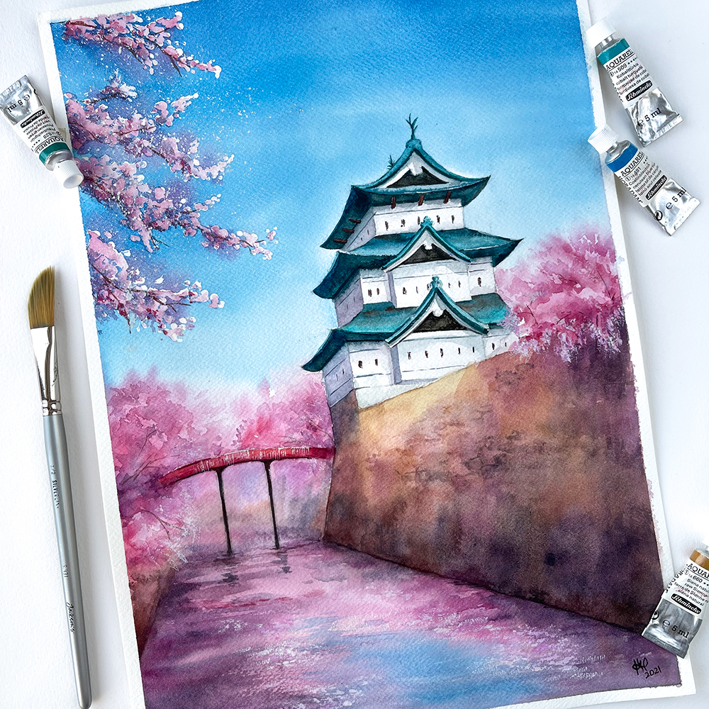
There is something wonderfully unreasonable about painting castles in watercolor. Castles are stubborn, heavy, dramatic things. Watercolor, meanwhile, behaves like a poetic cat: beautiful, moody, and absolutely not interested in obeying your schedule. Put them together and you get a year-long artistic adventure full of misty hills, crooked towers, accidental clouds, and at least one moment where a perfectly respectable castle wall turns into a soggy pancake.
Over the course of one year, I created 12 watercolor landscapes with castlesone for each month. The idea sounded simple at first: paint a castle scene every month, explore different moods and seasons, and improve my watercolor landscape painting skills along the way. In reality, it became a creative marathon. Each painting asked for a different atmosphere: snowy ruins in January, spring castles wrapped in wildflowers, summer fortresses glowing under golden skies, and autumn towers standing proudly like introverts at a party.
This project was not just about painting pretty buildings. It became a study in light, paper, patience, composition, storytelling, and the strange emotional power of old stone walls. A castle in a landscape is never just architecture. It is history, mystery, distance, protection, loneliness, romance, and occasionally a good excuse to paint dramatic clouds.
Why Castles and Watercolor Make Such a Magical Pair
Watercolor is known for its transparent glow, soft edges, and unpredictable movement. That makes it perfect for landscapes, especially scenes where atmosphere matters as much as detail. A castle does not need every brick painted individually to feel convincing. In fact, painting every brick is a quick way to lose your weekend and possibly your will to continue.
What matters is the silhouette, the value structure, and the feeling. A distant tower softened by fog can be more powerful than a hyper-detailed stone wall. A broken archway half-hidden behind trees can say more than a perfectly measured façade. Watercolor allows these scenes to breathe. The white of the paper becomes sunlight. A pale blue wash becomes morning mist. Granulating pigments can suggest stone, cliffs, moss, and old pathways without forcing every texture into place.
Castles also give a landscape a natural focal point. A mountain is majestic, a forest is peaceful, and a river is gracefulbut add a castle on the hill and suddenly the viewer wants a story. Who lives there? Why is it abandoned? Is there a dragon? Probably not, but watercolor is kind enough to leave the question open.
The Year-Long Plan: 12 Paintings, 12 Moods
I planned the project around the rhythm of the year. Instead of painting 12 random castles, I wanted each piece to feel connected to a specific month. This gave the series structure and helped me avoid the dreaded blank-page stare, also known as “artist.exe has stopped working.”
January: The Snow Castle
The first painting featured a lonely castle under a pale winter sky. I used cool blues, muted violets, and soft gray shadows. The biggest challenge was preserving the white paper for snow. In watercolor, white paint is often less magical than simply not painting the paper in the first place. This requires discipline, which is unfortunate because watercolor artists are often tempted to touch everything “just one more time.”
February: The Misty Fortress
February became a study in fog. I painted the castle as a distant shape, allowing the lower walls to dissolve into wet-on-wet washes. The lesson here was restraint. A misty scene works best when details appear and disappear. Too much definition ruins the mystery. Too little definition makes the castle look like a confused potato. Balance is everything.
March: The Hilltop Castle After Rain
For March, I focused on fresh greens, reflective puddles, and a damp sky. I used layered washes to build the hillside and added dry brush texture for stone and grass. The castle sat on a ridge, slightly off-center, with a winding path leading toward it. That path became the invitation into the painting.
April: The Spring Castle Garden
April needed flowers. Not polite flowers, eitherfull watercolor chaos flowers. I used loose brush marks, pinks, yellows, and fresh greens to suggest a garden below pale castle walls. The key was not over-describing the blossoms. In watercolor landscapes, suggestion often feels more natural than precision. A few lively marks can become a garden if the surrounding shapes support the illusion.
May: The Castle by the Lake
May was all about reflection. A castle beside water is irresistible, but reflections are tricky because they should look related to the object without becoming a perfect mirror copy. I softened the reflected towers with horizontal brushstrokes and let the pigment drift slightly. The result felt calm and dreamy, like the castle had just woken up from a nap.
June: The Golden Evening Castle
June gave me the chance to paint warm light. I placed the castle against a glowing sunset and used transparent yellow and orange washes before adding cooler shadows. The trick was keeping the light clean. Muddy color is the sworn enemy of glowing watercolor. Once the sky dried, I deepened the castle silhouette and let the warm background do most of the storytelling.
July: The Cliffside Castle
July was dramatic: a castle perched above the sea, cliffs dropping below, waves moving in broken lines. Rough paper helped create natural texture for rocks. I used dry brush for cliff edges and wet washes for the distant ocean. This painting reminded me that paper choice matters. Cold press paper is a friendly middle ground, while rough paper practically begs you to paint rocks, bark, and crumbling stone.
August: The Sunlit Ruins
In August, I painted ruins instead of a complete castle. Broken walls, open arches, and grasses growing through stone created a different mood. Ruins are excellent subjects because imperfection is built into the architecture. If a line wobbles, congratulations: it is ancient now. I used warm earth colors and granulating pigments to make the stones feel aged and weathered.
September: The Castle in the Forest
September brought deep greens, tall trees, and a castle partly hidden behind branches. This was a composition challenge because trees can easily swallow the focal point. I kept the castle lighter than the surrounding woods and used sharper edges near the main tower. The forest became a frame rather than a bully.
October: The Autumn Castle Road
October was my favorite. I painted a road curving through orange and red trees toward a stone castle under a moody sky. Autumn colors are joyful, but they can become loud quickly. I balanced the warm leaves with cool blue-gray shadows and a muted castle façade. The road created movement, guiding the eye through the scene like a polite tour guide wearing muddy boots.
November: The Storm Castle
November demanded drama. I painted heavy clouds, wind-bent trees, and a dark castle standing against a break of light. Wet-on-wet technique helped create stormy skies with soft transitions. I lifted a few lighter areas with a clean damp brush to suggest moving clouds. The castle itself needed strong value contrast, otherwise it disappeared into the weather like it had unpaid emotional bills.
December: The Candlelit Winter Castle
The final painting combined snow, twilight, and warm window lights. Tiny glowing windows can make a castle feel alive. I preserved small light shapes and painted cool shadows around them. December’s piece felt like the closing chapter of a book: quiet, reflective, and slightly magical.
Techniques That Held the Series Together
Although each painting had its own mood, a few watercolor techniques appeared again and again. These methods helped the series feel consistent while still allowing each landscape to have a different personality.
Light Pencil Sketches
Castles require structure. I started each piece with a light pencil sketch to place the horizon, towers, rooflines, and major landscape shapes. The sketch was not a prison. It was more like a helpful map drawn by someone who may or may not be good at directions. Watercolor needs room to move, so I kept the lines simple.
Large Washes First
I usually began with the sky, distant hills, or broad ground washes. Painting large shapes first helped establish atmosphere before details took over. This approach also prevented the castle from looking pasted onto the scene. When the background and foreground share color relationships, the whole landscape feels more believable.
Layering and Glazing
Watercolor rewards patience. Thin layers allowed me to build depth gradually, especially in stone walls, forests, and skies. Glazing helped create shadow without killing the light. The key was letting each layer dry before adding the next, which is easy in theory and extremely difficult when you are emotionally attached to finishing the tower immediately.
Dry Brush for Stone Texture
Dry brush became my best friend for castle walls and rocky cliffs. By dragging a brush with limited water across textured paper, I could suggest rough stone without painting every crack. This technique gave the architecture age and character. It also made me look more patient than I actually am.
Reserved Whites and Masking
For snow, window lights, sparkling water, and highlights, preserving white areas was essential. Sometimes I painted carefully around them; other times I used masking fluid. Masking fluid is useful, but it must be handled with care. Apply it to dry paper, let it dry completely, and remove it gently. Otherwise, the paper may protest, and paper protests are expensive.
Composition Lessons From Painting Castles
A castle can easily dominate a painting, so composition became one of the most important parts of the project. I learned to think of the castle not as “the thing in the middle,” but as part of a larger visual journey.
Leading lines were especially helpful. Roads, rivers, fences, cliff edges, and shadows could all guide the viewer toward the castle. Atmospheric perspective also made a big difference. Distant castles needed softer edges and lighter values, while closer structures could handle sharper contrast. Trees, rocks, and clouds worked as framing devices, helping the castle feel naturally placed rather than dropped into the painting like a tourist attraction from the sky.
I also learned that scale matters. A tiny castle on a huge mountain feels epic and lonely. A large castle filling the page feels powerful and immediate. A castle half-hidden by trees feels secretive. The same subject can tell completely different stories depending on placement and proportion.
Color Palettes That Worked Best
For castle watercolor art, I found that limited palettes often worked better than crowded ones. Too many colors can make a landscape feel noisy. A few well-chosen pigments create harmony and make the painting easier to control.
For stone, I often mixed ultramarine blue with burnt sienna to create natural grays. For mossy walls and forest shadows, I used muted greens mixed from blues, yellows, and earth tones. For sunset scenes, warm transparent washes created glow, while cooler violets and blues shaped the shadows. Granulating pigments were especially useful for old masonry, mountains, and rough paths because they created natural texture as they dried.
The biggest color lesson was this: shadows are not just black with a bad attitude. Castle shadows can be blue, violet, greenish gray, warm brown, or a mixture of surrounding colors. More interesting shadows made the paintings feel richer and less flat.
What Creating 12 Castle Landscapes Taught Me
This year-long watercolor project taught me more than any single painting could have. Repetition turned out to be powerful. By returning to the same broad theme month after month, I could compare decisions, notice patterns, and improve gradually. The castles became less intimidating. The landscapes became more intentional. Even the mistakes became useful, although I still reserve the right to glare at them.
I learned that watercolor is not about total control. It is about cooperation. You guide the water, but you also let it do what it does best. Some blooms become clouds. Some backruns become mist. Some uneven textures become ancient stone. The medium has a way of turning small accidents into atmosphere, provided you do not panic and scrub everything into sadness.
I also learned that a series creates momentum. On months when inspiration felt low, the project itself kept me moving. I did not need to reinvent my entire artistic identity every time I sat down. I only needed to ask, “What kind of castle belongs to this month?” That question was enough.
Extra Experience: The Real Life Behind the 12 Castle Paintings
Behind every finished watercolor landscape, there was a less glamorous scene: jars of cloudy water, paint-stained paper towels, reference photos scattered everywhere, and me whispering encouraging lies to a damp sheet of paper. Creating 12 watercolor landscapes with castles within a year sounded elegant when I first wrote it in my sketchbook. In practice, it became a routine built on small choices, small failures, and small victories that eventually added up.
One of the biggest experiences was learning how to manage time. A monthly painting sounds generous until life starts behaving like life. Some months gave me quiet weekends and perfect painting weather. Other months gave me deadlines, interruptions, and the artistic energy of a boiled noodle. I had to break each painting into stages: idea gathering, thumbnail sketches, value study, pencil drawing, first wash, middle layers, details, and final adjustments. When I treated the painting as one giant task, it felt overwhelming. When I treated it as a series of small steps, it became manageable.
I also became more comfortable using imperfect references. At first, I wanted every castle to be based on a perfect image: dramatic lighting, clear structure, beautiful surroundings, and no awkward modern parking lot in front. Reality, as usual, declined to cooperate. So I learned to combine references. A tower from one image, a hillside from another, a sky from memory, and a path invented entirely because the composition needed it. This helped me move from copying images to designing paintings.
Another important experience was understanding when to stop. Watercolor has a dangerous phase where the painting looks almost finished, and your brain says, “Just add a few more details.” This is usually the moment before disaster puts on tap shoes. I ruined a few sections by overworking shadows, darkening windows too much, or adding unnecessary texture to stone walls. Slowly, I learned to pause, step away, and look at the painting from across the room. If it read clearly from a distance, it probably did not need 47 more tiny bricks.
The emotional side surprised me most. Painting one castle is a project. Painting 12 castles becomes a diary. The January piece held the nervousness of starting. The June sunset felt more confident. The October road felt joyful and nostalgic. The December castle felt quiet, almost like a farewell. When I looked at the full series together, I could see not only landscapes, but also a year of attention. Each painting carried the weather of the month and the mood of the person holding the brush.
Finally, this project taught me that consistency does not have to be boring. Painting the same theme repeatedly did not limit creativity; it sharpened it. Because the subject stayed familiar, I could experiment more with light, season, composition, and color. Castles became a framework, not a cage. By the end of the year, I was no longer asking whether I could paint a watercolor castle landscape. I was asking what kind of story the next castle wanted to tell.
Conclusion
Creating 12 watercolor landscapes with castles within a year was part art challenge, part technical study, and part personal adventure. It gave me a reason to practice watercolor techniques consistently while exploring atmosphere, architecture, and seasonal storytelling. Some paintings came together gracefully. Others fought like tiny medieval kingdoms. But every piece taught me something useful.
If you want to start a similar project, choose a theme that excites you enough to revisit it many times. It could be castles, cottages, lighthouses, city streets, gardens, mountains, or imaginary places that exist only in your sketchbook. Keep the structure simple, let each painting have its own mood, and do not wait until you feel completely ready. Watercolor rewards practice, curiosity, and a willingness to laugh when the sky accidentally becomes more dramatic than planned.
A year can pass quickly. But 12 paintings give it shape. They turn months into colors, seasons into washes, and ordinary practice into a collection. And if there happens to be a castle on a hill at the end of it, all the better.
Note: This article is written as an original, publish-ready HTML draft based on real watercolor practices, landscape-painting principles, museum-level context about watercolor as a medium, and commonly used artist techniques such as washes, glazing, dry brush, masking, and paper-texture control.