Describing color to a blind person can sound impossible at first, like trying to explain Wi-Fi to a houseplant. Color is visual, right? So how can you explain something visual to someone who may not experience sight in the same way? The answer is: carefully, respectfully, and with more imagination than a paint aisle at a home improvement store.
The key is not to pretend that touch, sound, taste, or emotion are exactly the same as color. They are not. Red is not literally hot sauce. Blue is not literally a slow piano note. Green is not literally the smell of grass after rain. But these comparisons can build useful bridges. A good color description helps someone understand what a color means, where it appears, how people use it, and what feelings or associations it often carries.
Blindness is also not one single experience. Some blind people have no light perception, some can detect brightness, some have low vision, and some remember colors from earlier in life. So the best way to describe a color to a blind person is not to deliver a grand speech like you are narrating a nature documentary. It is to ask, listen, and adapt.
Below are eight practical steps for explaining color in a way that is thoughtful, useful, and human.
Step 1: Ask About Their Experience With Vision First
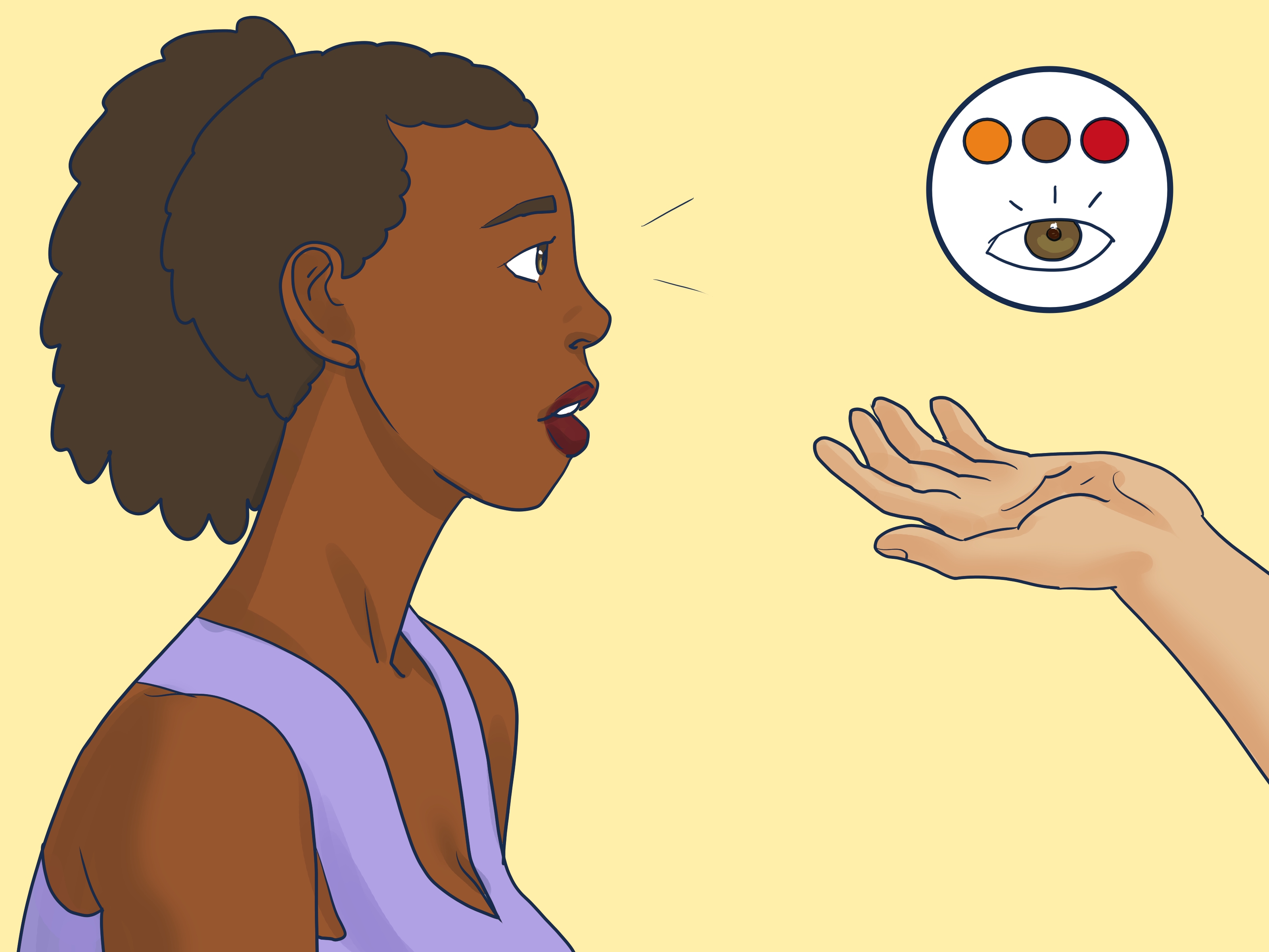
Before describing any color, start with the person, not the paint sample. A person who was born blind may understand color as a concept learned through language, objects, clothing labels, cultural meanings, and everyday references. A person who lost vision later in life may remember red, blue, yellow, green, and other colors vividly. Another person may have some light perception or partial vision, which means brightness, contrast, or large color blocks may still matter.
A respectful question can make the whole conversation easier: “Do color descriptions help you, and what kind do you prefer?” That small question does two important things. First, it avoids assuming that all blind people want the same type of explanation. Second, it gives the person control over the conversation. That is always better than launching into, “Red is the sound of a trumpet riding a motorcycle,” which may be poetic, but also a little exhausting before breakfast.
Step 2: Explain Color as Information, Not Just Appearance
Color is not only decoration. It carries information. It can signal danger, freshness, temperature, identity, emotion, brand recognition, and social meaning. A red stop sign tells drivers to stop. A green traffic light means go. A white wedding dress may suggest tradition in some cultures. A black suit may suggest formality. A yellow banana usually means ripeness, while a green banana is still waiting for its big moment.
This approach is especially helpful because color often matters in practical life. Clothing, food, safety signs, maps, school materials, web pages, sports uniforms, and product labels all use color to communicate. When describing a color, include what it does in the world. Instead of saying, “The shirt is blue,” you might say, “The shirt is navy blue, a dark formal blue often used for business clothes, uniforms, and classic outfits.”
That description is more useful than simply naming the color. It gives context, tone, and social meaning. It answers the invisible question: “Why should I care that this thing is blue?”
Step 3: Use Familiar Objects as Anchors
One of the easiest ways to describe colors is to connect them to familiar objects. The trick is to choose objects the person already knows through touch, smell, taste, sound, memory, or daily life.
Examples of Object-Based Color Descriptions
Red is the color often associated with ripe strawberries, tomatoes, fire trucks, stop signs, roses, and warning labels. It is bold, attention-grabbing, and hard for sighted people to ignore.
Blue is commonly linked with the sky, deep water, denim jeans, police uniforms, and calm branding. It can feel steady, cool, spacious, or dependable.
Green is tied to grass, leaves, herbs, forests, limes, recycling symbols, and the idea of growth. It often suggests nature, freshness, health, or permission.
Yellow is connected with sunlight, lemons, school buses, caution signs, corn, and bright flowers. It often feels energetic, cheerful, noticeable, and loud in a visual way.
Black is used for night, formal clothing, ink, charcoal, elegance, mystery, and seriousness. For many sighted people, black can feel strong, quiet, or dramatic.
White is associated with snow, paper, clouds, milk, clean towels, wedding dresses, and medical spaces. It can suggest cleanliness, simplicity, brightness, or emptiness.
These examples do not make someone “see” the color, and that should not be the goal. The goal is to build a useful network of meaning. Color becomes less like a mystery box and more like a category of information.
Step 4: Connect Colors to Touch, Temperature, Taste, and Sound
Sensory comparisons are popular because they give color an emotional and physical shape. They work best when you make it clear that you are using analogy, not giving a perfect translation.
Red can be compared to warmth, heat, chili, a fast drumbeat, or the feeling of urgency. Blue can be compared to cool water, a steady breeze, a soft low note, or a calm morning. Yellow can be compared to sunlight on your skin, citrus, a bright bell, or the first burst of energy after someone opens the curtains too early. Green can be compared to the smell of fresh herbs, soft moss, spring air, or the feeling of walking through a garden.
The best comparisons are specific. “Blue is calm” is fine. “A pale blue is like the cool quiet of early morning before the day starts making demands” is better. It gives texture, mood, and scale.
Still, avoid acting as if every blind person has “super senses.” That old myth has been polished and reused more times than a superhero origin story. Many blind people develop strong listening, touch, memory, or navigation skills through practice, tools, and experience, not magic. Use sensory comparisons because they are helpful, not because you assume blindness automatically turns someone into a human radar system.
Step 5: Describe Emotional and Cultural Associations
Colors carry emotional and cultural meanings. These meanings are not universal, but they are useful. Red may suggest love, anger, danger, passion, or celebration. Blue may suggest sadness, trust, calm, or professionalism. Green may suggest nature, money, health, jealousy, or environmental awareness. Purple may suggest royalty, creativity, spirituality, or luxury. Pink may suggest softness, sweetness, romance, or playfulness, depending on context.
The phrase “depending on context” is doing serious heavy lifting here. A red rose and a red alarm light do not communicate the same thing. One says romance. The other says, “Please stop ignoring this building.” A black dress at a formal event may feel elegant, while black smoke from a machine is a very different message. Color meaning changes with culture, situation, object, and personal preference.
When describing color, add the emotional layer only after the practical layer. For example: “This room is painted a soft green. Green is often associated with plants and nature, so people may find it relaxing and fresh. This shade is not neon or loud; it is muted and gentle.” Now the listener gets the object, the association, and the intensity.
Step 6: Explain Shade, Brightness, and Contrast
Color is not just red, blue, green, and yellow. There are shades, tones, brightness levels, and contrast. This is where many descriptions become more useful.
A bright red is energetic and attention-grabbing. A dark red, like burgundy, may feel richer, heavier, and more formal. A pale pink may feel light, soft, or delicate. A hot pink may feel playful, loud, and impossible to ignore, like a flamingo that has discovered social media.
Brightness can be explained through light and weight. Pale colors often feel lighter, softer, airier, or more delicate. Dark colors often feel heavier, stronger, more serious, or more formal. Contrast describes how much one color stands out from another. Black text on a white background has strong contrast. Light gray text on a white background has weak contrast and may be hard to read for many people with low vision.
This matters beyond conversation. In accessible design, color should not be the only way to communicate important information. A form should not show an error only by turning a field red; it should also include text like “Email address required.” A chart should not rely only on different colored lines; it should use labels, patterns, or clear descriptions. Color is powerful, but it should not be forced to carry the entire backpack.
Step 7: Use Real-Life Situations to Make Color Meaningful
A color description becomes stronger when it is attached to a real situation. If you are describing clothing, mention style, formality, contrast, and how the colors work together. If you are describing food, mention ripeness, freshness, flavor expectations, or presentation. If you are describing art, describe composition, mood, materials, shapes, and the role color plays in the piece.
Clothing Example
“The jacket is dark brown, close to the color people associate with coffee beans or leather. It feels casual but polished. The shirt underneath is cream, which is a warm off-white, so the outfit has a soft contrast rather than a sharp black-and-white contrast.”
Food Example
“The apple is a deep red with a little yellow near the top. For sighted people, that usually makes it look ripe, sweet, and crisp. It looks more like a snack you want to eat than a science experiment you forgot in the fridge.”
Art Example
“The painting uses mostly dark blue and gray, which gives it a quiet, rainy feeling. A small yellow circle near the top feels like a distant light. The yellow stands out because the rest of the painting is cool and shadowy.”
Notice how these examples do not depend on color alone. They include texture, mood, contrast, social meaning, and practical interpretation.
Step 8: Invite Questions and Let the Description Become a Conversation
The best color descriptions are not lectures. They are conversations. After explaining a color, ask what part was useful or confusing. Some people may want emotional comparisons. Others may prefer practical facts. Some may enjoy poetic descriptions. Others may want you to stop comparing everything to fruit because apparently the world is not a smoothie bar.
Try saying, “Would you like a practical description, a sensory comparison, or the social meaning of the color?” This gives options. It also shows that you are not trying to “fix” the person’s understanding. You are sharing information in a format that works for them.
Good communication is flexible. If one comparison does not land, try another. If the person says color is not important to them, respect that. If they enjoy detailed descriptions, give them detail. The goal is not to perform creativity; it is to connect.
Common Mistakes to Avoid When Describing Color
Do Not Say “You Wouldn’t Understand”
This is dismissive and usually untrue. A person may not experience color visually, but that does not mean they cannot understand its social, practical, emotional, or symbolic meaning.
Do Not Over-Romanticize Blindness
Avoid turning the conversation into a dramatic speech about darkness, courage, or “seeing with the heart.” Kindness is great. A movie trailer voice is not required.
Do Not Assume Black Means Blindness
People with total blindness do not necessarily “see black.” Some have no visual sensation at all. Others have light perception, shadows, flashes, or different visual experiences. Blindness varies widely.
Do Not Rely Only on Abstract Feelings
Saying “purple feels royal” may be interesting, but it is incomplete. Add examples: grapes, lavender, amethyst, formal branding, velvet, or creative design. Specifics make the description useful.
How to Describe Popular Colors Clearly
How to Describe Red
Red is one of the most intense colors in everyday life. It is used for stop signs, emergency signals, hearts, roses, ripe tomatoes, blood, fire trucks, and bold sports uniforms. It often communicates urgency, passion, heat, warning, or strong emotion. A bright red feels loud and energetic. A dark red feels deeper, richer, and more serious.
How to Describe Blue
Blue is linked with the sky, oceans, denim, uniforms, coolness, calm, and trust. Light blue often feels airy, soft, and peaceful. Navy blue feels formal, steady, and professional. Blue is commonly used by companies and institutions that want to seem reliable, which explains why the business world owns enough navy clothing to cover a small continent.
How to Describe Green
Green is strongly connected with plants, grass, leaves, forests, herbs, money, growth, and environmental ideas. Light green may feel fresh or young. Dark green may feel earthy, calm, and stable. Neon green is bright and attention-grabbing, often used when something wants to shout without using actual sound.
How to Describe Yellow
Yellow is associated with sunlight, lemons, caution signs, school buses, corn, and bright flowers. It often feels warm, cheerful, sharp, or energetic. Pale yellow can be soft and friendly. Bright yellow can feel loud, playful, and impossible to miss.
How to Describe Purple
Purple is often linked with royalty, imagination, mystery, spirituality, grapes, lavender, and luxury. A deep purple can feel dramatic and elegant. A light purple, like lavender, can feel gentle, floral, and calm.
How to Describe Orange
Orange sits between red and yellow in common color language. It is connected with oranges, pumpkins, autumn leaves, traffic cones, sunsets, warmth, and excitement. It can feel friendly, bright, playful, and energetic.
Experiences Related to Describing Color to a Blind Person
One of the most meaningful experiences in describing color is realizing that the conversation is rarely just about color. It is about translation. Sighted people use visual shortcuts all day without noticing them. “Grab the blue folder.” “Click the green button.” “The ripe ones are red.” “The cute house is the yellow one.” For someone who cannot access those visual cues directly, a better description changes color from a private visual detail into shared information.
Imagine helping a friend choose an outfit for a school event, job interview, family photo, or first day at a new place. Saying “This shirt is green” may not be enough. A richer description would be: “This is a dark forest green. It is not flashy. It feels calm and mature, and it pairs well with black pants. The contrast is noticeable but not dramatic.” That gives the person style information, emotional tone, and social context. It respects their ability to make the final choice.
Another common experience happens with food. Color often signals ripeness, freshness, or cooking stage. A sighted person may quickly notice that bananas are yellow, avocados are dark green, or toast has moved from golden brown to “call the fire department.” Describing those color cues can be genuinely useful. Instead of saying, “This peach looks good,” say, “It has a warm orange-yellow color with some red near the skin, which usually makes it look ripe and sweet.” Now color becomes practical information, not just decoration.
Describing art creates a different challenge. Art descriptions should not only list colors like an inventory report: “There is blue, red, and white. Congratulations, we have completed art.” A better description explains how the colors interact. For example: “The background is mostly deep blue, which gives the painting a quiet nighttime mood. A bright red shape cuts through the center, making it feel active and tense.” That kind of explanation lets the listener understand contrast, focus, and feeling.
People also learn quickly that color descriptions are personal. One blind person may love poetic comparisons, while another may prefer direct practical details. One person may ask what color their clothes are because they care about style. Another may not care at all and would rather know whether the shirt is clean, comfortable, and free of mystery wrinkles. Both responses are valid.
The most important experience is learning humility. You are not handing someone “the true meaning of blue” on a silver tray. You are offering one possible bridge between senses, language, culture, and daily life. Sometimes the bridge is elegant. Sometimes it wobbles. Sometimes you compare yellow to a trumpet and immediately regret everything. That is okay. The point is to keep the conversation respectful, useful, and open.
Conclusion
Learning how to describe a color to a blind person is less about finding a perfect translation and more about building meaningful connections. Start by asking about the person’s experience with vision. Explain color as useful information. Use familiar objects, sensory comparisons, emotional associations, and real-life examples. Describe shade, brightness, contrast, and context. Most importantly, let the person guide what kind of description helps them most.
Color may be visual, but its meaning is social, practical, emotional, and cultural. When you describe it with care, you are not just explaining red, blue, green, or yellow. You are making a piece of the world easier to share.
Note
This article uses respectful, practical language and recognizes that blind and low-vision experiences vary widely. When speaking with a real person, always ask what kind of description they prefer.