For years, kitchens were told to behave. They were supposed to be white, sensible, quiet, and vaguely afraid of personality. Then along came Paris Hilton, looked at the rulebook, probably set it down next to a rhinestone spatula, and proved that pink can absolutely work in the hardest-working room in the house.
And honestly? She has a point.
The kitchen is no longer just a place for meal prep. It is a backdrop for morning coffee, family catch-ups, midnight snacks, dinner parties, recipe videos, and the occasional dramatic stare into the fridge. In other words, it is a living space now. So why should it look like a sterile appliance showroom?
Hilton’s pink kitchen makes a bigger argument than “cute celebrity home trend.” It shows that pink can be playful without being childish, glamorous without being exhausting, and bold without turning a room into visual bubblegum. When used well, pink behaves less like a gimmick and more like a warm neutral with great lighting.
That is the real lesson here. Paris Hilton did not just make a kitchen pink. She made a case for color, character, and a little more fun in a room that has been stuck in beige witness protection for far too long.
Paris Hilton’s Kitchen Glow-Up Was More Than a Celebrity Flex
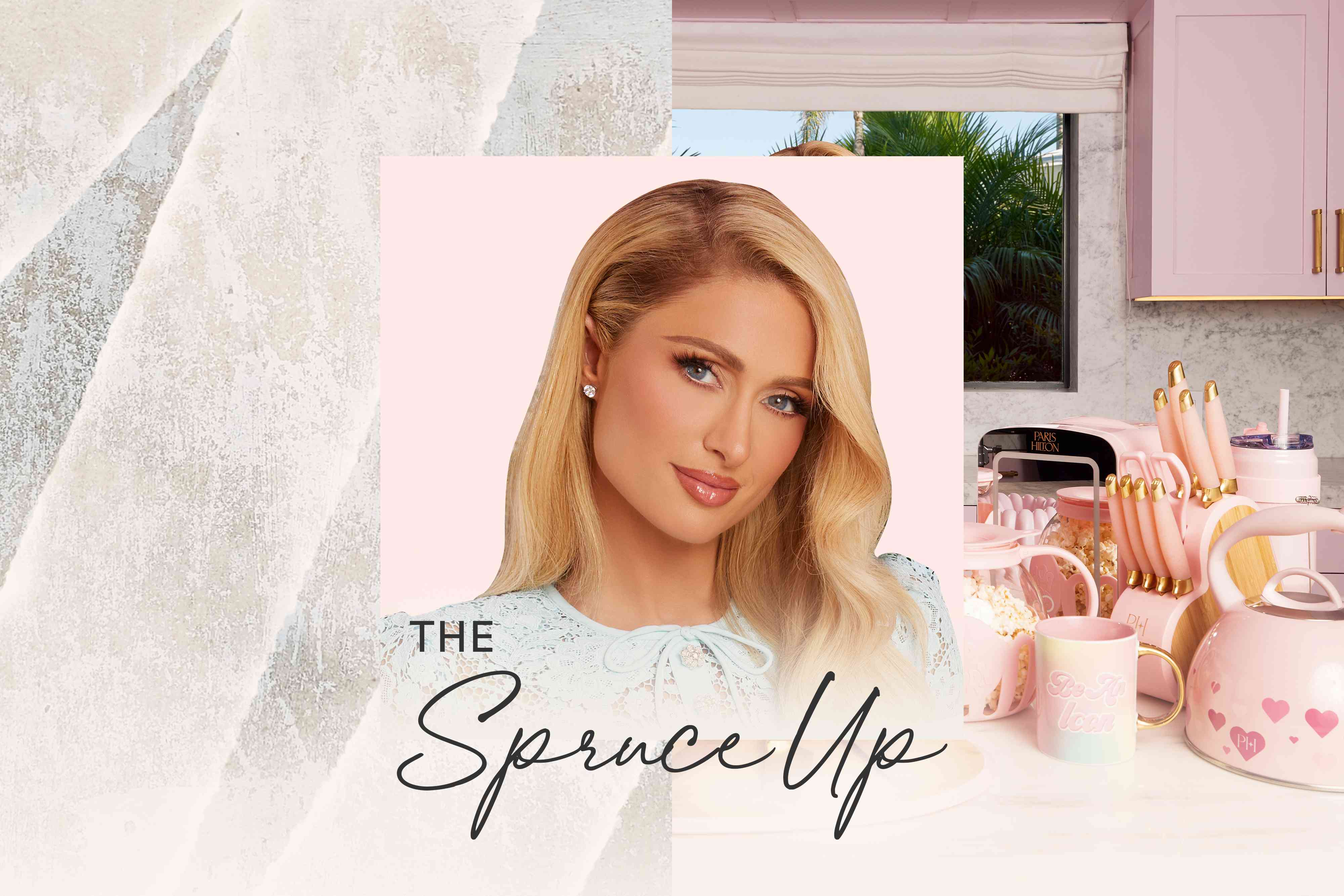
What makes Hilton’s kitchen makeover so interesting is that it was not random. It was brand-aware, yes, but it was also surprisingly design-savvy. Her once black-and-white cooking space was reimagined with pink cabinets, a matching pink ceiling, and gold details that pushed the look from novelty to polished glam. That mix matters.
Pink on its own can feel sweet. Gold on its own can feel flashy. But together, they create a balance that says, “Yes, I have taste, and yes, my whisk might be prettier than yours.” Add in a kitchen setting, and suddenly the color reads less like a teen bedroom and more like a confident design statement.
There is also something smart about the way Hilton ties the kitchen to her larger home-and-kitchen aesthetic. Her cookware and accessories lean heavily into pink, heart motifs, and metallic accents, so the kitchen becomes an extension of a recognizable point of view. Whether you are a fan of her style or not, consistency is one of the oldest tricks in good interior design.
A space feels memorable when it knows what it is. Hilton’s kitchen knows exactly what it is: glamorous, cheeky, camera-ready, and unexpectedly cohesive.
Why Pink Actually Works in a Kitchen
Pink succeeds in kitchens for the same reason it succeeds in fashion: it is far more versatile than people assume. Most critics hear “pink kitchen” and picture a room that looks like a frosted cupcake exploded. Real pink design is much more nuanced.
1. Pink can function like a neutral
Soft pinks with beige, clay, peach, or taupe undertones read almost like warmed-up neutrals. They do not scream for attention the way neon shades do. Instead, they soften hard lines, warm up stone surfaces, and add a gentle glow that cool grays and flat whites often cannot deliver.
This is especially useful in kitchens, where you already have a lot of hard materials: tile, quartz, metal, glass, and cabinetry. Pink takes the edge off those surfaces and makes the room feel less clinical.
2. Pink brings warmth without heaviness
Dark kitchens can feel dramatic, but they can also feel moody in the “I need better task lighting and emotional support” sense. Pink adds warmth and charm without making the room feel visually heavy. A blush cabinet, dusty rose backsplash, or muted coral ceiling can brighten the room while still keeping it cozy.
3. Pink works across design styles
One of the best arguments for pink is range. It can lean retro, cottagey, Art Deco, modern glam, contemporary, or even farmhouse, depending on what you pair it with. That flexibility is what makes Hilton’s kitchen interesting beyond celebrity gossip. Pink is not trapped in one aesthetic lane.
4. Pink makes a functional room feel personal
People gather in kitchens. They hover near islands, lean on counters, open cabinets, steal bites, and pretend they are helping. A kitchen with personality invites that kind of energy. Pink brings friendliness, softness, and visual warmth to a space that can otherwise feel overly technical.
The Secret Is Not Just Pink. It Is What Pink Is Paired With.
No color succeeds alone, and Hilton’s kitchen proves that pink becomes much more sophisticated when it has the right supporting cast.
Gold and brass
This is the obvious star pairing. Gold hardware, faucets, and light fixtures pull pink toward glamor and away from cartoon territory. The combination feels polished, feminine, and intentional. It is the design version of wearing a silk robe while ordering takeout: extra, but in a very controlled way.
White and cream
White counters, backsplashes, or walls give pink room to breathe. They prevent the kitchen from feeling oversaturated and help reflect light, which is especially important if you are using pink on cabinetry or ceilings.
Wood tones
Natural wood grounds pink beautifully. Butcher block counters, oak shelves, walnut stools, or even a simple wood floor add texture and keep the space from floating off into fantasy-land. If your goal is “charming and chic,” wood is your best friend.
Green, navy, and warm gray
Pink loves contrast. Olive green gives it earthiness. Navy gives it crispness. Warm gray gives it maturity. These pairings are useful if you want pink in your kitchen but also want the room to feel layered and grown-up.
How to Use Pink in a Real Kitchen Without Regretting It
Not everyone wants the full Paris Hilton treatment, and that is fair. Some people want a pink kitchen. Others want a kitchen that merely flirts with pink on weekends. The good news is that there are multiple levels of commitment.
Go bold with cabinetry
If you want maximum impact, paint lower cabinets a muted pink and keep uppers lighter or open. This creates color without closing in the room. For a bigger statement, color-drench the cabinets and ceiling, then use brass and white to keep the whole thing elegant.
Try a pink island
A pink island is one of the smartest entry points. It turns color into a focal point rather than a full-room commitment. Think of it as one fabulous shoe in an otherwise practical outfit.
Use pink in the backsplash
Tile is ideal for people who want color with structure. Pink zellige, blush subway tile, or pale rose checkerboard can bring personality without dominating every surface. A backsplash lets the color sparkle while the rest of the kitchen stays grounded.
Add pink through appliances and decor
This is the low-risk, high-fun option. A pink stand mixer, toaster, kettle, cookware set, dish towels, or bar stools can completely shift the energy of a kitchen. Hilton’s own product line leans into exactly this idea: everyday function, but with more attitude.
Look up, not just around
One of the smartest things about Hilton’s kitchen is the pink ceiling. Most people forget the ceiling exists until they need to change a lightbulb. A tinted ceiling adds surprise, wraps the room in color, and feels custom in a way that plain white rarely does.
Pink Is Having a Design Moment, But This Is Bigger Than a Trend
Yes, colorful kitchens are having a moment. Designers are moving away from all-white sameness and leaning toward cabinetry, finishes, and accents with more personality. But pink’s appeal runs deeper than trend cycles.
Pink works because it solves a modern design problem: how to make a high-function room feel warm, individual, and memorable. It adds softness to a space full of corners and equipment. It works with vintage influences, current retro revivals, and modern hardware. It can read playful or refined depending on the shade. That is not trend fluff. That is versatility.
And while Hilton’s version is unapologetically glamorous, the same principle applies to ordinary homes. A soft ballet pink can calm a busy family kitchen. A dusty rose island can make a builder-grade space feel custom. A blush backsplash can add life to a monochrome room. Even a few pink accessories can shift the mood from purely practical to genuinely inviting.
That is why this conversation matters. Paris Hilton may be the headline, but the broader takeaway belongs to everyone with a kitchen and a little courage.
Specific Design Lessons You Can Borrow From the Paris Hilton Aesthetic
You do not need a celebrity zip code or a camera crew to steal the best parts of Hilton’s approach. Here is what translates well into normal life.
Make it intentional
A pink kitchen works when it feels chosen, not accidental. Pick a palette and repeat it with discipline. If your pink shows up on cabinets, echo it in art, dishes, upholstery, or one other finish. Consistency makes bold color feel sophisticated.
Mix sparkle with restraint
Hilton’s style loves shine, but the room still needs balance. If you use metallic accents, keep the surrounding materials clean. If you use glossy tile, let counters stay simple. Glam works best when it has one foot on the ground.
Prioritize function
This may sound unglamorous, but pretty kitchens still need to cook. The best colorful kitchens are not props. They are usable, wipeable, and laid out for real life. If you are borrowing inspiration from Hilton, keep the mood, but make sure your choices still support how you actually live.
Let one feature do the talking
If you are nervous, choose one hero moment: the island, the ceiling, the tile, or the stools. A single memorable feature often has more impact than trying to make every inch of the room scream for attention.
Experiences: What Living With a Pink Kitchen Can Actually Feel Like
Here is the part that mood boards rarely explain: color changes behavior. Not literally, of course. A pink kitchen will not make you suddenly bake a perfect soufflé or organize your spice drawer by emotional depth. But it does change the way a room feels when you enter it, use it, and share it with other people.
A pink kitchen tends to feel welcoming right away. It has softness before you even touch a cabinet pull. On sleepy mornings, that matters. Harsh white kitchens can feel efficient, but they do not always feel kind. A blush-toned room catches daylight in a gentler way. It makes coffee rituals feel a little slower, breakfast a little less rushed, and even dish duty slightly less offensive. Not magical, exactly. Just more human.
There is also a surprising confidence that comes from a room with a distinct point of view. When guests walk into a pink kitchen, they react. They smile. They ask questions. They remember it. That is part of the pleasure. A kitchen should not have to apologize for being interesting. Hilton’s whole brand has always understood that style can be social. A memorable room becomes part of the experience of gathering.
For people who cook often, pink can also soften the seriousness that sometimes creeps into “dream kitchen” culture. Not every kitchen has to look like it belongs to a luxury developer with a passion for gray stone. A pink kitchen reminds you that beauty can be fun. A beautiful sauté pan can sit on the stove. A heart-shaped knob can exist in the same room as a sharp chef’s knife. Function and whimsy are not enemies.
And then there is the emotional side. Many homeowners end up choosing safe finishes because they are worried about resale, opinions, trends, or judgment. Living with color can feel like reclaiming a little territory. It says the home is not only an asset. It is also a place to enjoy. A pink kitchen, especially one done with warm tones and balanced materials, often feels less like a risk and more like a daily act of permission.
That is probably why the idea sticks. It is not only about pink. It is about allowing a practical room to carry mood, identity, and delight. Paris Hilton just happens to express that lesson at full volume.
Conclusion
Paris Hilton’s pink kitchen is flashy enough to grab attention, but its real achievement is more practical than it first appears. It shows that pink can be stylish, livable, flattering, and surprisingly flexible in a kitchen. The color can warm up hard finishes, personalize everyday routines, and work beautifully with gold, white, wood, green, navy, and soft neutrals.
Most importantly, it reminds homeowners that kitchens do not have to be boring to be functional. They can be expressive. They can be glamorous. They can have a little personality and still handle breakfast, homework, hosting, and the occasional late-night fridge stare.
So no, pink is not too precious for the kitchen. In the right shade, with the right pairings, it is confident, inviting, and weirdly timeless. Paris Hilton did not just prove that pink works in any space. She proved that even the most practical room in the house deserves a little main-character energy.