Some kitchens announce themselves with an eight-foot marble island, a chandelier the size of a small satellite, and enough polished brass to signal aircraft. This kitchen in Topanga Canyon takes the opposite approach. It is quiet, compact, warm, and wonderfully unbothered by the idea that a kitchen needs to look expensive to look exceptional.
Set inside a 1927 former hunting lodge in California’s Topanga Canyon, the kitchen was part of a larger renovation by artist and General Store cofounder Serena Mitnik-Miller and designer and builder Mason St. Peter. The couple approached the old cabin by preserving its character while stripping away awkward additions and opening the interior to more light, better circulation, and a stronger connection with the landscape.
The result is an excellent example of what might be called California minimalism without the preciousness. There are plywood cabinets instead of elaborate millwork, open shelves instead of rows of uppers, compact appliances instead of oversized stainless-steel monuments, and useful objects that double as decoration. It is stylish, certainly, but it looks ready for somebody to make pancakes.
A 1920s Cabin That Was Worth Saving
The house was not purchased as a pristine architectural trophy. Mitnik-Miller and St. Peter had spent years exploring possibilities around Topanga before finding a fixer-upper whose original character had largely survived. What they found was an old hunting lodge with good bones, uneven floors, accumulated additions, and plenty of renovation work waiting patiently for someone brave enough to begin.
Rather than forcing a completely new personality onto the cabin, the renovation simplified what was already there. The foundation was reinforced, floors were leveled, unnecessary walls came down, and formerly fragmented rooms became a more coherent open-plan interior. St. Peter has described indoor-outdoor living as a central element of the project, aided by an open plan, pocket doors, decks, clerestory windows, and skylights.
That philosophy matters when looking at the kitchen. It was not designed as a standalone showpiece. It is one part of a larger sequence connecting cooking, dining, living, entertaining, and the wooded landscape outside.
The U-Shaped Kitchen Makes a Small Footprint Work Hard
The original kitchen had limited cabinetry and a refrigerator that consumed an unfortunate amount of the available floor area. The remodeled version uses custom cabinetry arranged in a U shape, creating more counter surface while clearly defining the cooking zone inside the larger open living space.
It is a smart layout for a compact kitchen. U-shaped configurations place work surfaces on three sides, allowing a relatively small footprint to provide significant storage and prep space. Houzz, Better Homes & Gardens, This Old House, and the National Kitchen & Bath Association have all highlighted versions of this basic principle: efficient layouts rely less on sheer square footage than on thoughtful placement of work zones, storage, appliances, and circulation.
Most importantly, the Topanga kitchen stops before becoming visually heavy. There is no giant island planted in the middle simply because kitchen-design law apparently requires one. The open side of the U maintains a natural transition toward the dining and living areas.
Why the Layout Feels Bigger Than It Is
Several choices help prevent the U shape from turning into a cabinetry fortress. Upper cabinets are kept to a minimum. White walls reflect daylight. Natural wood introduces warmth without adding visual clutter. Open shelving keeps frequently used objects accessible while preserving breathing room above the counter.
Design guidance for compact U-shaped kitchens frequently recommends reducing the visual weight of upper cabinetry, particularly where an open shelf can provide enough storage without closing in the room.
Plywood Cabinets Are the Star Without Acting Like It
The cabinets were custom-built from marine-grade Douglas fir plywood. That sounds more like something you might specify for a boat workshop than a fashionable Los Angeles kitchen, which is precisely part of the charm.
Plywood brings visible grain, subtle variation, and an unfussy honesty to the space. Rather than disguising the construction material beneath ornate doors or layers of decorative finish, the design lets the wood be wood.
This approach has become familiar in contemporary cabins, studios, and minimalist interiors because plywood can simultaneously feel modern and rustic. Dwell has documented numerous interiors in which exposed plywood is used to bring warmth and texture to highly simplified architectural spaces.
In the Topanga kitchen, that quality is especially useful because nearly everything surrounding the cabinetry is pale. The Douglas fir keeps the room from drifting into sterile all-white territory.
The Refrigerator Practically Disappears
One of the smartest moves is also one of the least glamorous: the refrigerator and freezer were moved below the counter and concealed behind wood fronts.
For a small kitchen, that decision has enormous visual consequences. A conventional full-height refrigerator can dominate a room before you have even decided what is for dinner. Here, the cold storage becomes part of the cabinetry rather than a metallic interruption in the middle of the design.
Integrated and concealed appliances are frequently used in contemporary kitchens for exactly this reason. They reduce visual fragmentation and allow cabinetry, architecture, and materials to establish the room’s character.
There is a practical trade-off, naturally. An under-counter refrigerator will not satisfy a household that buys groceries as though preparing for a six-month siege. But for the right lifestyle, compact appliances can free valuable wall space and make a modest kitchen feel dramatically calmer.
Open Shelves Turn Everyday Objects Into the Decor
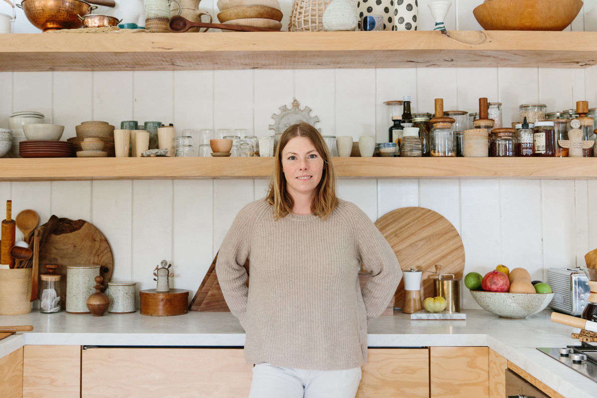
Instead of filling the walls with closed upper cabinets, the kitchen uses substantial wooden shelves holding ceramics, bowls, cups, vessels, and kitchen tools.
The effect could easily have become chaotic. It does not, largely because the objects share a vocabulary of natural materials and subdued tones. Wood, ceramics, metal, and glass mingle without fighting for attention. The kitchen feels collected rather than styled within an inch of its life.
Open shelving works especially well when it stores things people genuinely use. Apartment Therapy’s interviews with homeowners who live with open shelves found that accessibility and visual openness are major advantages, while dust and the need to control clutter are predictable disadvantages. Architectural Digest likewise demonstrates how wooden shelves can support a relaxed, rustic kitchen aesthetic by putting useful pottery, boards, jars, and cookware on view.
The Secret Is Editing
The lesson is not to remove every cabinet door in your house and display three years of promotional coffee mugs.
The Topanga approach works because the collection is edited. Shapes vary, but colors remain relatively quiet. Beautiful pieces are mixed with practical ones. There is room between objects. Negative space gets to participate in the design too.
For anyone recreating the look, start with the dishes and tools used most often. Add wooden bowls, handmade ceramics, clear glasses, cutting boards, and one or two objects with patina. Hide plastic food containers, appliance manuals, batteries, and the mysterious drawer of takeout menus somewhere with a door.
White Paint Lets the Original Cabin Texture Survive
The walls retain the spirit of the cabin’s old wood paneling while gaining a much cleaner appearance. According to Mitnik-Miller, the house had accumulated several variations of wood paneling over roughly eight decades. Rather than remove every trace, the couple painted it white, using Behr’s Swiss Coffee.
This is one of the renovation’s strongest ideas because it respects imperfection without romanticizing every old surface. The paneling keeps its lines and texture, but the pale finish visually unifies generations of material.
White also amplifies the natural light that became so central to the renovated house. Elsewhere in coverage of the property, both its skylights and clerestory windows are repeatedly emphasized, as is the broader goal of connecting the interior with Topanga’s landscape.
Brass, Copper, Wood, and Ceramics Provide the Color
There is no need for a dramatic accent wall when the useful things in the kitchen already bring enough variation.
A brass faucet, brass hooks, copper colanders, wooden boards, pottery, woven bags, and natural utensils create a palette drawn from materials instead of trendy paint chips. The colors are essentially variations of earth, clay, wood, metal, and warm white.
That material-driven approach is a recurring theme in California-inspired rustic interiors. Natural and reclaimed finishes create warmth precisely because they are allowed to show grain, patina, and minor imperfections rather than pretending to have arrived yesterday in protective plastic. Architectural Digest has similarly highlighted the ability of pottery, wood, and aged materials to make rustic kitchens feel genuinely lived in.
The Kitchen Belongs to the Rest of the House
Perhaps the most important design decision is something that is technically not inside the kitchen at all: the relationship between rooms.
Removing unnecessary interior walls allowed cooking, dining, and living areas to function together. GQ’s tour of the house noted that the family frequently entertained by using the entire property rather than treating individual rooms as isolated destinations. Guests could move through the living room, dining area, kitchen, deck, and outdoor spaces as one continuous environment.
That effortless flow fits the couple’s broader philosophy of home. Their book Abode: Thoughtful Living with Less focuses on revealing good architectural bones, increasing light, using natural materials, and filling rooms with objects that have meaning rather than merely filling rooms.
Mitnik-Miller’s later interviews about life in Topanga similarly emphasize space, family, art, nature, and a slower rhythm of living.
How to Borrow the Topanga Canyon Kitchen Style
You do not need a 1927 hunting cabin, resident coyotes, or a winding canyon road to borrow the kitchen’s best ideas.
1. Choose Natural Cabinet Materials
Consider plywood, Douglas fir, white oak, maple, or another wood with visible grain. Flat, uncomplicated fronts will generally capture the spirit better than elaborate raised-panel cabinetry.
2. Use Open Shelves Selectively
Replace one bank of upper cabinets rather than every cabinet in the kitchen. Open shelves are most successful when they hold frequently used, attractive objects and are balanced by concealed storage elsewhere.
3. Hide the Visual Noise
Panel-ready or under-counter appliances can help, but the bigger idea is simple: allow necessary equipment to disappear whenever possible. The toaster does not need a starring role.
4. Keep the Palette Restrained
Warm whites, natural wood, clay, copper, brass, and muted textiles provide plenty of variation. Instead of adding decorative color everywhere, let food, plants, books, flowers, and handmade objects supply changing accents.
5. Preserve Something Imperfect
If your house has old paneling, beams, irregular floors, vintage hardware, or another usable feature with character, consider working with it before replacing it. A renovation becomes more memorable when the finished room still knows which house it belongs to.
6. Design for Your Actual Routine
The best lesson from this kitchen is not plywood or open shelving. It is restraint. Every major choice responds to the way the space needs to function. Contemporary kitchen-planning guidance continues to emphasize lifestyle, storage, circulation, entertaining, and connections with adjoining living or outdoor areas rather than design trends alone.
Why This Kitchen Still Feels Relevant
Design trends move quickly. One year everybody wants waterfall countertops; the next year the Internet declares that waterfall countertops have personally ruined civilization.
The Topanga Canyon kitchen avoids much of that cycle because its identity comes from principles rather than fashionable accessories. Good light. Useful storage. Honest materials. Compact appliances. Objects with history. A layout that supports everyday life.
Even as kitchen trends change, those fundamentals age slowly.
The kitchen also demonstrates that minimalism does not have to mean emptiness. There are plenty of things here. Bowls are stacked. Colanders hang around. Ceramics occupy shelves. Bags and brushes live on hooks. The difference is that the objects feel purposeful.
Living With a Low-Key Topanga-Inspired Kitchen: The Real Experience
Photos make this style look effortless, but living with a kitchen like this would quickly reveal which parts are merely photogenic and which genuinely improve daily life. Fortunately, many of its strongest features belong in the second category.
The first noticeable difference would probably be how little physical distance separates common tasks. In a compact U-shaped kitchen, ingredients can move from refrigerator to counter to sink to range without requiring a cross-country expedition around a giant island. Preparing breakfast or making coffee becomes pleasantly direct.
Then there is the experience of open shelving. When plates and cups are visible, grabbing them is wonderfully easy. You stop opening three cabinet doors looking for the bowl that has apparently entered witness protection. Putting dishes away is faster too.
But open shelves also expose your habits. If you own 41 mismatched mugs, nine novelty cocktail glasses, and a plastic dinosaur cup nobody remembers purchasing, you will suddenly become very aware of them. The style rewards regular editing. That can be surprisingly pleasant: you keep the pieces you actually enjoy and let the kitchen evolve as objects are used, broken, replaced, collected, or inherited.
Natural wood cabinetry creates another experience that glossy modern kitchens often try to eliminate: aging. Wood changes. Brass darkens. Copper develops patina. Cutting boards collect marks. Handmade ceramics vary slightly from one another. Instead of regarding every sign of use as damage, a Topanga-inspired kitchen tends to look better once life begins happening in it.
That does not mean abandoning maintenance. Plywood needs appropriate finishing and protection, especially near water. Open shelves need cleaning. A pale painted floor or wall will reveal dirt. Under-counter refrigeration requires realistic grocery planning. Charming design does not repeal the laws of housekeeping.
The payoff is atmosphere. A room dominated by natural materials and warm neutral colors feels different throughout the day. Morning sunlight catches the grain of the cabinets. Ceramics cast little shadows across shelves. At night, metal fixtures and wooden surfaces feel warmer under softer lighting. The space changes rather than remaining uniformly slick.
Entertaining would also feel less formal. Because the Topanga kitchen is part of an open living and dining environment, the cook remains connected to everyone else. Guests can move between table, counter, living room, and outdoors instead of forming the traditional kitchen doorway traffic jam while repeatedly asking, “Can I help?”
There is also a psychological benefit to the room’s modest scale. Nothing suggests that you need restaurant-grade equipment to deserve cooking dinner. A compact four-burner range is enough. A few beautiful bowls are enough. A sensible amount of counter space is enough.
For homeowners trying to recreate the experience, that may be the most valuable lesson. Begin with what you do every day. Where do you make coffee? Which pan gets used constantly? Where do groceries land? Which dishes deserve to stay within reach? Which objects make you happy enough to see every morning?
Answer those questions before choosing the backsplash.
That is how a low-key kitchen becomes more than a look. It becomes a room that belongs specifically to the people using it.
Conclusion: California Cool Without Trying Too Hard
The Topanga Canyon kitchen created by Serena Mitnik-Miller and Mason St. Peter succeeds because it resists overdesign. Its custom Douglas fir plywood cabinets provide warmth and function. The U-shaped layout makes efficient use of a compact footprint. Open shelves display ceramics and everyday tools. Hidden refrigeration removes visual bulk. White-painted paneling preserves the cabin’s texture while reflecting abundant natural light.
Individually, none of these ideas is revolutionary. Together, they produce something much harder to achieve: a kitchen with personality that does not appear desperate to demonstrate its personality.
That may explain why the room remains inspiring years after it was completed. It belongs to a particular place and a particular house, but its principles travel well. Keep good bones. Remove what gets in the way. Use honest materials. Hide unnecessary visual clutter. Leave room for the objects and people that make a home feel alive.
And perhaps do not buy an enormous refrigerator simply because your kitchen contractor shows you a photograph of one.
Note: This article is an original editorial synthesis of documented information about the Topanga Canyon project together with established kitchen-layout, storage, material, and interior-design principles. It is written independently for publication and does not reproduce the wording of the original features.