Some homes politely welcome you inside. Others grab your imagination by the hand, sweep it across a painted floor, and introduce it to a chandelier with more personality than most reality-show contestants. This is the magic behind House Crashing: A Dreamy & Decadent Delighta home tour filled with graceful architecture, playful color, collected artwork, practical storage, and just enough eccentricity to keep everything interesting.
The house at the heart of this design story belonged to Richmond gallery owner Katie Ukrop. Originally toured by Young House Love after appearing in Domino, it featured stenciled floors, tall ceilings, marble fireplaces, pocket doors, built-in bookcases, pale blue and pink rooms, sculptural lighting, modern furniture, antiques, and plenty of white pottery. It was elegant without behaving as though children, pets, or spaghetti sauce had been banned from the premises.
That combinationdecadence without stiffnessis what makes the home worth revisiting. It offers a practical lesson for anyone who wants dreamy home decor that feels layered, personal, and genuinely livable.
What “House Crashing” Really Means
House crashing is less dramatic than the name suggests. No doors are kicked down, no lamps are interrogated, and nobody hides behind the drapes with a camera. It is simply an enthusiastic home tour that studies how real people decorate, organize, renovate, and personalize their spaces.
The best house tours do more than display expensive furniture. They reveal decisions. Why does one room feel calm while another feels lively? Why does a collection look charming instead of cluttered? How can a formal dining room still feel comfortable enough for Tuesday-night takeout?
In this home, the answer is balance. Historic architectural details provide grandeur, while pale colors soften the mood. Symmetry creates order, while unusual art and bright accents prevent predictability. Built-in storage handles the practical business of family life, leaving the visible surfaces free to look poetic rather than panicked.
Let the Architecture Do Some of the Decorating
One reason this dreamy house feels so luxurious is that its original architecture already knows how to make an entrance. High ceilings, bay windows, marble fireplaces, pocket doors, substantial trim, and built-in shelves give the rooms depth before a single pillow enters the conversation.
Highlight Existing Character
When a house has beautiful bones, decorating should support them rather than compete with them. A fireplace can become the visual anchor for a sitting room. Pocket doors can frame the transition between two spaces. A bay window can create a natural reading area or conversation nook without requiring a construction crew and a three-season television series.
Even modest homes usually contain something worth emphasizing: an old door, an arched opening, an unusually deep windowsill, original molding, exposed brick, or a pleasantly awkward corner. Painting, lighting, and furniture placement can transform that feature into a deliberate focal point.
Create Balance Around Imperfect Features
Symmetry played an important role in the Richmond home. In one room, a desk positioned beneath a window visually balanced a radiator beneath the opposite window. The two objects were not identical, but they occupied similar visual territory.
This is useful in older houses, where radiators, vents, uneven windows, and mysterious wall bumps often dictate the layout. Instead of treating those elements as defects, balance them with furniture, artwork, lamps, or plants of comparable scale. The room will feel composed even when its architecture is not perfectly mirrored.
Painted Floors Turn Wear Into a Design Opportunity
The home’s painted and stenciled wood floors are among its most memorable features. Rather than disguising worn boards beneath wall-to-wall carpet, the floors were sanded and transformed with colors, borders, and decorative patterns that shifted from room to room.
Paint can give structurally sound but cosmetically tired flooring a second life. Stencils, checkerboards, borders, diamonds, and freehand motifs can create the appearance of tile or an oversized rug. Preparation remains essential: the surface should be cleaned, repaired, sanded when appropriate, primed, and coated with paint intended for floors. A protective finish may also be needed in high-traffic areas.
Use Pattern to Guide the Eye
A painted border can visually define a dining area or make a narrow room feel more intentional. A small repeating stencil adds texture without consuming floor space. A large-scale diamond or checkerboard pattern can make an entryway feel grander.
The secret is allowing the floor to lead while the furniture plays backup. When the pattern is detailed, choose upholstery and rugs with quieter surfaces. Otherwise, every object starts shouting, and the room develops the decorative energy of an overbooked group chat.
Accept a Little Patina
Painted floors will eventually show wear, especially in busy family spaces. That is not necessarily a failure. Gentle scuffs can add character and reinforce the feeling that the room is lived in. Perfection is rarely as inviting as evidence that humans have crossed the floor carrying groceries, children, dogs, and the occasional dangerously full coffee mug.
A Soft Color Palette Can Still Have Personality
Dreamy interior design does not require coating every surface in cream. This house relied on misty blues, delicate pinks, warm whites, muted neutrals, and controlled bursts of stronger color. The result was restful but never sleepy.
Soft blue floors connected visually with blue artwork and painted furniture. Pale pink walls and linen cushions introduced warmth. Glossy white cabinetry, pottery, and trim reflected light and kept the pastel palette from becoming overly sugary.
Build the Palette in Layers
Begin with one dominant soft color, one supporting neutral, and one stronger accent. For example, use powder blue on a floor or wall, creamy white on trim and cabinetry, and hot pink on a pillow, ottoman, or framed print.
The accent color should appear in small, deliberate moments. It is the exclamation point, not the entire paragraph. Repeating it two or three times across a room creates rhythm without making the space feel themed.
Use Texture to Keep Pastels Sophisticated
Linen, lacquer, marble, aged wood, glazed ceramic, velvet, metal, and woven materials prevent soft colors from becoming visually flat. A pale room needs tactile contrast just as much as a dark room does. Combine matte walls with glossy furniture, smooth ceramics with distressed wood, and airy curtains with a substantial vintage table.
Mix Antique and Modern Furniture Without Starting a Time War
One of the most successful ideas in this eclectic interior is the combination of ornate antiques and streamlined modern pieces. An old chandelier can hover above a sleek lacquered dining table. A traditional fireplace can share a room with a contemporary Parsons desk. Historic bookcases can display modern artwork.
Designers often recommend finding a connecting threadsuch as color, proportion, material, or shaperather than trying to match every finish. A limited palette can unite objects from different eras, while one or two antique pieces per room can add history without making the space feel like a museum gift shop.
Choose Contrast Intentionally
If everything is old, the room may feel frozen in time. If everything is brand-new, it may resemble a showroom waiting for price tags. Contrast creates tension and makes individual pieces more noticeable.
Try pairing a vintage mirror with a simple console, an antique dining table with modern chairs, or a clean-lined sofa with an ornate side table. Keep scale in mind. A delicate antique chair may disappear beside an enormous sectional, while an oversized armoire could bully every other item in a small room.
Mix High, Low, Custom, and Secondhand
A memorable home does not need to come from one store or price category. Save for pieces that define the room, such as a sofa, dining table, original artwork, or statement light. Fill in with affordable shelves, simple desks, flea-market finds, inherited furniture, and objects collected gradually.
This approach creates a home that looks evolved rather than ordered in one afternoon by someone holding a catalog and a credit card with heroic limits.
Statement Lighting Is Functional Sculpture
The chandeliers and sculptural fixtures in this dreamy house do more than illuminate tabletops. They act as artwork, drawing attention upward and taking advantage of the tall ceilings.
A statement fixture can establish a room’s character before the rest of the furnishings are noticed. However, scale and placement matter. The fixture should relate to the room’s dimensions, furniture arrangement, and ceiling height. Layering it with table lamps, sconces, and task lighting creates a warmer, more flexible atmosphere than relying on one glaring overhead source.
In a dining room, center the fixture over the table rather than automatically centering it in the room. In a living space, use lighting to define conversation areas. In a kitchen, do not be afraid of decorative lighting simply because the room contains a refrigerator. Practical spaces deserve jewelry too.
Art and Collections Make the House Personal
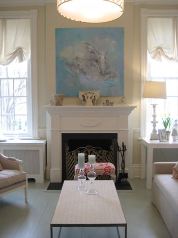
Because the homeowner was connected to an art gallery, the house naturally included original paintings, framed prints, humorous objects, and sculptural pieces. A blue bird painting echoed the floor color, while playful kitchen artwork made a functional backsplash feel personal.
Artwork is most effective when it participates in the room rather than hovering above it like a nervous guest. Pull colors from a painting into pillows, furniture, or accessories. Use a large piece above a fireplace, or arrange smaller works in a grid or an organic gallery wall.
Turn Repetition Into Cohesion
White pottery appeared throughout the kitchen and sunroom. Grouping similar objects by color or material allowed numerous pieces to read as one collection instead of unrelated clutter. Varying their heights and shapes introduced interest while the shared white finish maintained calm. Designers frequently use odd-numbered groupings, repeated colors, and mixed heights to create balanced displays.
The same method works with glass bottles, baskets, candlesticks, framed sketches, vintage cameras, or children’s ceramics. A collection does not need to be valuable. It needs a clear relationship and enough breathing room to be seen.
Decadent Design Still Needs Storage
The kitchen proves that beauty becomes far easier to maintain when clutter has somewhere to go. White cabinets, shelves, drawers, and generous built-ins provide storage for the less poetic realities of family life: food containers, school papers, cleaning supplies, dog treats, and approximately fourteen lids that fit no known container.
Closed storage conceals visual noise, while open shelving displays the objects that contribute to the design. The most successful rooms usually contain both. Built-ins are especially valuable because they can follow the architecture and use otherwise neglected wall space.
Before buying decorative baskets, examine what needs to be stored and where it is used. Place everyday items within easy reach. Reserve upper shelves for seasonal pieces or decorative collections. Good organization should reduce effort, not create a complicated filing system for teaspoons.
Bring Nature Into the Sunroom
The home’s sunroom continues the blue-and-white palette while introducing fresh green through plants. This creates a gentle transition between the interior and the outdoors. Sunrooms naturally benefit from abundant daylight and can function as reading rooms, breakfast areas, studios, play spaces, or quiet retreats.
Choose plants according to the actual light exposure rather than how attractive they looked under the garden center’s expertly flattering lamps. Add comfortable seating, washable fabrics, and a table for drinks or books. Painted furniture can repeat colors used elsewhere in the home, helping the sunroom feel connected rather than added as an afterthought.
How to Recreate the Dreamy and Decadent Look
Start With One Memorable Surface
Choose a floor, wall, ceiling, or backsplash as the room’s primary statement. Paint a border, use patterned wallpaper, introduce a deep color, or create a gallery arrangement. Do not attempt all four during the same weekend unless chaos is your preferred decorating style.
Repeat Colors Across Rooms
Use two or three related colors throughout the house. The exact shades can vary, but repetition creates flow. A blue floor might connect with blue artwork in the next room and a blue-painted cabinet farther down the hall.
Combine Formal and Playful Elements
Pair a marble fireplace with humorous art, a chandelier with simple cabinetry, or elegant linen with a bright floor cushion. These contrasts make refined rooms approachable.
Display What You Actually Love
Meaningful artwork, handmade ceramics, inherited furniture, travel finds, and children’s creations give a home emotional depth. Edit the display, but do not edit away every sign of personality in pursuit of a photographically perfect room.
Plan for Real Life
Use durable paint, washable textiles, hidden storage, sturdy tables, and comfortable seating. A decadent interior should support daily life. It should not require the household to move with the cautious choreography of museum security guards.
A 500-Word House-Crashing Experience: Walking Through a Home With a Point of View
To understand why this style of house crashing remains memorable, imagine experiencing the home as a visitor. The front door opens, and the first surprise is beneath your feet. Instead of ordinary wood boards, the floor carries a painted pattern that immediately signals confidence. This is not a house waiting to be decorated someday. It has already made several decisions, and it would like you to notice them.
The entry feels formal because of its height and architectural detail, yet the colors prevent it from becoming intimidating. Light moves across pale walls and glossy surfaces. The rooms do not demand silence. They encourage curiosity. You begin looking for the next small surprise: a painted border, an unusual light fixture, or a piece of art that refuses to take itself too seriously.
Moving into the living room, the bay window pulls daylight deep into the space. The fireplace establishes a traditional focal point, but the furnishings loosen the formality. Nothing appears to have arrived as a matching suite. An airy table, a soft chair, an antique object, and a modern accessory coexist because their proportions and colors feel related.
The sitting room changes the mood slightly. Built-in shelves and another fireplace create intimacy. Symmetrical furniture placement brings calm, while artwork adds emotion. This is where the house demonstrates that symmetry does not have to be rigid. It can simply give the eyes a place to rest before they wander toward the more eccentric details.
Then comes the dining room, where an ornate chandelier meets a sleek table. The contrast is immediate and delightful. One element carries history; the other brings polish and modernity. Together, they make the room feel collected over time. You can imagine a formal dinner taking place there, but you can also imagine someone opening a pizza box in the middle of the table and nobody calling the decorating police.
The kitchen offers a different kind of pleasure. Its white cabinetry and built-ins create visible order, but framed artwork and grouped pottery keep the space from feeling clinical. The room seems prepared for actual cooking, actual children, and actual mornings when every family member needs the same drawer at once.
Finally, the sunroom releases the visual tension. Blue floors, white storage, distressed furniture, plants, and bright accents create a space that feels halfway between indoors and outdoors. A dog could sleep on a vivid cushion without disrupting the design because the design was never based on perfection. It was based on character.
The lasting experience is not envy over a specific table or chandelier. It is recognition. The house feels distinctive because its owner made choices that reflected her taste, work, family, art, and daily routines. Every room contributes to the same story, yet no room repeats the previous one exactly.
That is the real pleasure of house crashing. It allows us to observe how another person turns architecture into autobiography. We leave with ideas about painted floors and pottery displays, but the deeper lesson is permission: a home can be graceful and funny, historic and modern, organized and imaginative, soft and boldall at the same time.
Conclusion: Decadence Is Better With Personality
House Crashing: A Dreamy & Decadent Delight succeeds because the home is not luxurious in a predictable way. Its appeal comes from thoughtful contrasts: weathered floors transformed with paint, traditional fireplaces paired with contemporary furniture, pale colors energized by hot pink, and practical built-ins styled with art and pottery.
The most useful lesson is that dream-home design does not depend on copying every object. Start with the character already present in your space. Add one bold surface, repeat a restrained color palette, mix old and new pieces, improve storage, and display objects that carry personal meaning. The result may not look identical to a magazine spreadand that is precisely why it will feel like home.