Some interiors whisper. Others hand you a tiny illustrated map, point toward a moon, a shell, a snake, and a suspiciously elegant bee, then ask whether you have ever considered living inside an alchemist’s notebook. That is roughly the experience created by the botanical tiles and wallpaper of British artist Fee Greening.
Greening’s work is not botanical decor in the usual “one leafy stem next to a beige sofa” sense. Her designs feel collected rather than manufactured: part medieval manuscript, part Dorset hedgerow, part curiosity cabinet, and part dream you have after falling asleep in a museum gift shop. Her hand-drawn motifs bring flowers, sea life, insects, suns, moons, and mythical-looking creatures into rooms without making them feel like a theme park for houseplants.
From decorative ceramic tiles to immersive wallpaper, Fee Greening’s collections offer a memorable way to use botanical pattern in kitchens, bathrooms, entryways, bedrooms, and richly layered living spaces. The appeal is not simply that the designs are pretty. It is that they tell a story. Every tile and repeat pattern seems to suggest that the room has secrets, preferably stored in a velvet-lined drawer beside a brass magnifying glass.
Who Is Fee Greening?
Fee Greening is a British illustrator known for her intricate dip-pen-and-ink work. Her visual language draws from medieval illuminated manuscripts, Gothic fairy tales, alchemical diagrams, folklore, antique natural-history illustrations, and the flora and fauna of the English countryside.
She studied at Central Saint Martins and later earned a master’s degree from the Royal College of Art. Over the years, Greening has created work for fashion, cultural, publishing, and lifestyle clients, but her interiors collaborations may be some of the most satisfying expressions of her style. A flat illustration becomes more atmospheric when it wraps a wall, appears behind a sink, or punctuates a fireplace surround.
Her move from London to rural Dorset also seems to have deepened the natural character of her work. The countryside provides more than a leafy backdrop. Shells, wild plants, insects, coastal finds, and old-world symbols appear throughout her designs, giving them a handmade, slightly enchanted personality.
The result is decorative art that avoids the usual botanical clichés. There are no generic palm leaves trying to convince your guest bathroom that it is a Miami resort. Instead, Greening offers something stranger, more poetic, and far more personal.
The Curios Tile Collection: Small Ceramic Stories for the Wall
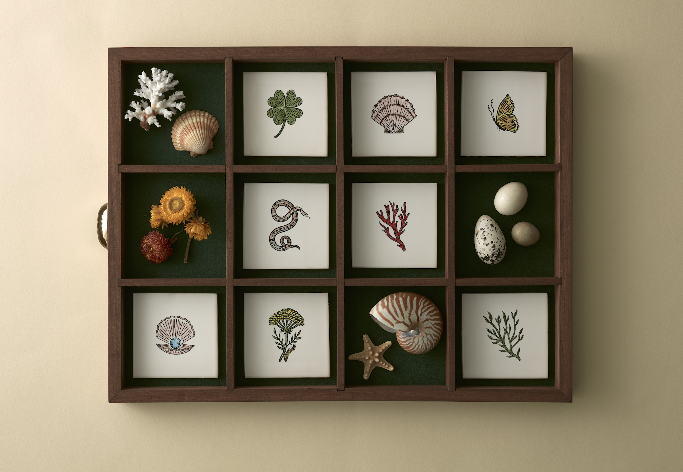
Fee Greening’s Curios Tile Collection, created with Balineum, translates her original ink-and-watercolor illustrations into decorative wall tiles. The collection includes 12 individual designs, each centered on a different natural or symbolic motif.
The tiles feature elements such as shells, flowers, insects, seaweed, clovers, serpents, suns, and moons. These are not arranged as a single mural that only works in one exact layout. Instead, each tile acts like a tiny illustrated specimen. You can use one as a focal point, repeat several motifs in a grid, or combine them with plain tiles for a more restrained composition.
That flexibility is a big part of the collection’s charm. A full wall of ornate pattern can be glorious, but not every home needs to look as though it belongs to a wizard with excellent credit. Greening’s tiles let homeowners introduce artwork in smaller, more intentional doses.
How the Tiles Are Made
The Curios tiles are made from hand-cut earthenware and finished using screen printing and hand painting. That handcrafted process matters because it preserves the character of the original drawings. The motifs retain their fine linework, slightly irregular energy, and artisanal quality rather than looking like generic images stamped onto ceramic.
Each tile measures approximately 126 millimeters square, or nearly five inches. That compact format makes the collection particularly useful for backsplashes, wall panels, fireplace surrounds, vanity walls, and decorative bathroom details.
They are designed for wall applications rather than floors or exposed outdoor areas. In other words, they are ideal for a backsplash behind your coffee station, but not for surviving an icy patio while hosting a competitive family barbecue.
Where Botanical Tiles Work Best
Kitchen backsplashes: A row of Curios tiles behind a range or open shelf can make a kitchen feel less like a laboratory for reheating leftovers and more like a place where interesting things happen. Pair the illustrated tiles with handmade white, cream, soft green, or pale blue field tile to let the motifs breathe.
Bathroom walls: Botanical wall tiles work beautifully behind a vanity, around a mirror, or as a small decorative panel above a tiled wainscot. Their nature-inspired imagery softens hard surfaces and adds visual interest without requiring a full renovation.
Fireplace surrounds: A fireplace already functions as a room’s anchor. Framing it with illustrated ceramic tiles turns it into a proper focal point, especially in cottages, historic homes, eclectic apartments, and traditional interiors with a mischievous streak.
Entryways and mudrooms: A few botanical tiles near a coat rack, bench, or umbrella stand can create the feeling that guests are entering a home with an actual point of view. Even a small wall can become memorable.
Fee Greening Wallpaper: A Cabinet of Curiosities for the Walls
If the tiles feel like individual treasures, Fee Greening’s wallpaper feels like the entire cabinet. Her wallpaper collaboration with CommonRoom includes designs such as Climbing Curios, Harlequin Pearl, and Twin Flower, each showing a different side of her imaginative world.
Climbing Curios is perhaps the clearest bridge between Greening’s botanical tile designs and her wallpaper. It brings together shells, flowers, insects, celestial symbols, and odd natural treasures in a repeating pattern that feels like an alchemist’s collection room. It is detailed enough to reward a closer look but organized enough to work as a complete wallcovering.
Twin Flower offers a softer floral direction, while Harlequin Pearl leans more theatrical and decorative. Together, these designs demonstrate that Greening is not limited to one version of “botanical.” Her work can be wild, romantic, ceremonial, playful, darkly whimsical, or quietly pastoral depending on the palette and room styling.
Why the Wallpaper Feels Different From Ordinary Botanical Prints
Many botanical wallpapers rely on scale alone: larger leaves, larger flowers, louder colors, and a vague promise that the room will become “lush.” Fee Greening’s patterns take another route. They rely on drawing, symbolism, and narrative.
Her linework has the intimacy of a sketchbook. You can sense the hand behind it. The motifs may include flowers and insects, but they also include moons, serpents, shells, and visual references that feel older than the current trend cycle. That gives the wallpaper staying power. It is decorative, but it does not feel disposable.
The patterns also manage a useful design trick: they can read as either historical or contemporary. Place them beside antique wood, brass sconces, and dark paint, and they feel like a rediscovered wall covering from a fantastically stylish 18th-century house. Pair them with clean-lined furniture, modern lighting, and plaster walls, and they become graphic, playful, and fresh.
How to Style Botanical Tiles and Wallpaper Together
The biggest opportunity in this collection is the conversation between tile and wallpaper. They share motifs and mood, so they can coexist without looking like two unrelated design decisions met awkwardly at a dinner party.
Create a Botanical Powder Room
A small powder room is one of the safest places to be brave. Use Fee Greening wallpaper above a tiled lower wall, then place a few Curios tiles behind the sink or around the mirror. Keep the vanity simple, perhaps in painted wood or natural oak, and add unlacquered brass hardware for warmth.
The key is balance. Let one surface lead. If the wallpaper is highly detailed, use only a few feature tiles rather than covering every available inch. Pattern can be dramatic without turning the room into a very tasteful optical illusion.
Build a Characterful Kitchen Backsplash
For a kitchen, start with a quiet foundation. Cream cabinetry, warm white walls, natural wood shelves, and stone counters create a calm stage for illustrated tiles. Use Curios tiles in a concentrated area behind the range, under an open shelf, or as a framed panel above a prep counter.
To connect the backsplash with the rest of the room, pull one subtle color from the tile designs into a linen cafe curtain, a painted shelf edge, or a small piece of artwork. Repeating a color is usually enough. Repeating every motif is how a nice kitchen starts developing a costume.
Design a Maximalist Bedroom Without Losing Sleep
Greening’s wallpaper can bring magic to a bedroom, but the room should still feel restful. Try it behind the bed as a feature wall, then keep the remaining walls in a complementary muted shade. Soft moss green, chalky blue, warm cream, faded rose, or mushroom brown can all work well with botanical linework.
Choose bedding in solid or lightly textured fabrics rather than another large print. Add one or two vintage-looking accents, such as a scalloped lamp, framed botanical illustration, or small antique side table. The wallpaper should be the storyteller; everything else can be supporting cast.
Color Palettes That Suit Fee Greening’s Work
The best color palettes for Fee Greening wallpaper and tiles tend to feel earthy, aged, and gently saturated. You do not need to recreate an English cottage exactly, unless you happen to own a cottage, a Labrador, and a collection of suspiciously beautiful baskets.
Moss and cream: Soft green, chalk white, aged brass, and pale oak create a botanical room that feels calm and collected.
Ink blue and ivory: Deep blue brings out the hand-drawn quality of the motifs and works especially well in bathrooms, libraries, dining rooms, and dramatic hallways.
Ochre and faded pink: These warmer tones make floral and natural motifs feel romantic without becoming overly sweet.
Charcoal and antique gold: For a more Gothic interpretation, pair the designs with dark paint, velvet, warm lighting, and brass or bronze finishes.
Terracotta and stone: Earthy clay tones emphasize the handmade quality of decorative ceramic tiles and suit kitchens, fireplaces, and rustic-modern homes.
Practical Tips Before Choosing Botanical Wallpaper or Decorative Tile
Beautiful pattern deserves a little planning. Before ordering wallpaper, measure carefully and account for repeat matching, windows, doors, alcoves, and extra material for future repairs. Patterned wallpaper is less forgiving than plain paint, which is unfortunate because paint never once asked us to calculate a repeat length.
For bathrooms, consider moisture levels. Wallpaper can work beautifully in a powder room or a well-ventilated bathroom away from direct splash zones. In wet locations such as inside a shower, decorative tile is typically the more practical choice. Use tile and grout products appropriate for the installation area, and follow the recommendations of the manufacturer and qualified installer.
Order samples whenever possible. A wallpaper that looks moody and enchanting online may look completely different under your home’s lighting. The same is true for tile, especially handmade or hand-finished ceramic surfaces. View samples in daylight, evening light, and the slightly unforgiving glow of your bathroom vanity light before making final decisions.
Finally, remember that these designs are art-led. Do not over-coordinate them into oblivion. Allow the imperfections, hand-drawn details, and little surprises to remain visible. A room with personality needs room to breathe.
Why Fee Greening’s Botanical Designs Feel Timeless
Trends move fast. One year, everyone wants wavy mirrors. The next year, every coffee table is apparently required to look like a sculptural mushroom. Fee Greening’s work has more staying power because it draws on visual traditions that have lasted for centuries.
Medieval manuscripts, botanical studies, folklore, decorative ceramics, and natural-history cabinets are not short-lived internet aesthetics. They are rich creative sources with deep visual roots. Greening translates them into designs that feel relevant now without flattening them into a generic vintage look.
Her botanical tiles and wallpaper also answer a broader desire for homes that feel personal. Instead of choosing a pattern because it is “on trend,” homeowners are increasingly choosing surfaces that suggest memory, curiosity, humor, and attachment. Greening’s work excels at that. It makes a room feel discovered rather than merely decorated.
Experiencing a Room Inspired by Fee Greening’s Botanical Tiles and Wallpaper
Imagine walking into a small bathroom lined with warm cream tile, a painted wood vanity, and a single wall of Fee Greening’s Climbing Curios wallpaper. At first glance, it is simply a beautiful botanical pattern. Then the details begin to appear. A shell seems to drift between stems. A tiny insect sits beside a flower. A moon looks down with the quiet confidence of someone who has been on duty for several billion years and has never once needed an appointment reminder.
That is the real experience of living with Greening’s work: it changes depending on how much attention you give it. In the morning, when you are half awake and trying to locate your toothbrush, the wallpaper may feel gentle and decorative. In the evening, with lower light and a candle or wall sconce nearby, the same pattern can feel theatrical, mysterious, and almost narrative. It becomes less like a backdrop and more like a companion.
Decorative tile has a different kind of presence. A hand-finished tile behind a kitchen sink becomes part of the daily rhythm of a home. You notice it while filling a kettle, rinsing herbs, arranging flowers in a glass jar, or standing around pretending that you are helping while someone else cooks. The tile is durable, but it is not anonymous. Its illustrated motif gives even a practical surface a small sense of ceremony.
There is also something satisfying about the scale of the Curios tiles. Each one is compact enough to feel collectible. A row of them can resemble pages from a tiny visual encyclopedia: one tile devoted to a shell, another to a flower, another to a strange little creature that may be a snake, a symbol, or an excellent reason to start reading old folklore. You do not need a huge room for them to make an impact. In fact, a small wall can make the experience feel more intimate.
In a bedroom, Greening’s wallpaper can create the pleasant sensation of being tucked into a storybook without being trapped inside a children’s illustration. The hand-drawn lines have enough sophistication to work with antique furniture, contemporary lighting, linen bedding, or a modern upholstered bed. They give the room texture even when the color palette is quiet.
In an entryway, the effect is more immediate. Guests may not identify every motif, but they understand the mood. The house feels curious, welcoming, slightly eccentric, and designed by someone who believes a wall should be allowed to have a personality. That first impression matters. It tells people that the home is not assembled from a catalog of safe choices.
The most rewarding part of botanical tiles and wallpaper by Fee Greening is that they invite slow looking. They reward the second glance and the accidental pause. A room becomes more than a place to pass through; it becomes a place to notice. And in a world full of blank walls, endless scrolling, and furniture named after Swedish geography, that feels like a minor domestic miracle.
Note: Product availability, specifications, colorways, and installation recommendations can change. Always confirm current details with the manufacturer or authorized retailer before ordering materials for a renovation.