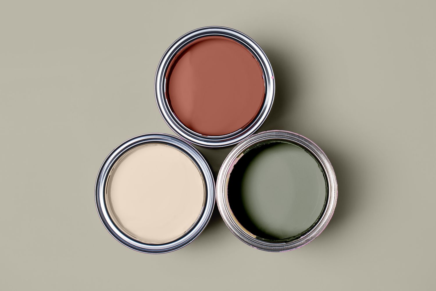
Choosing a wall color sounds easy until you realize your living room already contains approximately 47 opinions. The floor is honey oak. The sofa is cool gray. The rug has cream, rust, and navy in it. The curtains are beige. The dog is shedding on all of it equally. Then a tiny paint chip enters the chat and somehow becomes the most stressful square in the house.
Here is the good news: finding a paint color that works with everything you already have is not magic, and it is definitely not about grabbing the trendiest white from social media and hoping your furniture falls in line. The real trick is much smarter than that. You start by reading the room you already own.
The best paint color is usually the one that quietly connects your existing finishes, fabrics, and lighting. In other words, you do not choose the paint first. You choose the undertone family first, then test the paint like a skeptical detective with excellent taste.
The Trick in One Sentence
The trick to finding a paint color that works with everything you already have is to match the paint’s undertone to your room’s fixed elements, then test it in your actual light before committing.
That may not sound as glamorous as “buy this one perfect universal color,” but it works far better in real homes. Paint is not judged in a vacuum. It lives next to wood floors, countertops, rugs, trim, tile, and upholstery. If the undertones clash, the room feels off even when nobody can explain why. If the undertones harmonize, the whole space suddenly looks intentional, polished, and calm. Like it drinks enough water and answers emails on time.
Start With the Things You Are Not Changing
Before you look at a single paint swatch, make a list of your room’s fixed or expensive-to-change elements. These usually include:
- Flooring
- Cabinetry
- Countertops
- Fireplace stone or brick
- Large rugs
- Sofas and upholstered headboards
- Wood trim or built-ins
These elements are your color anchors. If your floors are warm, your wall color needs to respect that. If your sofa leans cool and your countertop has gray veining, a yellow-beige wall may look muddy or outdated next to it. The room will not explode, but it may give off “rental waiting room with aspirations” energy.
Look closely at the dominant colors already in the room. Pull colors from the rug. Study the wood tone in daylight. Notice whether your stone has pink, green, taupe, gold, or blue undertones. The goal is not to find a paint color that perfectly matches these elements. The goal is to find one that belongs in the same family.
What “Undertone” Really Means
Undertones are the subtle warm or cool color influences hiding beneath the main color. A white can lean creamy yellow, pink, blue, or gray. A beige can read peachy, golden, greenish, or taupe. A gray can suddenly turn purple just to keep your week interesting.
When people say, “This paint looked amazing in the store and weird in my house,” undertones are usually the culprit. The paint did not betray them. The room simply introduced itself.
How to Read Undertones Without Losing Your Mind
If you want a paint color that works with everything you already have, learn to compare swatches instead of judging one chip alone. A single paint chip lies politely. Put three or four similar options next to each other, and the truth starts spilling out.
Hold the swatches beside a sheet of bright white printer paper. Suddenly you will notice that one “white” is actually creamy, one is greenish, one is pink, and one is a cool gray-white that looks like it pays taxes early.
Then compare those swatches against your sofa, rug, wood floor, and countertop. This is where things click. The paint color with the right undertone will feel like it belongs. It will not scream for attention or make your existing finishes look dirty, too yellow, too pink, or too icy.
Quick Undertone Cheat Sheet
- Warm wood floors: usually pair best with warm whites, creamy off-whites, soft taupes, warm greiges, and muted earthy tones.
- Cool gray furniture: often looks best with soft neutrals that lean gray, greige, blue-green, or balanced off-white.
- Mixed metals and mixed textiles: usually benefit from a flexible near-neutral such as greige, mushroom, putty, or a soft sage.
- Stone with pink or violet undertones: needs extra caution because the wrong beige can make those notes shout.
Why Lighting Gets the Final Vote
Here is the part homeowners regularly underestimate: lighting changes everything. A paint color can look buttery in one room and flat in another. It can feel fresh at 10 a.m., beige at 4 p.m., and slightly offended by 8 p.m. lamp light.
Natural light direction matters. North-facing rooms tend to read cooler, so warm or higher-LRV neutrals often feel more balanced there. South-facing rooms get warmer light, which can intensify creamy or yellow undertones. East-facing rooms shift through the day, starting warmer and becoming cooler later. West-facing rooms can turn very golden by afternoon.
Artificial lighting matters too. Warm bulbs make creamy, peachy, and yellow undertones stronger. Cooler daylight bulbs pull out blue and gray notes. That means your “perfect neutral” may not be wrong at all; your bulbs may simply be staging a quiet mutiny.
The Best “Goes With Everything” Paint Colors Are Usually Not Pure White
Many people assume the safest answer is bright white. Sometimes it is. Often it is not. Stark white can look harsh next to warm wood, flat in dim rooms, and oddly blue under cool lighting. On the flip side, a too-creamy white can look dingy beside crisp trim or cool gray upholstery.
The most adaptable paint colors are usually soft, balanced neutrals with enough depth and enough subtlety to bridge multiple materials. Think:
- Warm off-whites
- Balanced greiges
- Soft taupes
- Mushroom tones
- Muted sages
- Dusty blue-greens used like neutrals
These shades work because they have a little nuance. They are not blank. They are flexible. They can sit next to linen, leather, brass, black iron, oak, walnut, marble, and woven textures without starting drama.
A Simple Formula for Choosing the Right Paint Color
- Identify your room’s non-negotiables. Start with floor, rug, sofa, stone, cabinetry, and trim.
- Decide whether the room reads mostly warm, mostly cool, or mixed. Mixed rooms usually need a balanced neutral.
- Narrow to one undertone family. Warm white, greige, taupe, soft sage, or another subtle near-neutral.
- Check the room’s light. Ask whether the room needs warming up, calming down, or brightening.
- Choose 3 to 5 samples. Never choose from one sample alone unless you enjoy unnecessary chaos.
- Test samples on large movable boards. Move them around the room at morning, afternoon, and night.
- View them next to furniture and trim. Not in isolation. Not from across the house. Right where they will live.
- Pick the color that makes everything else look better. That is the winner.
Three Real-World Examples
1. The Warm Wood Problem
You have medium oak floors, a camel leather chair, cream curtains, and a vintage rug with terracotta accents. The wrong cool gray wall will make the floor look orange and the leather look tired. A better choice is a creamy off-white, warm greige, or light taupe that acknowledges the warmth already in the room.
2. The Cool Modern Mix
You have a charcoal sofa, black window frames, white trim, and pale stone countertops. A yellow-beige paint may feel disconnected. A balanced gray-beige, soft putty, or restrained blue-green can create cohesion without turning the room into a weather forecast.
3. The “Everything Is Mixed” Room
You inherited warm wood floors, bought a cool gray sectional, and added a rug with navy, rust, and ivory because apparently you enjoy a challenge. In this case, a near-neutral with balanced undertones works best. Greige, mushroom, and certain muted sages are often excellent bridge colors because they can connect warm and cool elements without clearly choosing sides.
Use the 60-30-10 Rule So the Walls Don’t Do All the Work
One reason people overthink paint is that they expect the wall color to fix everything. But a room usually feels balanced when color is distributed well. A helpful design guideline is the 60-30-10 rule: about 60% dominant color, 30% secondary color, and 10% accent color.
In many rooms, the walls are part of the 60%, but they are not the entire show. Your sofa, rug, drapes, wood, and decor also contribute. Once you see the room as a palette instead of a single paint decision, choosing a paint color becomes easier. The walls only need to support the room, not perform a solo concert.
Do Not Skip the Sample Test
If there is one step worth being annoyingly disciplined about, it is sampling. Not tiny chips. Not one dab straight on the wall that you forget about for six days. Large, movable samples.
Paint sample boards and peel-and-stick samples are useful because you can move them around the room. Place one near the sofa, one by the trim, one in a shadowy corner, and one by the window. Look at them in daylight, lamplight, and that strange in-between hour when every color reveals its emotional baggage.
This is how you spot the difference between “pretty paint color” and “right paint color.” The right one makes your furnishings look richer, your trim look cleaner, and your room feel calmer. It does not fight the floors. It does not turn your rug weird. It does not suddenly go pink after sunset and act like that was always the plan.
Mistakes to Avoid When Choosing a Paint Color That Works With Existing Decor
- Choosing from a phone screen: digital images help, but screens distort undertones.
- Ignoring the flooring: floors cover a huge visual area and strongly influence what works.
- Picking a trendy color before reading the room: the internet does not live in your house.
- Using only tiny swatches: small samples hide the real behavior of a color.
- Forgetting bulb temperature: your evening lighting can completely change the effect.
- Assuming “neutral” means “safe”: neutrals still have undertones, and undertones still fight.
The Smartest Color Strategy for Most Homes
If your goal is a paint color that works with everything you already have, the smartest strategy is usually this: choose a soft, undertone-aware neutral that relates to your biggest furnishings and fixed finishes, then confirm it with real sample testing.
That is the whole game. Not chasing the latest viral white. Not copying a paint name from someone else’s kitchen. Not assuming beige is boring or gray is always modern. A room feels cohesive when the wall color respects what is already there.
And once you find that shade, the rest of the room relaxes. The wood looks richer. The sofa looks more intentional. The art stands out. Even the lamp you bought in a panic three years ago may finally look like it belongs.
Experience: What This Looks Like in Real Life
One of the most common experiences people have with paint is thinking they want a “simple neutral,” only to realize that neutral is not a category so much as an entire soap opera. A homeowner sees a lovely white in a magazine, paints the room, and suddenly the walls look icy against oak floors. Another person chooses a warm beige because it feels safe, then watches it turn peachy next to gray upholstery. The lesson is almost always the same: the room had an opinion long before the paint arrived.
A classic example is the open-concept living area with mixed finishes. Maybe the kitchen has white cabinets and cool veined counters, while the connected living room has warm wood furniture, a patterned vintage rug, and creamy curtains. At first, that sounds impossible. In practice, the winning color is often not a hard white or a flat gray, but a middle-ground shade with balanced undertones. When people finally test a soft greige or mushroom tone on a large board and move it from kitchen to living room, you can almost hear the room exhale. Everything starts looking more deliberate.
Another very real experience happens in darker rooms. People often assume they need the brightest white available to force the room into looking larger. But that super-bright white can feel stark, chilly, and disconnected, especially in north-facing spaces. A warmer off-white with a little softness often works far better. It still reflects light, but it does not feel clinical. The room stays bright without looking like a dentist’s office with throw pillows.
Then there is the emotional roller coaster of undertones. You test a color that looked perfectly innocent in the store, only to watch it turn pink at dusk, green in the morning, or weirdly lavender next to the stone fireplace. This is exactly why sample testing is so important. People who skip that step often end up repainting. People who test boards at different times of day usually feel much more confident, because they have already seen the paint behave under real conditions.
There is also a practical side to the experience. Once a homeowner starts choosing paint based on existing elements instead of isolated preference, future decorating gets easier. Pillows, art, blankets, and accent pieces seem to work more naturally because the backdrop is flexible. The walls stop arguing with the room and start supporting it. That is when a home begins to feel layered rather than random.
In the end, the most satisfying experience is not finding a mythical paint color that literally matches everything on Earth. It is finding a color that makes your own things look better than they did before. That is the real trick. The best paint color is not the loudest or the trendiest one. It is the one that quietly connects the room you already have, so the whole space finally makes sense.
Conclusion
The trick to finding a paint color that works with everything you already have is surprisingly practical: study the fixed elements, identify the undertones, account for the lighting, and test large samples before making the final call. When you do that, you stop guessing and start choosing with intention. The result is a room that feels cohesive, flattering, and far more expensive than the actual process of staring at paint chips in sweatpants.
In other words, the perfect paint color is not universal. It is contextual. But once you choose the right undertone family for your home, the right shade becomes much easier to spot. And when it works, it really works. Suddenly the floors make sense, the sofa looks smarter, and your home feels like it got its life together.