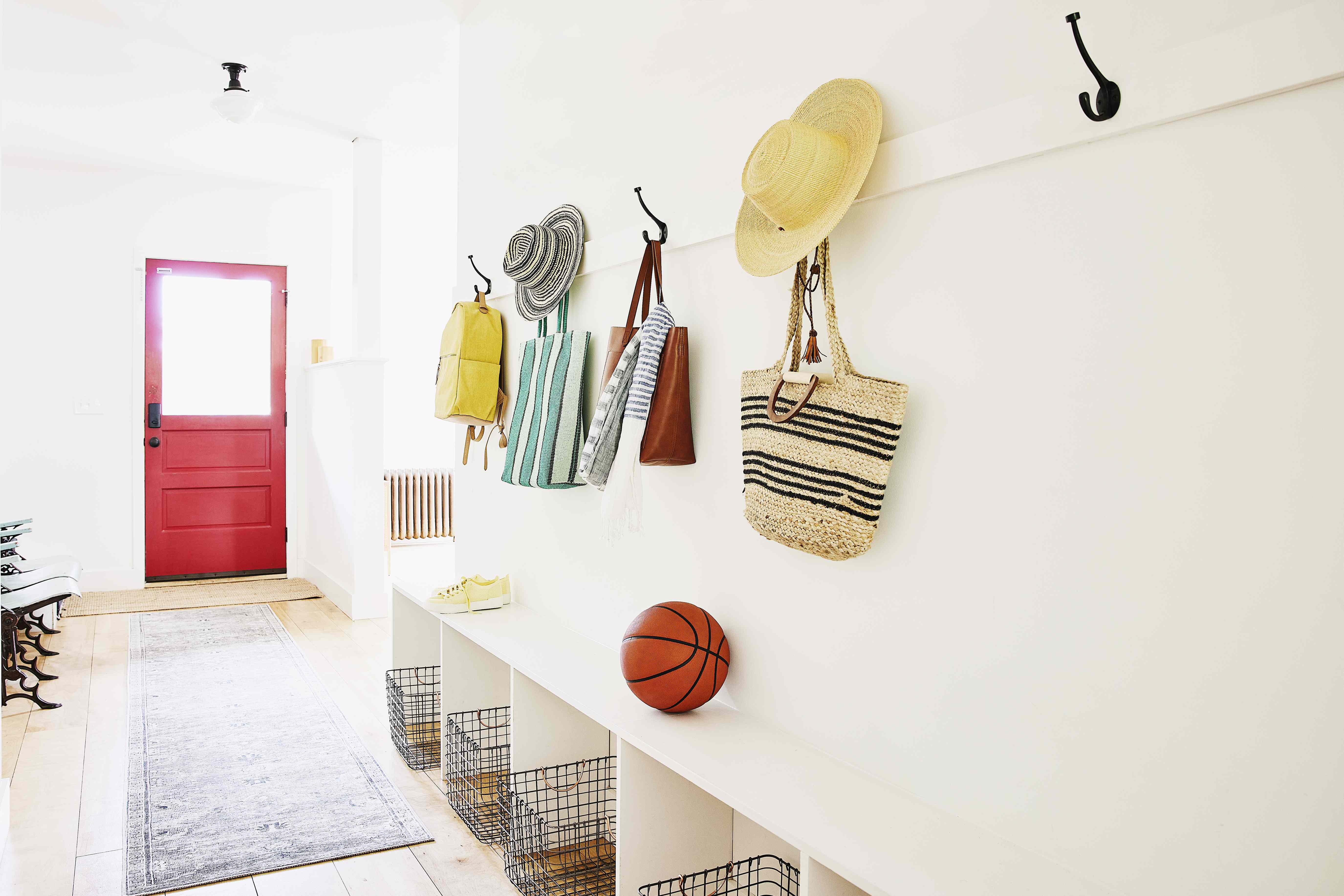
Your entryway has one job: make the first few seconds inside your home feel calm, polished, and intentional. Unfortunately, this tiny stretch of square footage is where many homes quietly lose the plot. It becomes a shoe graveyard, a backpack parking lot, a dimly lit corridor, or a random collection of “we’ll deal with this later” energy. In other words, the entryway often looks like life happened there… and then never left.
Designers tend to agree on one thing: the entryway sets the tone for everything that follows. Even if the rest of your house is lovely, a cramped, chaotic, or awkward entrance can make the whole home feel less welcoming. The good news is that most entryway mistakes are fixable without a full renovation or a dramatic television reveal involving a sledgehammer and tears.
Below are seven of the most common entryway mistakes designers want you to stop making right now, plus practical ways to fix each one. Whether you have a grand foyer, a narrow hallway, or basically two feet of floor between the front door and the living room, these ideas will help you create an entrance that feels stylish, functional, and a lot less frazzled.
1. Treating the Entryway Like a Dumping Ground
The most common entryway mistake is also the least glamorous: letting it become a catchall for everything that does not currently have a better home. Shoes, keys, unopened mail, reusable bags, sports gear, dog leashes, library books, packages, and random receipts start piling up until your “welcome home” moment feels more like an obstacle course.
This happens because many people do not design the entryway with a real purpose. They assume it is just a pass-through. Designers disagree. The entryway is a working zone, and if it does not have designated spots for daily essentials, clutter takes over at record speed. It is basically the law of home organization: empty horizontal surface plus human beings equals piles.
How to fix it
Start with a simple landing zone. A narrow console with drawers, a small chest, or a storage bench can do a lot of heavy lifting. Add a tray for keys, sunglasses, and loose change. Use one basket for grab-and-go items like hats or dog leashes. If mail tends to stack up, give it a dedicated sorter or tray and commit to clearing it regularly.
The key is restraint. Your entryway should hold what you use daily, not everything you own. Keep one or two pairs of everyday shoes nearby, not the entire family footwear museum. Store returns, donations, and out-of-season items somewhere else. Your front door is not a holding cell for errands.
2. Using the Wrong Storage: Too Much Open, Not Enough Hidden
Open hooks, floating shelves, wall pegs, cubbies, and hall trees can look charming in inspiration photos. In real life, they often become visual chaos if every coat, tote, and umbrella lives out in the open. Entryways are high-traffic spaces, which means they need storage that can handle mess without advertising it to every guest.
This is where homeowners get tripped up. They assume “more storage” automatically means “better storage.” Not necessarily. If every storage solution is open, the space can still look messy even when technically organized. A row of overflowing hooks is still overflowing. It just happens in a Pinterest-approved way.
How to fix it
Mix open and closed storage. Use a couple of hooks for the jacket you are actually wearing this week, but keep extra outerwear in a closet. Choose a bench with hidden shoe storage. Slide a lidded basket under a console for pet gear or scarves. If you have shelves, use matching bins so the look stays cohesive rather than “busy family command center meets sporting goods store.”
Good entryway storage should reduce visual noise, not create more of it. If you can see every single thing at once, the space is probably doing too much.
3. Going Too Big, Too Small, or Too Bulky With Furniture
Furniture scale matters enormously in an entryway. Oversized pieces block pathways and make the space feel cramped. Tiny pieces can look timid and underwhelming, especially in homes with high ceilings or wide walls. Then there is the classic mistake of choosing something bulky because it offers “more storage,” only to realize it now takes up half the circulation path and the front door barely clears the rug.
Designers often point out that an entryway needs proportion, not just furniture. A too-small rug, a miniature console, or a skinny mirror floating on a big blank wall can make the area feel unfinished. On the flip side, a huge cabinet shoved into a narrow hallway can make guests feel like they are squeezing through a backstage corridor.
How to fix it
Measure before you buy. Then measure again, because optimism has ruined many a hallway. Choose pieces that fit the width of the wall and leave comfortable walking clearance. In a narrow entry, a slim console, wall-mounted shelf, or narrow bench can work beautifully. In a larger foyer, do not be afraid of one statement piece with real presence, like an oversized mirror, a substantial chest, or a bold runner.
The goal is balance. Your furniture should support the flow of the space, not wrestle it into submission.
4. Leaving the Entryway Dark, Harsh, or Badly Lit
If your entryway feels gloomy, flat, or weirdly aggressive, the lighting is probably to blame. Some homes have little natural light near the front door, which makes lighting even more important. A single dim overhead fixture can make the space feel underwhelming. On the other hand, harsh lighting can make it feel sterile, like your guests just walked into a particularly judgmental dentist’s office.
Lighting affects both function and mood. You want enough light to safely kick off shoes, find keys, and welcome guests. But you also want warmth, softness, and a sense of intention. Designers consistently recommend treating entryway lighting as part practical necessity, part design statement.
How to fix it
Layer your lighting whenever possible. An overhead fixture handles general illumination, but a table lamp, wall sconce, or picture light can make the area feel much more inviting. If you have high ceilings, go bigger with your fixture instead of defaulting to something tiny and forgettable. If you have lower ceilings, a semi-flush mount with some personality works well.
Also pay attention to bulb temperature. Warm light tends to feel more welcoming than cool, bluish light. It is a small switch that makes a surprisingly big difference. In entryway design, “bright and cozy” beats “bright and suspicious” every time.
5. Skipping the Basics: A Mirror, a Rug, or a Place to Sit
Some entryway elements are not trendy extras. They are practical workhorses. Designers repeatedly mention three features homeowners often skip: a mirror, a rug, and seating. None of them are mandatory in every single home, but leaving out all three can make your entry feel less functional and far less finished.
A mirror helps reflect light, visually expands a small space, and gives you one last glance before you head out the door. A rug defines the area, adds softness, and helps trap dirt before it gets tracked through the rest of the house. A bench, stool, or tucked-away seat gives people somewhere to sit while taking shoes on or off, which is both useful and surprisingly civilizing.
How to fix it
Choose a mirror that matches the scale of the wall. Too small and it looks like an afterthought; too large and it can dominate the whole space. Pick a durable, washable rug with a low enough pile that the door can still open freely. And if square footage allows, add seating, even if it is just a compact bench with hidden storage or a slim stool tucked under a console.
Together, these pieces make an entryway feel complete. Without them, the space can read like a hallway that accidentally got dressed halfway through.
6. Forgetting That the Entryway Needs Personality
A lot of entryways are neat enough but still feel forgettable. They have a plain wall, a bland table, and the emotional warmth of a hotel corridor. Designers often warn against making the entryway so minimal that it loses all charm. This is the first impression of your home, not a waiting room for the rest of the decor to begin.
Blank walls are one of the biggest offenders. Without art, wallpaper, molding, or another visual anchor, the entry can feel unfinished. The same goes for playing it too safe with color or choosing a scheme that feels stark, cold, or disconnected from the rest of the home.
How to fix it
Add one strong focal point. That might be a large piece of artwork, a beautiful mirror, a sculptural lamp, wallpaper, or even a richly painted console. Think in terms of “hello, welcome” rather than “we have not decided what this area is yet.”
Color matters too. Warm neutrals, muted tones, and cohesive paint transitions tend to make entryways feel more polished and inviting. If your entry opens directly into another room, avoid abrupt paint breaks that chop up the space visually. Let the entry feel connected to the rest of the home while still having its own moment.
7. Ignoring Flow, Scent, and the Overall Experience
Great entryways do more than hold your keys. They shape how the home feels the second someone walks inside. That means design is not only about what is in the space, but also how the space works. If the path is awkward, the front door bumps into furniture, the air smells like wet sneakers, and guests have nowhere to set a bag, the entryway is not doing its job.
This is the mistake people often miss because it is less about decor and more about experience. Designers talk a lot about creating an entryway that feels intentional. That means considering movement, visual anchor points, sensory details, and the emotional vibe of the first few seconds indoors.
How to fix it
Stand at your front door and walk through the space like a guest. Is the path clear? Is there a place to drop keys? Does the area smell fresh? Is there enough light? Does the wall in front of you offer something nice to look at? Can you take off shoes without performing an interpretive balance routine?
Add a subtle diffuser or candle if scent matters to you. Keep floor space open. Make sure the first sightline into your home feels calm rather than cluttered. In design, small sensory cues add up fast. A tidy, softly lit, pleasant-smelling entryway makes the entire home feel more thoughtful.
Why Entryway Design Matters More Than People Think
It is easy to focus on bigger rooms when decorating. Kitchens get all the appliance drama, living rooms get the expensive sofas, and bedrooms get the cozy makeover treatment. The entryway, meanwhile, gets a shrug and maybe a hook. But that little zone does a surprising amount of work. It introduces your style, controls clutter, supports daily routines, and creates a transition from outside chaos to inside calm.
When the entryway works, your whole home feels easier to live in. Mornings run smoother. Guests feel welcomed. Shoes stop migrating like confused wildlife. You stop spending the first five minutes after work staring at a pile of unopened packages and wondering how everything unraveled again.
The best part is that fixing an entryway usually does not require an enormous budget. Often, it is about editing what is already there, improving the lighting, adding smarter storage, and choosing a few details that make the space feel intentional. It is less about perfection and more about purpose.
Real-Life Experiences With Entryway Mistakes and What They Teach Us
I have seen entryways of all kinds: suburban foyers with soaring ceilings and one lonely light fixture, apartment entrances so tiny they practically open into the refrigerator, and family homes where the first thing you meet at the door is a mountain of shoes with strong opinions. The funny part is that the problem is rarely “bad taste.” It is usually good people being busy and assuming the entryway can fend for itself.
One of the most common real-life scenarios is the narrow hallway entry. Someone adds a console they loved online, only to discover it sticks out too far and turns every arrival into a side shuffle. Then they place a decorative bowl on top, a stack of mail beside it, a candle near the edge, and before long the whole setup is one dramatic elbow away from collapse. The lesson is simple: beautiful furniture is not automatically the right furniture. In an entryway, inches matter.
Another classic mistake shows up in busy family homes. Hooks go up on the wall with the best of intentions. At first it looks charming: one jacket here, one tote there, maybe a hat. A month later it looks like the backstage area of a regional theater production. Every hook is overloaded, backpacks are slumped on the floor, and the dog leash is somehow tangled in a scarf from February. That experience teaches an important design truth: open storage only works when there is discipline to match it. If daily life is messy, closed storage is your friend.
I have also noticed how often lighting gets ignored. People tolerate dim entryways for years because they are in and out so quickly. But once a warm lamp or better ceiling fixture goes in, the entire mood changes. Suddenly the space looks intentional instead of forgotten. It feels safer, calmer, and more inviting. Good lighting does not just help you see the room; it helps you feel the room.
There is also the emotional side of entryway design, which people do not talk about enough. Walking into a cluttered entrance after a long day can make the whole house feel stressful before you have even set down your bag. Walking into a tidy, softly lit, good-smelling space does the opposite. It sends a subtle message that the day is winding down and you are home. That is powerful for such a small area.
Perhaps my favorite entryway transformation stories are the simplest ones. A bench added under a mirror. A washable runner replacing a too-small mat. A tray for keys that ends years of “Where are my keys?” theater. A lidded basket that hides pet gear and somehow restores domestic dignity. These are not flashy upgrades, but they are the kind you feel every single day.
The biggest takeaway from real homes is that entryways do not need to be grand to be good. They just need intention. A tiny entrance can still be charming, organized, and welcoming. A large foyer can still fail if it is dark, empty, or awkwardly furnished. Good design here is less about square footage and more about knowing what the space needs to do, then helping it do that job with style.
And honestly, that may be why entryways are so satisfying to fix. They are small enough to tackle, but important enough to change the way your entire home feels. That is a pretty good return for one bench, one mirror, and a serious conversation about shoe storage.