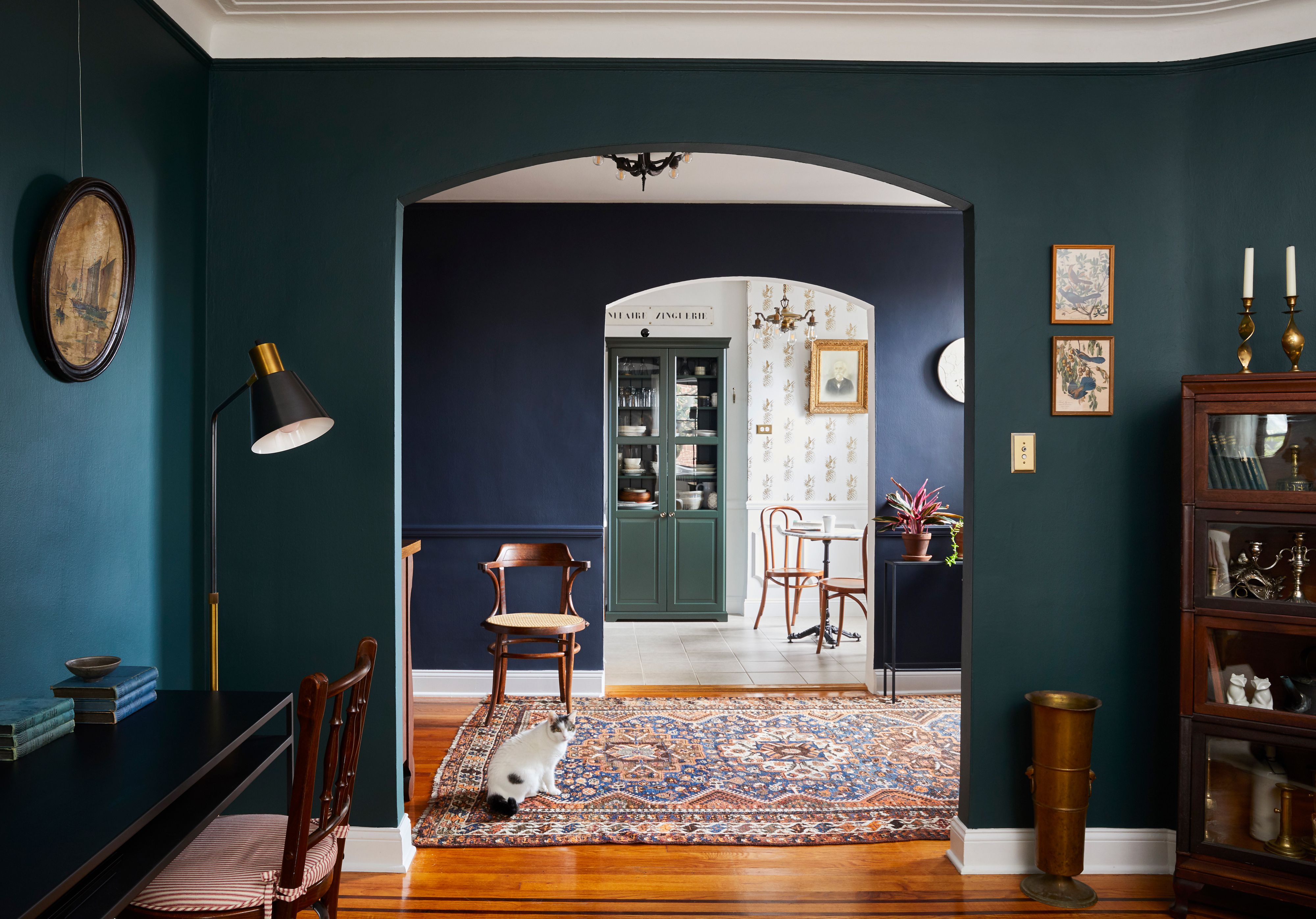
Paint is the cheapest magic trick in home design. With one weekend, a few gallons, and a playlist loud enough to drown out your regret, you can make a room feel brighter, taller, calmer, cozier, or more expensive. But paint can also do the opposite. The wrong color placement, finish, undertone, or contrast can make a perfectly decent room feel like it has been quietly shrinking behind your back.
If your living room feels cramped, your hallway looks narrow, or your bedroom gives “stylish storage closet” instead of “peaceful retreat,” the problem may not be square footage. It may be the paint strategy. Interior designers often use color to change how the eye reads boundaries. Light colors can reflect more light, continuous colors can blur edges, darker shades can create depth when used intentionally, and the right ceiling or trim choice can make walls feel taller. The key word is intentionally.
Below are seven common paint mistakes that can make your home look smaller, plus practical fixes that help rooms feel more open without knocking down a single wall. Your sledgehammer can take the day off.
Why Paint Changes the Way a Room Feels
Before we get into the mistakes, it helps to understand why paint has such a strong visual effect. A room is not just measured by its floor plan. It is also measured by light, contrast, shadow, lines, and how smoothly the eye moves from one surface to another. When walls, trim, doors, and ceilings have harsh color breaks, your brain reads each surface as a separate boundary. That can make the room feel chopped up and compact.
On the other hand, soft transitions and thoughtful color placement can make those boundaries less obvious. A pale wall with a slightly lighter ceiling may feel airy. Trim painted the same color as the wall can make vertical surfaces look taller. A deep color wrapped around a small powder room can create a jewel-box effect instead of a cramped cave. Paint does not actually add square footage, but it can make the square footage you have feel more generous.
1. Choosing a Dark Color Without a Lighting Plan
Dark paint is not the villain. In fact, rich navy, charcoal, forest green, oxblood, espresso, and inky blue can be stunning in small rooms. The mistake is choosing a dark paint color without thinking about natural light, artificial light, furniture, flooring, and finish. A low-light room painted in a flat, muddy dark shade can absorb light until the space feels heavy and closed in. Suddenly your cozy den feels less like a library and more like a dramatic cave where Wi-Fi fears to enter.
Why It Makes a Room Look Smaller
Darker colors typically reflect less light than lighter colors. When there is not enough lighting to balance them, walls can appear to move inward. Corners look deeper, ceilings feel lower, and furniture may seem bulkier because the room loses visual breathing space.
How to Fix It
If you love dark colors, use them with confidence, not panic. Add layered lighting: overhead fixtures, sconces, table lamps, floor lamps, and warm accent lighting. Choose a finish with a little life, such as eggshell or satin, where appropriate. Pair deep walls with lighter upholstery, reflective accents, pale artwork mats, brass details, or natural wood. In a small bedroom or powder room, consider painting the trim, doors, and ceiling in the same or related shade to create a seamless look instead of a boxy one.
A smart rule: dark paint works best when it feels deliberate. If the room has poor lighting and lots of dark furniture, choose a softer mid-tone or a warm neutral instead. Moody is beautiful. Murky is what happens when moody forgets to pay the electric bill.
2. Painting the Ceiling Too Dark in the Wrong Room
The ceiling is often called the fifth wall, which sounds fancy until you realize many homeowners ignore it completely. A ceiling color can change the perceived height of a room. A dark ceiling can look elegant and dramatic, especially in a room with high ceilings or strong design features. But in a low-ceilinged room with limited light, the wrong dark ceiling can visually press downward.
Why It Makes a Room Look Smaller
High contrast between light walls and a dark ceiling draws attention to the top boundary of the room. Instead of letting the eye travel upward, it stops at a bold horizontal line. This can make the ceiling feel lower and the room feel shorter.
How to Fix It
For most small or low rooms, paint the ceiling white, soft off-white, pale neutral, or a lighter version of the wall color. This helps create an airy effect and can make the walls feel taller. If you want color on the ceiling, keep the contrast gentle. A pale blue ceiling over warm white walls, a soft greige ceiling over beige walls, or a diluted version of the wall color can add personality without lowering the visual height.
If you are committed to a dark ceiling, go all in with a thoughtful design plan. Use it in a room with good lighting, intentional contrast, and cohesive decor. A dark ceiling can feel expansive when paired with the right wall color and finish, but it should not look like the room is wearing a very heavy hat.
3. Using High-Contrast Trim That Chops Up the Walls
White trim can be crisp, classic, and beautiful. It can also be a visual stop sign. In small homes, strong contrast between walls and trim can outline every door, window, baseboard, crown molding, and awkward corner. The room starts to look like a coloring book, and every line reminds you exactly where the walls end.
Why It Makes a Room Look Smaller
Contrast creates boundaries. When trim is much lighter or darker than the walls, your eye notices the edges of the room more clearly. In a compact space, this can make walls feel shorter, ceilings lower, and architectural interruptions more obvious.
How to Fix It
Paint trim the same color as the walls or use a slightly lighter or darker shade from the same color family. This monochromatic approach helps blur edges and gives the room a smoother, more spacious feel. For example, soft greige walls with trim in the same greige but a satin finish can look polished without adding harsh contrast. In a small hallway, painting doors, trim, and walls the same color can make the passage feel less busy and more continuous.
You can still use different finishes for durability and dimension. Try eggshell on walls, satin on trim, and flat on the ceiling. The surfaces remain practical, but the color story stays calm.
4. Picking Paint Without Testing It in Real Light
Paint chips are charming little liars. A color that looks warm and creamy under store lighting can turn green, gray, yellow, pink, or strangely cafeteria-like once it meets your actual room. Light changes everything: morning light, afternoon light, north-facing exposure, warm bulbs, cool bulbs, shadows from trees, and even reflections from floors or nearby buildings.
Why It Makes a Room Look Smaller
A color with the wrong undertone can make a room feel dull, flat, cold, or visually crowded. For instance, a gray with blue undertones may feel chilly in a north-facing room. A bright white may look harsh in a room with limited natural light. A beige with too much yellow may clash with flooring and make the entire space feel visually noisy.
How to Fix It
Always test paint samples on large boards or directly on multiple walls. Look at them in the morning, afternoon, evening, and under artificial lighting. Compare the paint against flooring, cabinetry, countertops, tile, rugs, and large furniture. A beautiful wall color must cooperate with what already lives in the room.
Pay attention to Light Reflectance Value, often called LRV. This number helps indicate how much light a paint color reflects. Higher-LRV colors generally feel brighter and more open, while lower-LRV colors absorb more light and feel deeper. LRV is not the only factor, but it is a useful clue when choosing paint for small spaces.
5. Creating One Random Accent Wall
Accent walls can work, but they are often misunderstood. A single dark wall in a small room may seem like an easy way to add drama, but if it is not connected to the architecture or furniture layout, it can make the room feel shorter, narrower, or visually lopsided. It is like putting one dramatic eyebrow on an otherwise calm face. Memorable? Yes. Balanced? Not always.
Why It Makes a Room Look Smaller
A high-contrast accent wall pulls attention to one surface. In a small room, this can make the eye stop abruptly instead of moving around the space. If the accent wall is at the wrong end of a narrow room, it may visually shorten the room. If it competes with furniture or artwork, the whole space can feel busier.
How to Fix It
Use accent walls only when they highlight a meaningful feature: a fireplace, built-in shelving, bed wall, dining niche, or architectural recess. Better yet, consider a more cohesive paint strategy. Color drenching, where walls, trim, doors, and sometimes ceilings are painted the same color, can make small spaces feel more intentional and expansive. A tonal palette can also work beautifully: one main wall color, a slightly lighter ceiling, and trim in a related shade.
If you want contrast, repeat the accent color elsewhere through textiles, artwork, or decor. A color that appears only once can feel random. A color that appears thoughtfully feels designed.
6. Using the Wrong Finish for the Space
Paint finish affects how light moves across a room. Flat paint hides imperfections but absorbs more light. Glossy paint reflects light but can highlight every bump, ripple, patch, and “I swear that wall was smooth before” moment. The wrong finish can make a small room look either dull and lifeless or shiny and chaotic.
Why It Makes a Room Look Smaller
In tight spaces, surface imperfections are easier to notice. A very glossy wall can create glare and emphasize uneven drywall, making the room feel busy. A completely flat finish in a dark hallway may absorb light and make the space feel dim. Both extremes can reduce the sense of openness.
How to Fix It
Choose finishes based on room function and wall condition. Eggshell or matte finishes often work well for living rooms and bedrooms because they provide softness while offering more durability than flat paint. Satin can be useful in kitchens, baths, mudrooms, and kids’ spaces. Semi-gloss is often best reserved for trim, doors, and cabinetry because it is durable and easy to clean.
If your walls are imperfect, avoid high gloss on large surfaces unless you plan to skim coat or repair first. If the room is dark, consider a washable matte or eggshell in a lighter color. The goal is gentle light movement, not a wall that reflects your entire life choices back at you.
7. Ignoring Flow Between Rooms
A small home can feel even smaller when every room has a completely different paint personality. One room is icy gray, the next is pumpkin spice orange, the hallway is bright white, and the bathroom is teal because someone got bold after watching one design video. While colorful homes can be gorgeous, abrupt transitions can make a compact floor plan feel fragmented.
Why It Makes a Room Look Smaller
When adjacent spaces have unrelated colors, the eye reads each room as a separate box. This is especially noticeable in open floor plans, small apartments, narrow hallways, and homes where several rooms are visible at once. Too many strong color changes can create visual clutter.
How to Fix It
Create a whole-home palette. This does not mean every room must be beige and obedient. It means colors should relate to one another. Choose one main neutral or soft base color, then add two or three supporting colors that share similar undertones. For example, warm white, mushroom beige, muted olive, and dusty blue can flow beautifully. In a cooler home, soft white, pale gray, slate blue, and charcoal may feel cohesive.
Use stronger colors in rooms that can handle them, such as powder rooms, offices, dining rooms, or bedrooms. Keep connecting spaces like hallways, stairwells, and open living areas more consistent. A connected palette makes the home feel larger because the eye moves easily from one space to the next.
Smart Paint Strategies That Make a Home Feel Bigger
Now that we have scolded the mistakes politely, let’s talk solutions. The best paint strategy for a small home is not always “paint everything white.” White can be lovely, but it can also look stark, cold, or unfinished if the room lacks natural light. Instead, aim for balance, continuity, and light control.
Use Soft, Light-Reflective Colors
Soft whites, warm off-whites, pale grays, light beiges, creamy neutrals, misty blues, and gentle greens can help a room feel open. These shades reflect more light and often make walls appear to recede. Choose undertones that complement your floors and furniture. A warm white may flatter wood floors, while a cooler white may work better with gray tile or modern finishes.
Try a Monochromatic Color Scheme
Painting walls, trim, and doors in the same color can make a room feel calmer and larger. This approach works especially well in small bedrooms, hallways, bathrooms, and living rooms with lots of doorways or moldings. Vary the finish instead of the color to create depth.
Paint the Ceiling with Purpose
A ceiling does not have to be plain white, but it should support the room’s proportions. In low spaces, a lighter ceiling usually helps. In tall or dramatic rooms, a deeper ceiling can create intimacy. In small rooms where you want a seamless effect, wrapping the wall color onto the ceiling can erase hard boundaries.
Reduce Visual Clutter
Paint is only one part of the equation. Even the perfect wall color cannot save a room buried under oversized furniture, tiny rugs, low curtain rods, cluttered shelves, or poor lighting. Paint works best when paired with good scale, open pathways, reflective surfaces, and thoughtful furniture placement.
Real-Life Experiences: What These Paint Mistakes Look Like in Actual Homes
One of the most common real-life paint regrets happens in small living rooms. A homeowner chooses a trendy charcoal gray because it looked sophisticated online. In the photo, the room had giant windows, pale oak floors, cream furniture, and professional lighting. In the actual home, the room has one small window, a dark sofa, espresso floors, and a ceiling fan light that gives off the emotional warmth of a dentist’s office. The result? The walls close in. The room feels smaller not because charcoal is bad, but because the supporting elements are not there. A better version might be a smoky warm greige, a lighter taupe, or charcoal used across the walls and trim with layered lighting and pale furnishings.
Another common experience shows up in hallways. Many people paint hallway walls one color, trim bright white, doors another white, and the ceiling builder-grade flat white. In a narrow hallway, all those lines create a striped effect. Every door frame becomes a border. Every baseboard becomes a visual interruption. When the walls, trim, and doors are painted the same soft neutral, the hallway often looks longer and less cluttered. Add good lighting and a runner that fits the scale, and suddenly the hallway stops feeling like a tunnel built for laundry baskets.
Bathrooms are also famous for paint surprises. A deep jewel tone can be gorgeous in a powder room, but it needs intention. If the mirror is small, the light fixture is weak, the ceiling is low, and the trim is stark white, the room may feel chopped up. However, when the same rich color is used on the walls, trim, and ceiling, with a warm metal mirror, flattering sconces, and a lighter vanity top, the space can feel elegant instead of cramped. The lesson is simple: bold color is not the problem. Lonely bold color is the problem.
Bedrooms often suffer from ceiling neglect. A homeowner may paint the walls a beautiful sage green but leave the ceiling a cold white that clashes with the warmth of the walls. The sharp line around the top of the room makes the ceiling feel lower. A softer white, a pale version of the wall color, or even the same sage carried onto the ceiling could create a more restful, expansive effect. The room would feel less like a box with a lid and more like a complete design.
Kitchens bring another practical lesson: paint must work with fixed finishes. Cabinets, counters, backsplash tile, flooring, and appliances all influence how wall color appears. A crisp white wall may look fresh beside white quartz and stainless steel, but it can look harsh against warm cream cabinets. A gray may turn blue next to beige tile. A beige may turn yellow near cool counters. Testing paint in the actual kitchen is not optional; it is self-defense.
In open floor plans, the biggest mistake is choosing colors room by room without a shared palette. The living area is warm white, the dining area is blue, the kitchen is gray, and the hallway is beige. None are terrible alone, but together they make the home feel visually smaller because each zone stops and starts abruptly. A better approach is to choose one main color for connected spaces, then use deeper or more colorful shades in defined areas like a pantry, powder room, office, or bedroom.
The best experience-based advice is this: paint should help the eye travel. When color creates too many stops, the home feels smaller. When color creates flow, the home feels larger, calmer, and more expensive. And yes, “more expensive” is always welcome, especially when the upgrade came from a paint can and not a renovation loan.
Conclusion
The paint mistakes that make a home look smaller usually come down to contrast, lighting, undertones, finish, and flow. A dark wall is not automatically wrong. A white ceiling is not automatically right. Accent walls are not always bad, and trim does not have to be bright white to look classic. The real goal is to make every paint choice support the room’s proportions.
When in doubt, test large samples, study the room at different times of day, reduce harsh transitions, and choose colors that work with your existing finishes. A small room can feel stylish, open, and comfortable when the paint plan is cohesive. You may not gain actual square footage, but you can absolutely gain visual spaceand possibly the confidence to stop apologizing for your “cozy” room every time someone visits.