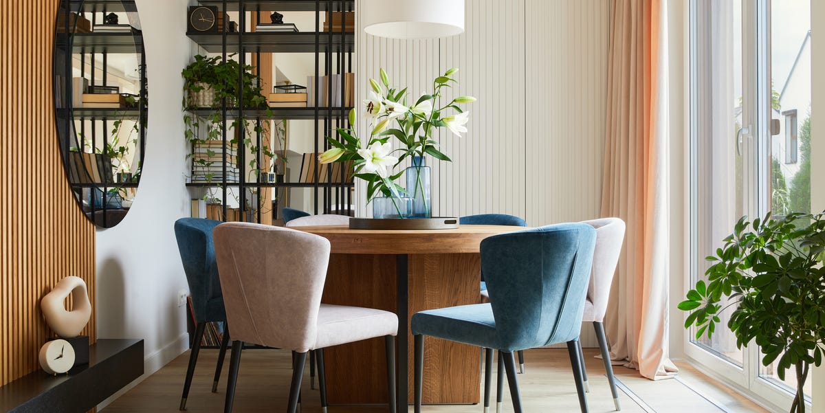
A poorly designed space does not always announce itself with neon walls, a suspiciously tiny rug, or a sofa that looks like it was assembled during a power outage. Sometimes, the room is expensive. Sometimes, everything is technically “on trend.” Sometimes, every pillow has been karate-chopped with professional confidence. And yet, something still feels wrong.
According to many interior design pros, the biggest sign of a poorly designed space is bad scale and proportion. In plain English: the furniture, lighting, art, rugs, and decor do not properly relate to the size of the roomor to one another. A giant sectional swallows a small living room. A tiny pendant light floats awkwardly above a dining table. A small piece of art looks stranded on a large wall like it took a wrong turn. The result is a room that feels uncomfortable before anyone can explain why.
The good news? Poor scale is fixable. You do not need to gut your home, sell your sofa on a dramatic Facebook Marketplace post, or start over with a designer-approved trust fund. You need a better understanding of proportion, layout, traffic flow, lighting, and how real people actually live in a room.
The #1 Sign of a Poorly Designed Space: Everything Feels the Wrong Size
When design pros walk into a room, they often notice scale before they notice style. A room can be modern, traditional, farmhouse, coastal, minimalist, maximalist, or “I inherited this from three relatives and made it work.” Style is flexible. Scale is less forgiving.
Scale refers to how the size of an item relates to the room. Proportion refers to how items relate to one another. A sofa may be the right scale for a large open living room but completely wrong for a narrow apartment. A coffee table may be beautiful on its own but look like doll furniture next to a deep sectional. A chandelier may be glamorous in a showroom but comically huge over a small breakfast nook.
Bad scale creates visual tension. You may not know the technical reason, but your brain senses the imbalance. The space feels crowded, skimpy, awkward, heavy, empty, or strangely unfinished. That is why designers care so much about measurements before mood boards. A stunning velvet chair still needs to fit through the door, leave room for knees, and not bully the rest of the room.
Why Poor Scale Makes a Room Feel Uncomfortable
Great interior design is not just about making a space look pretty in photos. It is about making a room feel natural to use. Poorly scaled furniture interrupts that comfort. You may have to shimmy around a bulky ottoman, squeeze between chairs, or sit too far from a table to place your drink down like a civilized person.
Rooms with poor scale often have one of two problems. First, they may be overfilled with pieces that are too large or too numerous. Second, they may be underfilled with small items that do not have enough presence. Both situations can make a home feel less intentional.
Oversized Furniture Can Shrink a Room
A common design mistake is buying furniture based on how it looks in a store instead of how it will fit at home. Showrooms are often much larger than residential rooms, so that “perfectly normal” sofa may arrive looking like it plans to occupy the entire zip code.
Oversized furniture blocks pathways, crowds windows, hides architectural features, and makes the room feel smaller. A large sectional can work beautifully, but only if the room has enough breathing space around it. If guests must climb over the chaise to reach the seat, the sofa is no longer furniture. It is an obstacle course.
Undersized Pieces Can Look Random and Unfinished
Small furniture is not always the safer choice. A tiny rug in a large living room can make the seating area look disconnected. A small coffee table can make a sofa feel bulky. A petite lamp on a large console can look timid, as though it is apologizing for being there.
Undersized decor can also make a space feel like it was decorated one nervous purchase at a time. Instead of creating confidence, the room feels scattered. Designers often solve this by using fewer pieces with stronger presence: a larger rug, properly sized art, a substantial coffee table, or a statement light fixture that fits the room instead of disappearing into it.
How to Tell If Your Room Has a Scale Problem
You do not need a design degree to spot poor scale. You simply need to look at your room with a slightly more suspicious eye. Start with the feeling of the space. Does the room feel crowded even when it is clean? Does one piece dominate everything else? Does the room feel unfinished even though you keep buying decor? These are clues.
Check the Walking Paths
A well-designed room allows people to move naturally. You should not have to turn sideways to pass between the sofa and coffee table. You should not bump into a chair every time you open a cabinet. Traffic flow is one of the most practical signs of good design.
In living rooms, leave enough space between major pieces so movement feels easy. In dining rooms, chairs should pull out comfortably without crashing into walls or sideboards. In bedrooms, both sides of the bed should feel accessible whenever possible. When a room works physically, it usually looks better too.
Look at the Rug
The rug is one of the easiest ways to diagnose a poorly designed space. A rug that is too small can make furniture look like it is floating separately instead of belonging to one conversation area. In a living room, the front legs of sofas and chairs should usually sit on the rug, or the rug should be large enough to anchor the full seating arrangement.
In a dining room, the rug should extend far enough beyond the table so chairs remain on the rug when pulled out. A dining rug that only fits under the table may look fine when no one is sitting there, but the moment chairs move, the room starts arguing with itself.
Study the Wall Art
Art that is too small, too high, or too isolated can throw off an entire wall. A single tiny frame on a large blank wall often looks accidental. A gallery wall with pieces spaced too far apart can feel chaotic instead of collected.
As a general rule, artwork should relate to the furniture below it. Above a sofa, console, or bed, art should feel connected to the width of the piece. That does not mean it has to match perfectly, but it should have enough visual weight to hold the wall. Hang art around eye level for most rooms, and lower it slightly when it relates to seated furniture.
Notice the Lighting
Lighting is another major clue. A room that depends only on one overhead fixture often feels flat, harsh, or gloomy. Poor lighting can make even beautiful furniture look tired. Designers usually layer lighting with overhead lights, table lamps, floor lamps, sconces, and accent lighting.
Scale matters here too. A chandelier that is too small over a dining table looks underwhelming. A lamp that is too short beside a sofa may not provide useful light. A giant floor lamp in a narrow corner may feel like it is auditioning for a sci-fi movie. Good lighting should support the room’s function and mood without overpowering it.
Other Signs of a Poorly Designed Space
While bad scale is the top giveaway, it rarely travels alone. Like an uninvited guest who brings three friends, poor scale often appears with clutter, weak lighting, awkward layouts, and a lack of personality.
Too Much Matching
A room where every piece comes from the same furniture set can feel flat. Matching sets are convenient, but they often remove the character that makes a home feel personal. A more polished room usually mixes materials, shapes, ages, and textures. Think wood with metal, smooth surfaces with woven pieces, clean lines with something vintage or handmade.
The goal is not chaos. The goal is coordination without looking like a showroom display. A room should feel collected, not copied and pasted.
No Clear Focal Point
A well-designed room gives the eye somewhere to land. The focal point might be a fireplace, a beautiful view, a bed, a dining table, a large artwork, or a dramatic light fixture. When there is no focal point, the room can feel restless.
Sometimes the problem is that everything is trying to be the star. A bold rug, busy wallpaper, oversized art, patterned curtains, and colorful furniture can all work together, but only when there is hierarchy. Without hierarchy, the room feels like five people talking at once.
Furniture Pushed Against Every Wall
Many people push furniture against the walls because they think it will make the room feel larger. Sometimes it does the opposite. In a large room, wall-hugging furniture can create an awkward empty center. In a living room, floating furniture slightly inward can make conversation easier and define a cozier zone.
This does not mean every room needs a sofa in the middle like a museum exhibit. It means furniture should respond to how the space is used, not simply line the walls out of habit.
Clutter Without Intention
Clutter is not the same as personality. A home can be layered, colorful, and full of objects while still feeling intentional. The difference is editing. Poorly designed spaces often have too many small items competing for attention: tiny frames, random candles, souvenir bowls, mail piles, decorative objects, and mystery cables living their best lives.
Editing does not mean stripping the room bare. It means choosing what deserves attention. Keep the pieces that tell a story, serve a purpose, or add beauty. Store or donate the rest. Your shelves do not need to prove they have been working overtime.
How to Fix a Poorly Designed Space Without Starting Over
The fastest way to improve a poorly designed space is not always shopping. In fact, shopping too soon can make the problem worse. Before buying anything, measure the room, identify the main function, and decide what needs to stay.
Step 1: Measure Before You Buy
Measurements are not glamorous, but neither is returning a sofa that blocks a doorway. Measure the room’s length, width, ceiling height, window placement, door swings, and major pathways. Then measure your existing furniture. This will show you whether the issue is one oversized item, too many pieces, or decor that lacks enough scale.
Step 2: Edit the Room
Remove small accessories first. Take out extra side tables, unused chairs, too-small lamps, and decor that does not add much. Live with the simplified room for a day. Often, the space immediately feels calmer and more balanced.
Editing helps you see what the room actually needs. Maybe the sofa is fine, but the rug is too small. Maybe the layout works, but the lighting is weak. Maybe the room is not poorly designedit is just wearing too many accessories at once.
Step 3: Anchor the Space
Use a rug, lighting fixture, artwork, or large furniture piece to anchor the room. Anchoring gives a space structure. In a living room, that may mean a rug large enough to connect the seating. In a bedroom, it may mean a headboard, nightstands, and lamps that relate in height and width. In a dining room, it may mean a table, rug, and chandelier that feel like one composition.
Step 4: Layer Lighting
Replace the “one sad ceiling light” approach with layers. Add a table lamp for warmth, a floor lamp for reading, and accent lighting for depth. Use dimmers when possible. Soft, adjustable light makes a room feel more expensive, more comfortable, and much more forgiving after 7 p.m.
Step 5: Add Personality With Restraint
After scale, layout, and lighting are working, add personality. This is where art, books, textiles, plants, vintage finds, and meaningful objects shine. The key is restraint. A few personal pieces displayed with confidence will always look better than twenty tiny objects scattered like decorative confetti.
Room-by-Room Examples of Better Scale
Living Room
If your living room feels cramped, check the depth of the sofa, the size of the coffee table, and the rug. A deep sectional may need a larger room, while a sofa with visible legs can feel lighter. The coffee table should be close enough to use but not so close that knees file a complaint. The rug should connect the seating area rather than sit alone in the middle like a decorative postage stamp.
Bedroom
In a bedroom, the bed is usually the star. Choose a bed size that allows comfortable circulation. Nightstands should relate to the height of the mattress, and lamps should be tall enough for reading. If the bed wall feels empty, add larger art, a wider headboard, or layered textiles to create balance.
Dining Room
A dining room can look poorly designed when the table, chairs, rug, and light fixture do not communicate. The chandelier should feel centered and properly sized over the table. Chairs should have room to move. The rug should be large enough to handle real dinners, not just imaginary ones where nobody pulls out a chair.
Entryway
Entryways are small but powerful. A tiny console under a large mirror may feel weak, while a bulky cabinet can block flow. Choose pieces that fit the wall and leave room for movement. Add a tray, lamp, mirror, or art to make the area feel intentional instead of accidental.
Why Function Is the Secret Ingredient of Good Design
The best rooms are not just beautiful. They support daily life. A poorly designed space often fails because it was decorated for a fantasy version of living. The formal chair nobody sits in. The white rug under toddlers, pets, and spaghetti night. The coffee table so delicate it creates emotional tension every time someone reaches for a drink.
Design pros often advise people to decorate for the life they actually have. That means choosing durable fabrics, practical layouts, reachable storage, comfortable seating, and lighting that works from morning coffee to late-night scrolling. When a room fits your habits, it automatically feels better designed.
Experiences That Reveal the #1 Sign of a Poorly Designed Space
One of the easiest ways to understand bad scale is to remember rooms that looked fine at first but felt annoying over time. For example, imagine a living room with a beautiful oversized sofa. It photographs well. It looks plush. It practically whispers, “Cancel your plans.” But after a week, the problems appear. The coffee table is too far away because the sofa is too deep. The walkway to the balcony is narrow. The side chair no longer fits, so guests sit in a row like they are waiting at the dentist. The sofa is not uglyit is simply wrong for the room.
Another common experience happens with rugs. Many homeowners buy a smaller rug because it costs less and seems safer. At first, it adds color and softness. But once placed under the furniture, it makes the entire room look disconnected. The sofa sits off the rug, the chairs barely touch it, and the coffee table appears to be floating on a tiny island. A larger rug, even a simple neutral one, can instantly make the same furniture look more expensive and intentional.
Lighting offers another lesson. A room may have lovely furniture but still feel cold because the only light comes from a ceiling fixture. Overhead lighting alone can flatten textures and create harsh shadows. Add two lamps, a dimmer, or a wall sconce, and suddenly the room feels layered. Nothing major changed, yet the atmosphere improves. This is why designers treat lighting as part of the architecture of comfort, not as an afterthought.
Art placement can create the same “almost right” feeling. A small framed print placed too high above a large sofa makes the wall feel empty and the sofa feel heavier. Lowering the art and choosing a larger pieceor grouping several pieces tightlycan bring the wall back into proportion. The fix may take ten minutes, but the room looks more finished immediately.
There is also the experience of overdecorating. Many people try to fix a room by adding more: more pillows, more candles, more trays, more objects, more tiny plants bravely fighting for sunlight. But if the foundation is off, accessories only create noise. Removing half the small items often makes the remaining pieces look better. The room exhales. The eye can finally rest.
The most important lesson is that a well-designed room does not need to be perfect. It needs to feel balanced, usable, and connected to the people who live there. The #1 sign of a poorly designed space is not a specific color, trend, or price point. It is the uneasy feeling that the parts do not belong to the whole. When scale and proportion are corrected, even modest rooms can feel polished, welcoming, and quietly confident.
Conclusion
The biggest sign of a poorly designed space is poor scale and proportion. When furniture is too large, rugs are too small, lighting is awkward, or art does not relate to the wall, the entire room can feel off. The fix begins with measuring, editing, improving traffic flow, anchoring the room, and layering lighting. From there, personality can shine without creating clutter.
A beautiful room is not about copying a trend or buying the most expensive sofa. It is about balance. When every piece feels like it belongsphysically, visually, and functionallythe space becomes easier to live in and easier to love.
Note: This HTML includes only the body section and is formatted for easy copying into a web publishing editor.