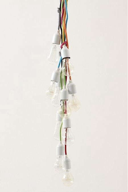
If your ceiling has been acting like a background extra while the rest of your room tries to carry the whole scene, Anthropologie’s colorful pendant lighting may be the design intervention it has been waiting for. A well-chosen pendant does more than illuminate a countertop or dining table. It draws the eye upward, adds personality, and quietly tells your guests, “Yes, I do have opinions about scallops, glass, brass, and mood lighting.”
That is exactly why Dose-of-Color pendants at Anthropologie feel so timely. They deliver the kind of decorative punch that turns practical lighting into a style moment. Instead of defaulting to safe, invisible fixtures, these pendants lean into blush pink milk glass, green glass, scalloped edges, pleated silhouettes, printed shades, and rich texture. In other words, they are not here to whisper. They are here to glow, flirt, and occasionally steal the show from your backsplash.
For anyone shopping for Anthropologie pendant lighting, the appeal is obvious: the collection blends decorative charm with real function. Some options feel playful and retro. Others look refined, romantic, or a little bit bohemian. The common thread is color used with intention. These are not neon carnival lights. They are curated, room-enhancing shades that bring warmth, softness, and style into spaces that often get overrun by white, black, and brushed nickel.
Why Anthropologie’s Colorful Pendants Work So Well
The secret is balance. Anthropologie’s pendant lights tend to combine expressive details with familiar shapes, so they feel fresh without tipping into chaos. A scalloped edge softens the geometry of a room. A blush or green glass shade adds color, but in a way that still feels grown-up. A brass detail anchors the whimsy so the fixture reads as intentional rather than accidental, like someone spilled a paint chip fan onto the ceiling and hoped for the best.
This is especially clear in Anthropologie’s more recognizable pendant styles. The Greta Scalloped Metal Pendant offers a cheerful, compact profile with color options that feel decorative but easy to place. The Eloise Scallop Milk Glass Pendant takes a more polished route, using curved edges and tinted glass to create a soft statement that still works in kitchens, breakfast nooks, and entryways. Meanwhile, textile-forward and pleated styles add another layer of personality for shoppers who want lighting that feels more collected than cookie-cutter.
That matters because pendant lighting has shifted from a purely practical choice to a major design feature. In many homes, the pendant is no longer an afterthought tossed over an island at the eleventh hour. It acts like jewelry for the room, but useful jewelry, which is frankly more than can be said for most earrings after hour three of a dinner party.
Color Changes the Mood Faster Than You Think
Neutral lighting fixtures have their place, but a colorful pendant can transform the emotional temperature of a room almost instantly. Soft pinks warm up hard surfaces such as stone, tile, and painted cabinets. Green glass can make brass feel fresher and wood cabinetry feel richer. Creamy milk glass introduces color while keeping the light diffusion gentle and flattering. The result is a room that feels layered and designed rather than merely assembled.
This is one reason colorful pendant lights are especially effective in kitchens and dining spaces. Those rooms are often full of functional finishes: countertops, appliances, stools, plumbing fixtures, and lots of right angles. A pendant with a hint of color breaks up that strictness. It introduces softness without sacrificing structure, which is exactly what many modern homes need.
Best Rooms for a Dose-of-Color Pendant
Kitchen Islands
The kitchen is the most obvious place for statement pendant lighting, and for good reason. It is a hardworking zone that benefits from both task light and decorative focus. A pair or trio of colorful pendants above an island can keep a white kitchen from feeling clinical or help a wood-heavy kitchen feel more playful. If your cabinets and counters are already fairly neutral, an Anthropologie pendant in blush, green, or another muted tone can become the visual bridge that connects cabinetry, bar stools, and decorative accents.
For kitchens, colorful pendants work best when the shade complements the room’s broader palette instead of fighting it. A green glass fixture can echo herbs, plants, or olive-toned textiles. A pink-toned pendant can soften black accents and make brass hardware feel warmer. A patterned or pleated shade can add dimension where flat finishes dominate. This is where kitchen island lighting becomes more than functional overhead light. It becomes a design decision with actual personality.
Dining Areas and Breakfast Nooks
Dining spaces are ideal for pendants with a little drama. The table already serves as a focal point, so the light above it should feel deliberate. A colorful Anthropologie pendant can make a small breakfast nook feel curated and charming, while a larger dining room can handle something more sculptural or textural. Milk glass, pleated fabric, or scalloped forms work particularly well here because they cast a gentler visual impression than harsher industrial fixtures.
In a breakfast area, a pendant can also help define the zone without walls. One colorful fixture over a round table says, “This is where the coffee happens,” which is valuable information in any household.
Entryways, Bedrooms, and Reading Corners
Do not limit colorful pendant lights to kitchens. In an entryway, one expressive pendant can create a strong first impression before anyone notices your excellent shoe storage situation. In a bedroom, a pendant can replace a basic flush mount and bring softness overhead, especially when paired with warm bulbs and textiles. In a reading nook or sitting area, a small pendant can add atmosphere and help carve out a cozy corner inside a larger room.
This flexibility is part of the appeal of the Anthropologie aesthetic. Many of the brand’s fixtures feel decorative enough for living spaces while remaining practical enough for everyday use. They bring style without requiring the room to become a full-blown stage set.
How to Style Anthropologie Pendant Lighting Without Overdoing It
Colorful pendants make a stronger impression when the rest of the room gives them a little breathing room. That does not mean the room has to be boring. It just means not every surface needs to be competing for attention like a group project where nobody trusts each other.
Pair Color with Texture
If your pendant has a tinted glass or painted metal finish, support it with texture elsewhere in the room. Think wood stools, woven shades, linen curtains, ceramic vases, or a lightly veined stone countertop. Texture grounds color and keeps it from feeling too sugary or overly styled. Anthropologie’s lighting often works best in spaces that mix materials rather than relying on one finish from floor to ceiling.
Repeat the Hue, Don’t Clone It
A pendant light looks more integrated when its color shows up subtly somewhere else in the room. That could be a dish towel, a piece of art, a floral arrangement, or a cushion in a nearby banquette. The key is repetition without perfect matching. A blush pendant does not need a blush kitchen. It just needs a few quiet echoes so it looks invited rather than stranded.
Let the Fixture Be the Star
If you choose a scalloped, pleated, tasseled, or richly colored pendant, keep surrounding décor edited. The point is to make the light feel special. Too many ornate details nearby can blur the effect. Good lighting should feel like a focal point, not like it wandered into a costume party by mistake.
Practical Buying Tips Before You Fall in Love at First Glow
Falling for a pendant based on looks alone is understandable. Dangerous, but understandable. Before buying, think through scale, hanging height, bulb temperature, and how the fixture will behave in the room once it is actually installed.
Get the Size Right
Pendant lighting should relate to the size of the surface below it and the openness of the room around it. A tiny pendant over a large island can look apologetic. An oversized pendant in a compact nook can feel like it is trying to land a plane. If your space is open-concept, you may want pendants that make a statement without blocking sight lines across the room. If the room is smaller or more enclosed, a decorative fixture can carry more visual weight.
Mind the Hanging Height
In most kitchens and dining areas, pendants are commonly hung about 30 to 36 inches above the counter or table surface. That range usually keeps the light useful without interrupting conversation or views. Ceiling height matters too. In rooms with higher ceilings, pendants can often hang a bit higher or use longer rods or cords to feel properly scaled.
Spacing Matters More Than People Think
When using multiple pendants over an island, spacing has a huge impact on whether the final look feels polished. A common approach is to leave roughly 24 to 30 inches between pendants and keep them several inches in from the island’s ends. This helps the grouping feel centered and intentional. The exact measurement depends on fixture width and island size, but the broader lesson is simple: do not eyeball it five minutes before the electrician arrives.
Pick the Right Bulb Temperature
Even the prettiest pendant can disappoint if the bulb makes the room look like a dentist’s office. For a warm, welcoming atmosphere, many designers and lighting guides favor bulbs in the 2700K to 3000K range. That warmth tends to flatter colored glass, brass, wood, and skin tones. If the pendant sits over a serious prep zone and you need sharper task light, you can lean slightly brighter, but consistency across nearby fixtures is important. Mixed bulb temperatures can make a beautifully designed room feel off for no obvious reason, which is one of the rudest tricks lighting can play.
Are Dose-of-Color Pendants Worth It?
If you want invisible lighting, probably not. But if you want a fixture that adds function and personality at the same time, the answer is often yes. Anthropologie’s pendant selection spans a wide range, from relatively accessible small statement pieces to more investment-level fixtures with designer energy. That gives shoppers room to choose their level of drama and commitment.
What you are really paying for is more than illumination. You are paying for shape, finish, mood, and a little bit of delight. In a room full of hard-working essentials, that matters. Lighting is one of the few elements that can affect both daytime appearance and nighttime atmosphere. A colorful pendant earns its keep twice: once when the sun is up and the room needs a focal point, and again when evening falls and the glow turns the entire space softer and more inviting.
Design Verdict: Color Overhead Is a Smart Move
Lighting: Dose-of-Color Pendants at Anthropologie is not just a trend story. It reflects a broader shift toward expressive, layered interiors where function and personality are expected to coexist. Homeowners are moving away from sterile, one-note lighting and choosing fixtures that bring beauty, texture, and individuality into everyday rooms.
Anthropologie is especially good at this category because its pendants often hit the sweet spot between playful and polished. They feel curated rather than cold, decorative rather than fussy, and colorful without becoming chaotic. Whether you are refreshing a kitchen island, waking up a breakfast nook, or replacing a forgettable entry fixture, a well-chosen pendant can completely change the room’s tone.
And that, really, is the magic of it. A small shift overhead can make everything below it look better. Cabinets feel richer. Walls feel warmer. Meals feel cozier. Even your ordinary Tuesday toast starts to seem like it was plated by someone with excellent taste.
The Experience of Living With a Colorful Pendant
Living with a colorful pendant is different from merely admiring one on a product page. Online, you notice the shape first: the scallop, the pleat, the shade, the polished hardware. In a real room, what you notice is the atmosphere. A soft green or blush pendant changes the tone of the space throughout the day. In the morning, it can look crisp and decorative in natural light, almost like a little sculpture hanging over the table. By evening, the same fixture feels warmer and moodier, and the color begins to influence the room in subtle ways that are hard to appreciate until you actually sit under it with a cup of coffee or a late dinner.
One of the most satisfying parts of the experience is how a colorful pendant gives a room identity. In open-concept homes, rooms can blur together if every finish is neutral and every light fixture is safe. Add one dose-of-color pendant over an island or breakfast table, and suddenly that area feels defined. It becomes a destination instead of just another patch of square footage. People tend to gather under it. Eyes go there naturally. Photos of the room look better because there is a clear focal point instead of a ceiling full of blank nothingness.
There is also a practical emotional effect. Warm, flattering light makes daily routines feel better. Food looks more appetizing. Conversations feel more intimate. The room seems more finished, even if not every other detail is perfect yet. Many people spend money on décor trying to make their home feel cozy, collected, or special, when a big part of that feeling actually comes from lighting. A pendant with character can do a surprising amount of heavy lifting.
Another real-world advantage is that colorful pendants often make styling easier, not harder. Once the fixture is in place, it gives you clues about what the room wants next. A green pendant might nudge you toward natural wood, linen, pottery, or olive accents. A blush glass pendant may inspire softer art, warmer metals, or curved accessories. Instead of creating limitations, the pendant becomes a starting point. It helps the room tell you who it wants to be, which is honestly more helpful than some renovation mood boards.
Of course, there are lessons people only learn after installation. The first is that bulb choice matters enormously. The wrong bulb can flatten the whole effect, making a charming fixture feel harsh or oddly clinical. The second is that scale becomes more obvious in real life than it does online. A pendant that felt dainty on-screen can look much bolder once suspended in a small room. And the third lesson is that colorful lighting tends to invite compliments. Guests notice it, ask about it, and remember it. That alone makes it different from most home purchases, which usually get approximately three seconds of attention before everyone moves on to the snacks.
In the long run, the experience is less about novelty and more about atmosphere. A good colorful pendant does not wear out its welcome. Instead, it becomes one of those details that quietly improves everyday life. You stop thinking of it as a product and start thinking of it as part of the room’s personality. That is when you know the fixture was worth it. It is no longer just something that lights the room. It is something that helps make the room feel like yours.
Conclusion
Anthropologie’s dose-of-color pendants prove that practical lighting does not have to be visually shy. With scalloped forms, tinted glass, fabric shades, and cheerful yet sophisticated color options, these fixtures make it easier to add personality overhead without sacrificing everyday function. The best results come from matching the pendant to the room’s scale, choosing a warm bulb temperature, and styling the surrounding space so the light has room to shine. Done right, a colorful pendant does more than brighten a surface. It makes the whole room feel more thoughtful, more layered, and much more alive.