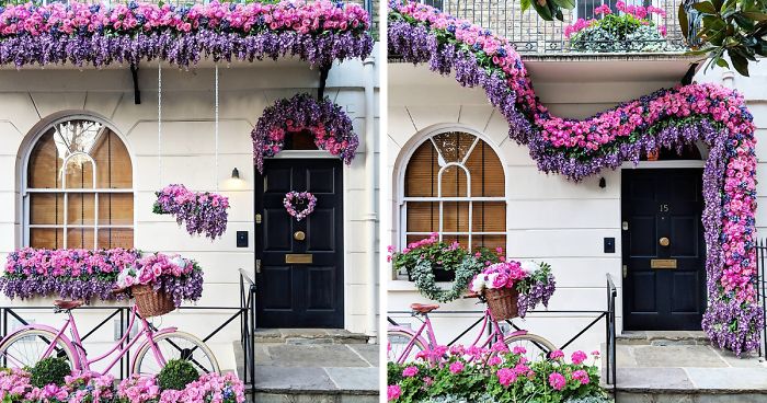
London has no shortage of grand museums, royal landmarks, and queues that somehow become longer the moment you join them. But one of the city’s most delightful visual pleasures is much quieter: the front door.
Walk through neighborhoods lined with Georgian townhouses, Victorian terraces, brick cottages, and pastel-painted facades, and you will notice that London front doors are rarely just doors. They are miniature stage sets. They have glossy paint, brass knockers, striped awnings, tiled steps, potted olive trees, and house numbers that appear to have been selected after a heated debate among very stylish pigeons.
Some entrances look so perfectly balanced, color-coordinated, and mildly mysterious that they could belong in a Wes Anderson movie. You can practically imagine a deadpan concierge opening the door, handing you a tiny envelope, and informing you that the train to an imaginary seaside hotel leaves in seven minutes.
This collection celebrates 30 charming London front-door moments that capture that storybook quality. None of them needs a dramatic mansion, a moat, or a butler named Nigel. The magic often comes from a painted panel, a polished brass detail, a crooked-but-charming plant pot, or a color combination brave enough to make a gray morning feel less gray.
Why London Front Doors Feel So Cinematic
A great front door does not need to shout. It simply knows its role. On a London street, the door is often framed by brickwork, white trim, fanlights, narrow steps, railings, and windows stacked with reassuring confidence. The architecture provides the symmetry; the homeowner supplies the personality.
That combination is exactly why colorful doors work so well in the city. A deep green door can make pale brick feel richer. A dusty pink door can soften a formal townhouse. A bright blue door can turn a serious Victorian facade into something that looks ready to sell pastries, postcards, and an extremely expensive mechanical pencil.
The Wes Anderson connection is not about copying a movie set one paint color at a time. It is about visual intention. The most memorable doors use balance, contrast, repetition, and slightly unusual details. A centered knocker, matching planters, a painted archway, or a precise stripe can create the same pleasing sense that every object has been placed on purpose.
30 London Front Doors With Storybook Charm
-
The Pistachio Green Entrance
A pale green door framed by cream trim feels fresh without becoming sugary. Add brass hardware and two clipped shrubs, and the whole entrance looks ready for a charming fictional pastry shop.
-
The Powder Blue Door With a Fanlight
Soft blue paint beneath a rounded fanlight creates instant period drama. It is restrained, elegant, and just whimsical enough to suggest a secret correspondence is happening inside.
-
The Burgundy Door on Warm Brick
Deep wine red against weathered London brick brings the kind of confidence normally reserved for old libraries and people who know how to pronounce every wine region correctly.
-
The Butter Yellow Surprise
A buttery yellow door brightens a cloudy street without looking like it escaped from a cartoon. Paired with black railings, it becomes cheerful, polished, and slightly theatrical.
-
The Dark Teal Victorian
Teal is a front-door overachiever. It feels traditional, playful, and unexpectedly refined all at once. On a Victorian terrace, it makes white trim and brass numbers look especially crisp.
-
The Blush Pink Townhouse Door
Blush pink works best when the rest of the facade remains calm. Against pale stucco or cream-painted brick, it feels romantic without drifting into birthday-cake territory.
-
The Navy Door With White Columns
A navy entrance brings structure to a light-colored facade. The effect is formal but not stiff, like a well-tailored blazer worn with sneakers nobody expected.
-
The Glossy Black Door With Gold Details
Black front doors can be classic, but the best ones avoid looking severe. Glossy paint, a bright brass knocker, and a cheerful pot of greenery keep the mood warm.
-
The Coral Door Behind Iron Railings
Coral has enough warmth to wake up a shaded entryway. Seen through black iron railings, it feels like a little theatrical reveal before the main scene begins.
-
The Lavender Door With Patterned Tiles
A muted lavender door paired with Victorian tiles is pure visual delight. It is soft, unusual, and somehow makes even a rainy pavement look like part of the composition.
-
The Forest Green Door and Brass Lion Knocker
Few combinations feel more London than dark green paint and aged brass. A lion knocker adds a hint of grandeur, although the lion probably has strong opinions about online deliveries.
-
The Red Door With White Trim
A rich red door is bold, timeless, and impossible to ignore. White trim keeps it from becoming too heavy, while polished hardware gives it a proper finishing flourish.
-
The Eggshell Blue Cottage Door
This soft, chalky blue works beautifully on smaller homes and mews-style entrances. It feels relaxed and friendly, like a place where someone definitely owns a good teapot.
-
The Mustard Door With Slate Steps
Mustard yellow can be difficult, but on a brick facade with gray slate steps it looks warm and intentional. The secret is choosing ochre rather than highlighter yellow.
-
The Cream Door With a Circular Window
A round porthole window can make even a simple entrance feel memorable. In a soft cream finish, it becomes less nautical and more “private club for charming oddballs.”
-
The Peacock Blue Statement Door
Peacock blue belongs to homeowners who understand that front doors are small opportunities for joy. It looks especially dramatic beside pale stone, red brick, or dark railings.
-
The Warm Gray Door With Copper Hardware
Not every cinematic door needs bright paint. A warm gray door paired with copper or aged bronze hardware can feel elegant, balanced, and quietly expensive.
-
The Olive Green Entrance With Terracotta Pots
Olive green creates a beautiful bridge between brick, stone, and plants. Terracotta pots on either side make the whole scene feel collected rather than decorated.
-
The Cherry Red Mews Door
On a compact street, a cherry-red door creates a perfect focal point. It turns a modest facade into a memorable one without demanding a marching band.
-
The Lilac Door Behind a White Gate
White gates make pastel doors pop. Lilac adds a soft, dreamy quality, especially when paired with a climbing plant that appears to be having a very productive year.
-
The Sage Door With Frosted Glass
Sage green and frosted glass create a calm, almost botanical entryway. It feels modern enough for a renovated home but gentle enough for a historic street.
-
The Orange Door That Refuses To Be Boring
Orange is not for timid facades. Used in a burnt or rust-toned shade, however, it can make old brick glow and transform a narrow entrance into a scene-stealer.
-
The White Door With a Colorful Transom
A white door can still have personality when the glass above it carries a subtle tint or decorative pattern. It is minimalism with a tiny wink.
-
The Midnight Blue Door With House Numbers in Brass
Midnight blue feels polished, traditional, and slightly mysterious. Large brass numbers make the design easier to read from the sidewalk and more satisfying in photographs.
-
The Pink Door With Matching Planters
Matching planters create the kind of symmetry that makes people stop walking for a second. A pink door in the middle completes the frame like a perfectly centered prop.
-
The Chartreuse Door in a Quiet Row
Every street needs one brave door. Chartreuse can be wonderfully playful when the rest of the facade is understated, like a splash of lime in a very serious cocktail.
-
The Chocolate Brown Door With Cream Panels
Brown is often overlooked, which is a shame. A rich chocolate door with pale inset panels can look deeply traditional, cozy, and much more interesting than plain black.
-
The Sky Blue Door With a Checkerboard Step
Checkerboard tiles instantly add movement and character. Pair them with a sky-blue door, and the entryway feels like it belongs in a carefully styled travel postcard.
-
The Brick-Red Door With Eucalyptus Wreath
Brick red against pale stucco has a nostalgic, collected look. A simple eucalyptus wreath gives the entrance texture without making it feel like a seasonal craft store exploded.
-
The Deep Plum Door at Dusk
Plum paint shifts beautifully in changing light. In the morning it may look almost brown; by evening, it becomes moody and dramatic in the best possible way.
What Makes These Front Doors Feel Like Movie Sets?
The secret is not simply color. A bright door without context can look random. A cinematic entrance feels considered because the details cooperate.
Symmetry Gives the Eye a Place To Rest
Matching planters, centered knockers, evenly placed lamps, and balanced railings all help create order. Symmetry does not have to be perfect. In fact, a slightly uneven plant or a hand-painted number can keep the scene from feeling too polished.
Color Creates the Plot
Paint is often the fastest way to change a facade’s personality. Deep greens feel historic and grounded. Blue doors feel crisp and calm. Pink, coral, and yellow add optimism. Burgundy and plum bring drama. The best choices respond to the brick, trim, paving, and natural light already present.
Hardware Supplies the Character Development
A brass letterbox, a black iron handle, a ceramic house number, or an old-fashioned knocker can do more than a dozen decorative accessories. Think of hardware as the supporting cast: small, important, and occasionally responsible for stealing the scene.
Plants Make an Entrance Feel Lived In
A door becomes more welcoming when it has some greenery nearby. Bay trees, clipped boxwoods, olive trees, ferns, herbs, and flowering pots add softness to brick and stone. The goal is not to create a jungle gym for neighborhood cats. A few well-chosen plants are enough.
How To Borrow the London Front Door Look at Home
You do not need a Georgian townhouse or a cinematic production designer to make your own front door more memorable. Start with the architecture you already have. A modest home can support a strong paint color, a new handle, a well-chosen house number, and a pair of simple planters.
Before committing to paint, look at the door throughout the day. Morning light, cloudy light, and evening light can make the same color behave like three different personalities. Test samples next to brick, stone, siding, trim, and paving. The paint swatch may look sophisticated in a store and unexpectedly fluorescent outside. Paint has hobbies. One of them is surprising people.
Choose one focal point. That may be a jewel-toned door, patterned tiles, bold house numbers, or unusual hardware. When every detail competes for attention, the entrance loses its charm. A great doorway feels composed, not crowded.
Experience: Taking a Slow Front-Door Walk Around London
There is a particular pleasure in walking around London without a strict plan, especially when you stop treating every street as a shortcut between famous attractions. A front-door walk is slower than a museum visit, cheaper than afternoon tea, and far less likely to involve a gift shop selling a tiny crown for your refrigerator.
Begin in an area with terraced houses and let the street set the pace. The first few doors may look ordinary: dark paint, brass letter slots, a recycling bin attempting to ruin the composition. Then, suddenly, you spot a pale pink doorway framed by white molding and two perfect bay trees. A few steps later, there is a glossy teal door with a brass knocker shaped like a hand. Then comes a mustard-yellow entrance with black-and-white tiles, looking so carefully arranged that you half expect the homeowner to step outside carrying a vintage suitcase.
The best part of this kind of walk is that you start noticing patterns. Brick changes color from one neighborhood to another. Some homes lean into symmetry with matching planters, matching lamps, matching everything. Others create charm through contrast: a formal black railing beside a bright blue door, or a strict Victorian facade softened by a huge, unruly hydrangea.
London weather helps, too. On a bright day, glossy paint catches the sun and makes ordinary details shine. On an overcast afternoon, pastel doors look softer and more theatrical against gray skies. After rain, the pavement reflects facades and railings, turning the street into a slightly distorted mirror. It is one of the few times getting caught in a drizzle can feel aesthetically productive.
A good front-door walk also changes how you think about homes. You realize that the doorway is not just a boundary between public and private space. It is a small announcement. It says someone cared enough to choose this green, this brass, this tile, this planter, this number. It may not reveal much about the people inside, but it offers a clue about the mood they wanted to create before anyone even knocked.
That is why these London doorways feel so cinematic. They are not grand because they are expensive. They are memorable because they are deliberate. They make a person pause, smile, and briefly wonder whether the next building might contain a secret hotel lobby, an eccentric family portrait, or a tiny elevator operated by a man in a red cap.
Note: This is an original editorial appreciation piece. The numbered entries are visual design portraits rather than a location guide, and private residences should always be enjoyed respectfully from public spaces.