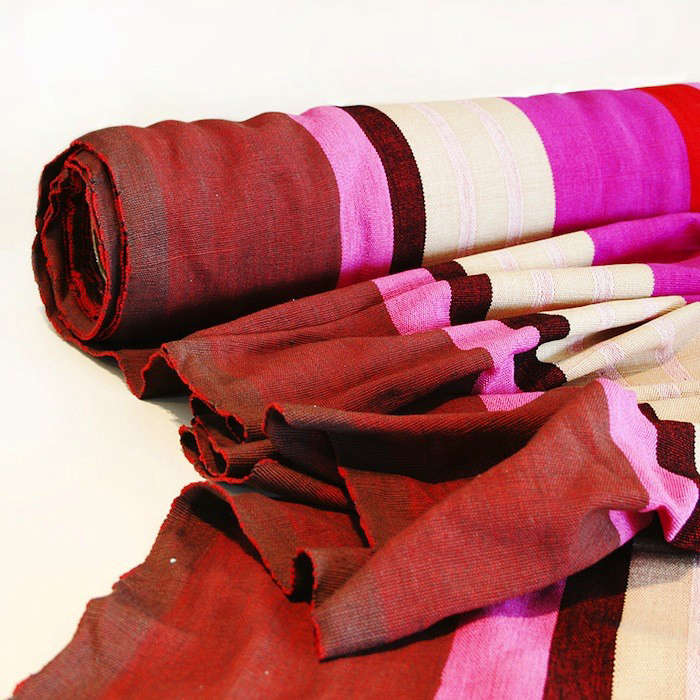
Some names sound like they belong to a summer cocktail. Others sound like a boutique fabric you suddenly become emotionally attached to after seeing one well-styled room online. Barefoot Berry Stripe falls firmly into the second category. It has that irresistible mix of charm, color, and design confidence that makes people say, “I only came here for throw pillows,” and then leave mentally redecorating an entire guest room.
At its core, Barefoot Berry Stripe is best understood as a textile story: handwoven character, bold but orderly stripes, and a rich berry palette that feels cheerful without becoming childish. It carries the kind of visual energy that can wake up a room in seconds. It is not trying to be shy. It is not apologizing for liking color. It is, in the most flattering possible way, the design equivalent of someone who wears lipstick to the grocery store and somehow makes it seem reasonable.
What makes this pattern especially interesting is that it sits at the crossroads of several enduring interior trends. Stripes never really disappear, because they are one of the rare motifs that can read as classic, coastal, preppy, playful, tailored, or artistic depending on scale and color. Berry tones also keep finding their way back into interiors because they add warmth, depth, and personality without the heaviness of darker browns or the sweetness of pastel pink. Put the two together and you get a textile that feels both expressive and surprisingly useful.
This article takes a close look at what Barefoot Berry Stripe suggests as a design idea, why striped berry-toned textiles remain so appealing, how to use them well, and what living with a pattern like this actually feels like in real rooms. If you have ever wanted your home to feel more layered, more human, and just a little less like a beige waiting room, you are in the right place.
What Is Barefoot Berry Stripe, Exactly?
Barefoot Berry Stripe refers to a striped cotton textile associated with Barefoot’s handwoven design tradition. That matters because this is not just “a stripe.” It comes from a design language shaped by simple geometry, strong color, and craftsmanship. In plain English, that means the fabric has more personality than the average mass-produced yardage that shows up, shrugs, and blends into the background.
The phrase also tells you almost everything you need to know about the vibe. Barefoot suggests grounded, tactile, handmade ease. Berry points to a juicy color family somewhere between raspberry, plum, red, and pink. Stripe gives the pattern structure, rhythm, and a sense of order. The result is a textile that feels relaxed yet intentional. Think of it as the sweet spot between bohemian warmth and tailored design.
That combination is one reason striped textiles continue to thrive in interiors. Designers love stripes because they can change how a room feels. Horizontal stripes can make a narrow space appear wider. Vertical stripes can make ceilings feel taller. Smaller stripes can act almost like texture, while bolder bands become a focal point. Barefoot Berry Stripe lands in that delicious middle ground where the pattern has presence, but it can still play nicely with other pieces in the room.
Why the Pattern Works So Well
1. Stripes Bring Order to Color
Colorful rooms can go wrong when they lack structure. That is where stripes earn their keep. Even when the palette is lively, the repetition of parallel lines adds discipline. Your eye understands the rhythm immediately. The room feels energetic, but not chaotic. In other words, Barefoot Berry Stripe gives you permission to be fun without looking like you lost a bet with a paint store.
This is one reason stripes are so resilient in American decorating. They can be graphic and modern, but they also feel timeless. A stripe can live comfortably in a cottage kitchen, a polished sitting room, a beach house bedroom, or a creative studio apartment. Change the scale, soften the palette, or mix in natural woods and woven textures, and the same basic motif suddenly tells a different story.
2. Berry Tones Feel Warm, Rich, and Human
Berry shades are quietly brilliant in home design. They carry some of the drama of red, some of the softness of pink, and some of the sophistication of plum. They can read cozy in winter, fresh in spring, and deliciously inviting all year long. Unlike primary red, which can feel pushy, berry tends to feel layered. It has mood. It has depth. It has the confidence of a color that knows it looks good under lamplight.
Berry also works beautifully with a wide range of companion tones. Pair it with cream and natural wood for a relaxed, artisanal look. Add navy or indigo for something classic and slightly coastal. Bring in olive, brass, or deep green if you want more richness. Mix it with pale blush and soft gray if you prefer a gentler, more contemporary palette. Barefoot Berry Stripe is versatile precisely because berry is more adaptable than people expect.
3. Handmade Character Softens the Geometry
One of the most appealing things about handcrafted textiles is that the pattern never feels too sterile. Machine-perfect stripes can look sharp, but they can also feel cold if the rest of the room is not warm enough to support them. A handmade-feeling textile introduces tiny irregularities, tactile softness, and visual depth. The stripe becomes more inviting. It feels lived-in rather than showroom-stiff.
That matters for modern interiors, especially at a time when many people are tired of rooms that look overly staged. Barefoot Berry Stripe suggests design with a pulse. It feels collected, not algorithmically assembled. It implies that someone in this house reads real books, lights candles before guests arrive, and owns at least one serving bowl that does not match the others but is somehow better because of it.
How to Use Barefoot Berry Stripe at Home
Drapery and Window Treatments
Striped fabric is a natural fit for windows because it already has directional movement. When used as curtains or drapery, Barefoot Berry Stripe can frame a room with color while emphasizing height. If you want the room to feel taller, hang panels high and wide so the fabric draws the eye upward. The stripe does some of the work for you.
Because the berry palette is expressive, this approach works especially well in rooms that need a focal point but do not need another piece of furniture. A dining nook, reading room, guest bedroom, or home office can all benefit from patterned panels. If full drapery feels like too much, consider Roman shades, a fabric valance, or even just a covered cornice for a smaller dose.
Accent Pillows and Cushions
If you are stripe-curious but not stripe-committed, pillows are the gateway. Barefoot Berry Stripe on cushions can wake up a neutral sofa, soften a wooden bench, or make a bed feel more layered. This is also the easiest place to experiment with scale mixing. Pair the stripe with a small floral, a block print, or a solid velvet in a related tone. The goal is not perfect matching. The goal is a room that looks like it evolved over time.
A useful rule is to repeat the berry tone at least one or two more times in the room. A ceramic vase, a lamp base, an art print, or even a stack of books with wine-colored spines can tie everything together. Suddenly the cushions do not look random; they look intentional.
Upholstered Benches and Accent Chairs
Striped upholstery can be stunning on smaller furniture. A bench at the foot of the bed, a dining banquette, or one confident accent chair is often enough. Because cotton fabrics are comfortable and breathable, they can feel relaxed and approachable in seating. That said, the smartest move is to use striped upholstery where it can be appreciated without taking daily abuse from sticky fingers, muddy paws, or that one relative who always balances a full plate on the arm of the chair like it is an Olympic event.
For higher-traffic situations, use the striped fabric strategically. Upholster the seat of a bench instead of the whole piece. Use removable cushion covers. Or let the stripe show up on a window seat where the impact is high but wear is more manageable.
Table Linens and Soft Furnishings
Barefoot Berry Stripe would also shine in smaller textile moments: table runners, placemats, napkins, cushion covers, and lightweight throws. This is where a striped fabric can add personality without asking the entire room to change its identity. A berry-striped table runner on a natural wood table, for example, feels festive but not fussy. It is especially effective in homes that lean neutral and need a shot of color that still feels grounded.
How to Style It Without Overdoing It
The first rule of decorating with stripes is simple: let the stripe know when to stop talking. Barefoot Berry Stripe has enough personality that it does not need competition from five other loud patterns in unrelated colors. If the textile is the star, the rest of the cast should support the performance.
- Keep the palette connected. Mix in solids or subtle prints that share a berry, cream, blush, olive, or navy note.
- Vary the scale. If you pair the stripe with another pattern, choose something smaller or looser, like a tiny floral, a textured weave, or a soft plaid.
- Use natural materials. Wood, rattan, linen, brass, and ceramic help balance the crispness of stripes.
- Break up repetition. Art, shelving, and upholstery curves can soften the strong geometry of striped elements.
- Start small if needed. A pillow, lampshade, or bench cushion is often enough to test the look before making a larger commitment.
Another useful tip is to think in terms of mood rather than formula. Do you want the room to feel airy and playful? Pair the stripe with white walls, pale woods, and woven baskets. Do you want it to feel richer and more cocooning? Add olive paint, brass hardware, deeper woods, and a few jewel-toned accents. The same striped fabric can flex across these moods surprisingly well.
Is It Practical?
Beauty matters, but so does real life. If Barefoot Berry Stripe is a cotton-based textile, practicality depends on where and how you use it. Cotton is beloved in interiors because it is soft, breathable, comfortable, and easy to dye in vivid colors. That makes it a natural match for decorative textiles. But cotton can also wrinkle, stain, or show wear if placed in the wrong battlefield. Maybe do not put your prettiest berry-striped cotton on the chair where the dog performs his daily spinning routine before sitting down.
For window treatments, decorative cushions, and occasional-use upholstery, cotton can be an excellent choice. For heavy-duty family-room seating, you may want a lined, blended, treated, or easily removable version if available. In other words, design with optimism, but not with amnesia. Think about sunlight, spills, and traffic before deciding where the fabric belongs.
Care also shapes longevity. Rotating cushions, keeping fabric out of harsh direct sun when possible, and spot-cleaning quickly all help preserve color and structure. Handmade-looking textiles reward a little respect. They are not demanding, but they do appreciate not being treated like a disposable paper napkin with ambition.
Room-by-Room Ideas
Living Room
Use Barefoot Berry Stripe on two or three pillows, one upholstered ottoman, or drapery panels. Add cream upholstery, warm wood, and a green plant or two for balance. This is an easy way to make a neutral living room feel more collected and alive.
Bedroom
A striped lumbar pillow, bench cushion, or pair of drapes can make a bedroom feel layered without overwhelming a restful palette. Berry tones are especially lovely against white bedding, natural oak, or muted blue-gray walls.
Dining Area
A banquette cushion or table linen in berry stripe can instantly make a breakfast nook more inviting. The color feels cheerful in daylight, and the pattern adds energy without needing elaborate styling tricks.
Home Office
A patterned Roman shade or pinboard covered in berry stripe can make a work area feel more personal. This is ideal for people who want their office to feel creative rather than corporate. Your laptop may still bring spreadsheets. At least the window treatment can bring morale.
Experiences Related to Barefoot Berry Stripe
What does a textile like Barefoot Berry Stripe actually feel like in daily life? Not in a catalog. Not in a perfectly lit showroom where nobody has ever misplaced a coffee mug. In a real home, the experience is less about “trend” and more about atmosphere.
Picture walking into a living room on a gray afternoon. The walls are soft white. The sofa is oatmeal. There is a wooden coffee table, a stack of books, and a lamp switched on a little earlier than necessary because everyone secretly likes the room better that way. Then there are the berry-striped pillows. Suddenly the room has a pulse. It no longer feels unfinished. It feels inhabited. The stripe gives the eye somewhere to land, and the berry tone adds warmth that makes the whole space feel friendlier. It is a small change, but emotionally it reads like the room exhaled.
In a bedroom, the effect is different. Barefoot Berry Stripe does not have to be loud to be memorable. A bench at the foot of the bed upholstered in a berry stripe can make the room feel tailored and calm at the same time. In the morning, it catches the light differently than a solid fabric would. At night, it adds depth without demanding attention. The experience is subtle, but that is the point. Good textiles do not always shout. Sometimes they simply make you notice that the room feels complete.
There is also something very human about striped fabric in a dining space. A berry-striped runner or cushion can make ordinary meals feel a little more intentional. Toast on Tuesday still looks like toast on Tuesday, of course, but somehow it now happens in a setting that suggests you have your life more together than you actually do. That is one of home design’s most useful illusions.
Guests notice it, too. Not always in a dramatic “where did you get that?” way, although that happens. More often they register the room as warm, layered, and welcoming. That is the hidden power of a textile like this. It contributes to mood more than spectacle. It helps a home feel thoughtful rather than decorated for the sake of being decorated.
And then there is the tactile experience. Handmade-feeling cotton textiles bring softness that glossy, overly polished materials cannot fake. They invite touch. They look comfortable before anyone even sits down. In a design era where people want homes to feel restorative, that matters. Barefoot Berry Stripe suggests ease, craft, and personality all at once. It does not feel sterile. It feels lived with, and that is a compliment.
For people who are nervous about color, this kind of pattern can also be a gentle confidence-builder. It lets you experiment with richer tones without repainting the whole house or buying an emerald sofa in a burst of weekend bravery you later have to emotionally process. One pillow becomes two. Two become drapes. Before long, you are layering berry, rust, and olive like you were born knowing how to do this. Barefoot Berry Stripe can be the design equivalent of training wheels for color, except much prettier.
Ultimately, the experience of Barefoot Berry Stripe is about balance. It is cheerful without being silly, structured without being stiff, and colorful without becoming exhausting. It brings a handcrafted, collected spirit into a room, and that spirit tends to linger. You stop noticing the individual stripe after a while. What you notice instead is that the room feels better. Warmer. Smarter. More like a place where life is actually happening.
Conclusion
Barefoot Berry Stripe is appealing because it captures several things people want from their homes right now: color with depth, pattern with purpose, and a handmade spirit that softens modern life. It proves that stripes are not just a classic motif; they are a practical design tool. They can structure a room, lift a neutral palette, add movement, and create a stronger sense of personality almost instantly.
Whether you use it for drapery, cushions, upholstery, or smaller soft furnishings, the real charm of Barefoot Berry Stripe lies in its flexibility. It can read cozy, artistic, tailored, relaxed, or slightly coastal depending on what you pair with it. That kind of range is rare. And when a fabric manages to be memorable, useful, and emotionally warming at the same time, it has earned its place in the room.
If your home needs more life but you are not ready for a full design identity crisis, Barefoot Berry Stripe is the kind of patterned nudge that can get you there. It is structured enough to feel timeless, colorful enough to feel joyful, and human enough to feel like it belongs in a real home. Which, honestly, is more than can be said for a surprising amount of furniture.