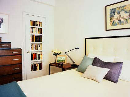
Some bedrooms whisper, “Please relax.” Others shout, “I bought every decorative pillow in the zip code.” The bedrooms created by 2Michaels Interior Design belong to a far more interesting category: spaces that feel peaceful without becoming predictable, colorful without turning into a paint-swatch convention, and sophisticated without looking as though nobody is allowed to sit on the bed.
Founded by sisters Jayne and Joan Michaels, the New York interior design studio is known for combining modern architecture, twentieth-century furniture, expressive art, and carefully controlled color. Their bedroom interiors offer a particularly clear view of that philosophy. Soft blues may share a room with deep purple velvet. A warm teak headboard may sit beside turquoise, yellow, and red. White walls are rarely treated as empty space; instead, they become a calm background for furniture, textiles, and art with real personality.
This closer look at bedrooms by 2Michaels Interior Design explores what makes the rooms memorable, why their approach continues to feel relevant, and how homeowners can borrow the underlying ideas without needing a Manhattan penthouseor a furniture auction paddle permanently attached to one hand.
Meet 2Michaels Interior Design
2Michaels is led by Jayne and Joan Michaels, sisters whose interest in modern architecture began in Palm Springs, California, and developed further during time spent in Milan. Their exposure to designers such as Franco Albini, Carlo Scarpa, and Gio Ponti helped shape an appreciation for disciplined forms, unusual materials, and furniture that works as both a practical object and a piece of sculpture. After moving to New York, they studied interior design at the Fashion Institute of Technology.
The studio describes its work as fresh, effortless, poetic, comfortable, and timeless. More importantly, its projects are intended to reflect the personality and history of each client rather than impose a recognizable designer “uniform” on every property. That emphasis on personal, layered interiors explains why the firm’s bedrooms feel collected instead of staged.
Although 2Michaels is strongly associated with midcentury design, its rooms are not frozen in 1958. Vintage Italian, Swedish, American, and Danish pieces regularly appear beside contemporary art, custom upholstery, classical architecture, and practical modern comforts. The result is less “period room” and more “an interesting person lives here.”
What the Original Bedroom Tour Revealed
A Remodelista feature published in 2011 highlighted four 2Michaels bedrooms and focused on the designers’ ability to use rich color in warm, classic ways. The rooms were notably different from one another, yet all displayed the same control over palette, proportion, and texture.
An Airy White Bedroom with Purple and Blue
The first bedroom used white as its dominant background, then introduced restrained shades of purple and blue. This is an important distinction: the room was not simply a “white bedroom.” Its character came from quiet shifts in tone.
Pale walls and bedding allowed daylight to travel through the room, while lavender and blue prevented the space from feeling clinical. The colors were subtle enough to promote calm but distinct enough to give the eye somewhere to land. Instead of demanding attention, the accents gently animated the neutral shell.
This is one of the studio’s most useful lessons. A restful bedroom does not have to be beige from floor to ceiling. Soft color can create serenity when its saturation, placement, and surrounding materials are carefully controlled.
A Blue-and-Gray Bedroom Built from Prints and Solids
Another bedroom combined blue and gray through both printed and solid fabrics. The limited palette kept the composition cohesive, while variations in pattern created movement.
Mixing patterns is where many bedrooms encounter turbulence. One floral print invites a stripe, the stripe introduces a geometric pillow, and suddenly the bed resembles a fabric store during an earthquake. The 2Michaels approach avoids this by creating relationships among colors even when the patterns differ.
A successful mix typically includes changes in scale. A larger print can be balanced by a smaller motif and broad areas of solid fabric. Repeating one or two colors across the bed, curtains, rug, and accessories helps the room feel intentional rather than improvised at 11:45 p.m.
Jewel-Toned Velvet as a Controlled Accent
In a third bedroom, velvet pillows in jewel tones supplied color and texture. The strategy was economical: rather than coating every surface in dramatic color, the designers concentrated the strongest hues in movable, touchable elements.
Velvet changes as light moves across its pile, giving even a simple pillow more visual depth than a flat cotton fabric. Deep plum, sapphire, emerald, or garnet can therefore add richness without requiring elaborate ornament.
This is also a practical approach for homeowners who are curious about color but unwilling to pledge lifelong loyalty to an eggplant-purple wall. Pillows, throws, and small upholstered pieces allow experimentation with relatively little risk.
Turquoise, Yellow, and Red Against Teak
The boldest room in the original roundup combined turquoise, sunflower yellow, and red with a midcentury teak headboard. On paper, that palette sounds energetic enough to organize its own parade. In the room, however, warm wood acted as a visual mediator.
Teak contains brown, gold, and reddish undertones, allowing it to relate naturally to both warm and cool colors. The headboard also gave the room a strong architectural anchor. Once the bed had a clear visual center, the brighter accents could play around it without making the composition feel unstable.
The lesson is not that every bedroom needs three primary-adjacent colors. It is that bold combinations become easier to manage when they are grounded by natural materials, repeated thoughtfully, and surrounded by sufficient visual breathing room.
The Design Language Behind 2Michaels Bedrooms
Architecture Comes Before Decoration
2Michaels projects often begin with close attention to the building itself. In prewar Manhattan apartments, the designers may work with original moldings, tall windows, unusual hallways, or formal proportions. In modern houses, they respond to open views, wood surfaces, glass walls, and strong geometric lines.
For a Central Park West project, the studio reshaped an awkward area to create a walk-in closet and transformed the primary bathroom into a spa-like retreat with a steam shower and soaking tub. In another Upper West Side apartment, abundant light and strong architectural bones created an opportunity to experiment with art, color, and Italian midcentury furniture.
This architecture-first method prevents furniture from feeling randomly dropped into a box. The position of the bed, scale of the headboard, height of the artwork, and amount of visible floor should respond to the room’s actual proportions.
Midcentury Furniture Is Used as Vocabulary
The firm’s interiors frequently include work associated with Gio Ponti, Franco Albini, Ico Parisi, Frits Henningsen, Josef Frank, and other influential twentieth-century designers. Yet the pieces are not assembled as a museum collection. They are used to establish rhythm, silhouette, craftsmanship, and historical depth.
A sculptural chair may soften an empty corner. A slim-legged nightstand may keep a small bedroom visually open. A vintage desk can introduce patina beside crisp contemporary bedding. The value lies not only in the label but in what the object contributes to the room.
Homeowners can apply this principle without chasing rare auction pieces. Look for furniture with clear proportions, useful functions, and materials that improve with age. A well-shaped vintage dresser from a local resale shop may bring more character than a complete matching bedroom set delivered in seven identical cardboard boxes.
Color Is Layered Rather Than Announced
Color in a 2Michaels bedroom often arrives in stages. Walls establish atmosphere. Wood contributes warmth. Upholstery adds a secondary tone. Bedding, artwork, and accessories introduce sharper accents.
This layered method is more flexible than selecting a single “theme color.” It allows a pale blue room to include gray, cream, walnut, and a small amount of orange. It also lets a mostly white bedroom feel colorful without sacrificing brightness.
Current bedroom guidance from major U.S. design publications similarly emphasizes creating a specific mood, coordinating undertones, and using texture to keep neutral palettes from appearing flat. Cool blues and greens are often selected for calm, while yellow or warmer accents can provide energy in smaller amounts.
Art Is Part of the Room, Not an Afterthought
Because 2Michaels works frequently with clients who collect art, paintings and sculptures are integrated into the overall composition. Artwork may balance the bed, introduce an unexpected color, or create tension with a piece of vintage furniture.
The art does not always need to be enormous. In bedrooms with tall ceilings, smaller works can emphasize vertical space by leaving generous wall area around them. A restrained installation may feel more confident than filling every blank surface simply because a hammer and several nails were available.
How to Create a Bedroom Inspired by 2Michaels
1. Decide How the Room Should Feel
Before choosing paint, determine the emotional goal. Should the bedroom feel airy, cocooning, artistic, tailored, or quietly glamorous? This decision will guide everything that follows.
An airy bedroom might begin with chalky white, pale blue, or misty gray. A cocooning room could use tobacco brown, muted green, deep blue, or a low-contrast combination of related tones. The correct palette is the one that supports the desired mood and works with the room’s natural light.
2. Let One Element Establish the Palette
Start with an object that already has character: a painting, vintage rug, upholstered headboard, patterned fabric, or wood bed frame. Pull two or three colors from it rather than selecting unrelated shades individually.
For example, a painting containing dusty blue, burgundy, cream, and charcoal could inspire pale blue walls, cream bedding, a charcoal bench, and one burgundy velvet pillow. The artwork becomes the quiet organizer of the room instead of merely something hung above the bed after everything else is finished.
3. Combine Solids, Patterns, and Texture
A sophisticated bedroom needs variation, but not necessarily more objects. Linen, wool, velvet, polished wood, paper, ceramic, and metal can create depth within a relatively narrow color scheme.
Pair one prominent pattern with a smaller secondary print and several solids. Allow at least one fabric to feel tactile. Even an all-white bedroom becomes more dimensional when crisp cotton, washed linen, bouclé, matte plaster, and warm wood appear together. Better Homes & Gardens and Architectural Digest both emphasize texture as a way to give neutral bedrooms richness without excessive visual noise.
4. Use Wood to Balance Strong Color
Natural wood is particularly helpful when working with turquoise, yellow, red, purple, or other saturated shades. Walnut makes bright colors feel more tailored. Oak introduces lightness. Teak connects naturally with oranges, reds, blues, and greens.
There is no need for every wood finish to match. A room can combine a walnut bed, oak floor, and darker vintage nightstand when the tones share a compatible warmth and the shapes remain visually balanced.
5. Layer the Lighting
A bedroom should not depend on one ceiling fixture powerful enough to illuminate a minor-league baseball field. Ambient, task, and decorative lighting serve different purposes and should be controlled separately whenever possible.
Use a ceiling fixture for general illumination, bedside lamps or sconces for reading, and a smaller lamp near a dresser or chair for atmosphere. Dimmers allow the room to shift from practical morning light to a softer evening glow. Wall-mounted fixtures are especially valuable in smaller bedrooms because they preserve nightstand space.
6. Give the Bed Visual Authority
The bed is usually the largest object in the room and should look intentional. A sculptural wood headboard, upholstered frame, canopy, or large textile can establish a strong focal point.
That does not mean the bed must be enormous. In a compact room, a clean-lined frame with visible legs can reduce visual weight. In a tall room, a higher headboard can improve proportion. The surrounding nightstands and lamps should support the bed rather than compete with it.
7. Leave Some Space Unfilled
One reason professionally designed bedrooms often feel calm is that they include negative space. Not every wall requires art. Not every corner requires a chair. Not every chair requires six pillows and a decorative throw arranged as though it is preparing for a catalog audition.
Open space makes important furniture and artwork easier to appreciate. It also improves circulation and makes daily taskschanging sheets, opening drawers, walking to the closetconsiderably less athletic.
Why These Bedrooms Still Feel Current
The original Remodelista bedroom roundup dates to 2011, but the interiors avoid many of the visual signals that make rooms age quickly. They do not depend on a single fashionable paint color, novelty accessory, or complete furniture collection. Their interest comes from proportion, art, material, and unusual color relationships.
The studio’s more recent portfolio continues the same broader philosophy. Projects such as the Tribeca lofts, the Apthorp apartment, the Prasada residence, and the Brookline house combine historic or modern architecture with personal collections, refined furniture, and livable comfort. The exact objects change, but the attention to scale and simplicity remains consistent.
This continuity explains why the bedrooms remain useful references. Timeless design does not mean removing everything distinctive. It means choosing distinctive elements for reasons deeper than temporary popularity.
Conclusion: A Bedroom Should Feel Personal, Not Perfect
Bedrooms by 2Michaels Interior Design demonstrate that calm and character are not opposites. White walls can support jewel-toned velvet. Midcentury teak can live comfortably beside turquoise and sunflower yellow. Fine art can coexist with practical bedside storage. A luxurious room can still appear relaxed enough for someone to place a book on the nightstand without first calling the stylist.
The most transferable lesson is to design through relationships. Consider how the wall color responds to the wood, how the rug balances the bed, how a pillow repeats a tone in the artwork, and how light changes every material after sunset. When those relationships are strong, a bedroom does not need dozens of decorative gestures. It needs a few thoughtful decisions that work together.
Extended Experience: Testing the 2Michaels Approach in a Real Bedroom
The best way to understand this design philosophy is to imagine applying it to an ordinary bedroom rather than a professionally photographed showpiece. Consider a modest room with white walls, one window, a basic upholstered bed, two mismatched nightstands, and a ceiling light that produces approximately the same atmosphere as a convenience store.
The first temptation might be to buy an entirely new furniture set. A more 2Michaels-inspired approach would begin by studying what already works. Perhaps the bed has a good shape, the wood floor provides warmth, and the morning light is surprisingly beautiful. Those three qualities become the foundation.
Next, introduce a restrained palette. A faded blue rug could anchor the bed while connecting with a small abstract painting containing blue, rust, cream, and black. Instead of painting every wall blue, keep the walls warm white and repeat the blue in two pillow shams. Add one rust-colored velvet cushion to relate to the artwork and warm the composition.
The mismatched nightstands do not necessarily need replacing. Painting one is often less convincing than letting the difference appear intentional. Balance them through lamps of similar height, or use matching wall sconces above both sides of the bed. This creates symmetry without pretending the furniture is identical.
Lighting produces the most immediate improvement. Replace the harsh ceiling bulb with a warmer, dimmable source. Add reading lights that can operate independently. Place a small ceramic lamp on the dresser so the room can be illuminated without using the overhead fixture at night. Suddenly, the same walls, bed, and floor feel softer because the light is no longer interrogating them.
Texture comes next. Crisp cotton sheets are paired with a linen duvet, a wool throw, and perhaps one velvet accent. The bed gains depth, but the color palette remains limited. A vintage wood bench or small chair introduces patina and gives the room one object that does not look freshly removed from a shipping carton.
Artwork should be tested at several heights before nails are involved. Hanging it too high disconnects it from the bed; hanging it too low can make the headboard feel crowded. Leaving more wall around a smaller piece may create a stronger result than automatically choosing oversized art.
The final stage is editing. Remove the tiny accessories that contribute little beyond collecting dust. Clear enough of each nightstand to hold a book, water glass, and phone. Keep one memorable objecta sculptural bowl, framed photograph, or unusual lampinstead of seven decorative objects competing for employee of the month.
The experience reveals why the 2Michaels style feels effortless even though it is carefully considered. The goal is not to make every item match. It is to create a conversation among color, material, architecture, and personal objects. Once that conversation becomes clear, the room feels finished without feeling frozen. It becomes a bedroom rather than a display: a place with enough beauty to lift the mood and enough comfort to survive an unmade bed on a Tuesday morning.
Note: This independent editorial article is based on publicly available information about 2Michaels Interior Design and established bedroom-design guidance. It is not sponsored by or officially affiliated with the studio.